The living room is the heart of the home, a space for relaxation, socialising, and creating memories. The colours you choose for this central hub have a profound impact on its atmosphere, influencing everything from perceived space to your mood. But with an endless spectrum of shades available, knowing where to begin can feel overwhelming. Forget generic advice that simply lists popular paints; this guide dives deep into curated palettes that are both timeless and on-trend, offering specific, actionable guidance for creating a cohesive and stylish space.
We will explore nine distinct and professionally endorsed colours for living room schemes, moving beyond a single pot of paint to examine complete, workable palettes. For each one, you'll find practical implementation details covering everything from feature walls and woodwork to soft furnishings and metallic accents. We'll break down the psychology behind each combination and provide real-world examples to help you visualise the final result in your own home. Whether you crave a serene, neutral sanctuary or a vibrant, energetic hub, this curated list provides the inspiration and direction needed to select a palette that truly reflects your personal style and elevates your everyday living. Let's find your perfect combination.
1. Sophisticated Sanctuary: The Neutral Monochromatic Scheme
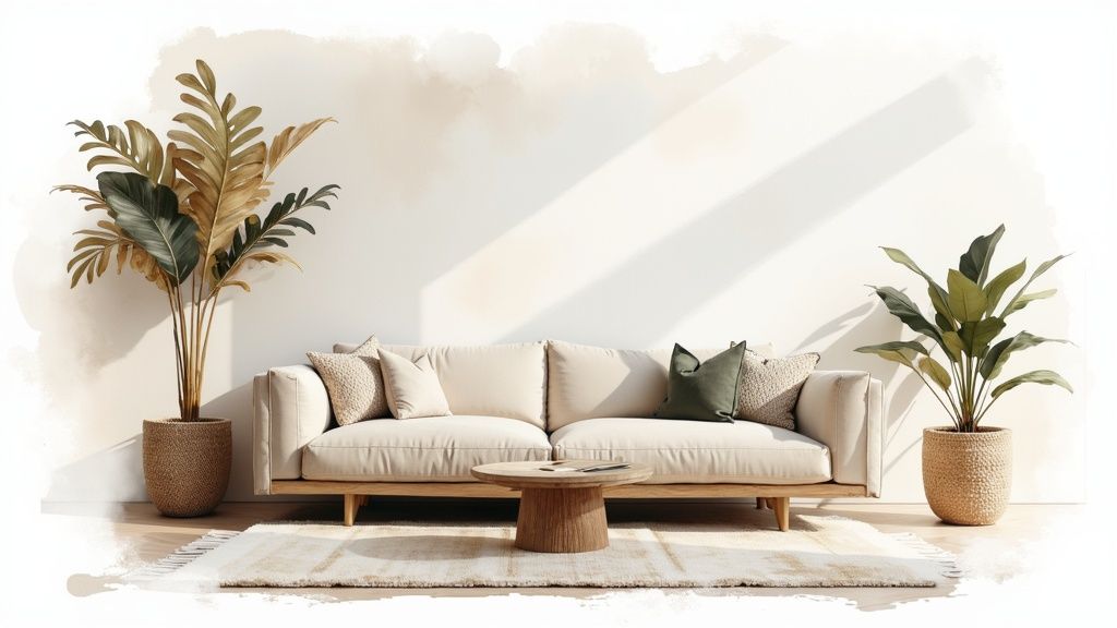
Choosing the right colours for a living room can feel daunting, but a neutral monochromatic scheme offers a timeless and sophisticated solution. This approach moves beyond a single flat shade, instead layering various tints, tones, and textures from the same neutral colour family, such as beige, grey, or off-white. The result is a cohesive and calming environment that feels both curated and effortlessly elegant. By focusing on a single core colour, you allow texture and form to become the stars, creating a space that is rich in depth and visual interest without overwhelming the senses.
Achieving a Dynamic Neutral Look
The key to a successful monochromatic room, popularised by designers like Kelly Hoppen, is preventing it from looking one-dimensional. This is achieved by introducing a variety of materials and finishes. Imagine a living room where walls in a matte off-white serve as a backdrop for a creamy bouclé sofa, a linen-upholstered armchair, and a plush wool rug. Each element shares a similar hue but contributes a unique texture, creating a tactile and inviting atmosphere.
Actionable Tips for Implementation
To bring this look home, concentrate on creating subtle yet impactful variations.
- Layer Textures: Combine different materials like chunky knit throws, smooth leather cushions, and rough-hewn wooden furniture to add complexity.
- Vary the Finishes: Use the same neutral colour in different paint finishes. For example, paint your walls in a matte finish, your trim in a satin finish, and add a piece of furniture with a high-gloss lacquer.
- Incorporate Natural Elements: A few well-placed houseplants or a vase of fresh flowers will introduce a gentle, organic contrast that enhances the neutral palette.
- Use Metallic Accents: Sparingly add accents of brass, chrome, or black metal through light fixtures or décor. This provides a refined contrast without disrupting the serene mood.
2. Navy and White Classic
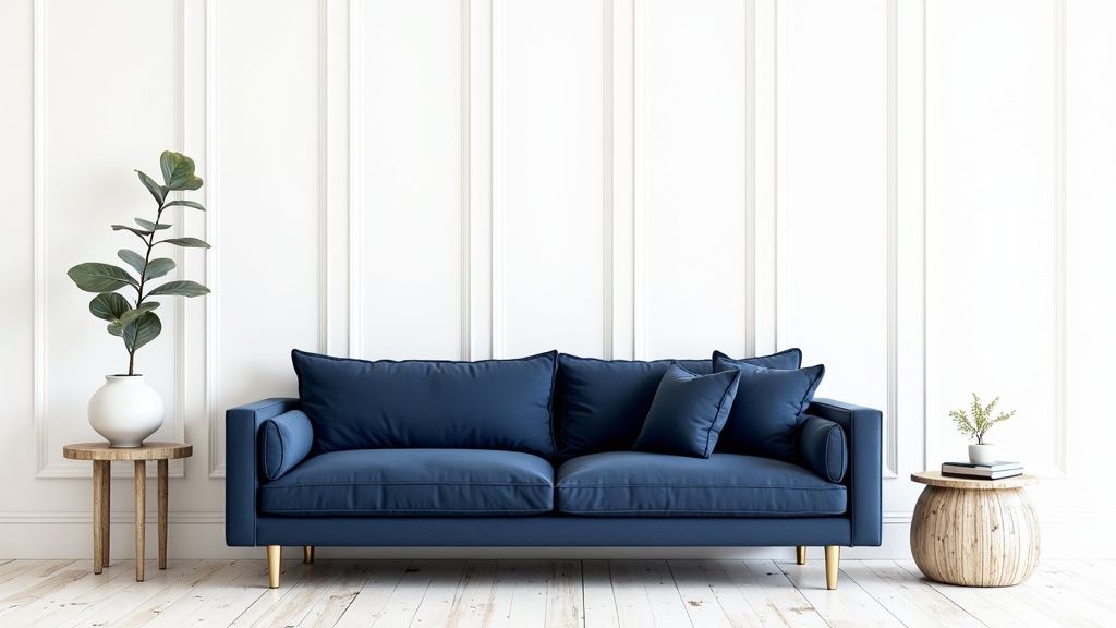
The combination of deep navy blue and crisp white offers a timeless and powerful choice for living room colours, evoking a sense of enduring elegance. This classic pairing creates a sophisticated, preppy aesthetic that feels both traditional and refreshingly contemporary. Inspired by nautical themes and refined coastal interiors like those popularised by Ralph Lauren Home, this scheme balances the depth of navy with the brightness of white for a look that is both bold and liveable. It’s a versatile palette that can lean towards a formal, structured feel or a relaxed, Hamptons-style beach house vibe depending on the execution.
Achieving a Balanced Coastal Feel
The success of a navy and white living room lies in achieving the perfect balance to prevent the space from feeling cold or overwhelmingly dark. The crispness of white walls or large furniture pieces can be used to lift the deep, dramatic tone of a navy feature wall or sofa. This high-contrast look, championed by designers like Mark Hampton, allows for a clean, sharp, and organised feel while providing a strong foundation for decorative accents and personal touches. The goal is to create a dynamic interplay between light and dark.
Actionable Tips for Implementation
To introduce this classic scheme into your living room, focus on strategic balance and rich accents.
- Warm with Wood Tones: Incorporate furniture pieces in oak, walnut, or teak to introduce warmth and prevent the high-contrast palette from feeling too stark or chilly.
- Add Metallic Lustre: Use brass or gold hardware on cabinetry, light fixtures, and mirror frames. These warm metallic finishes provide a touch of luxury and contrast beautifully against the deep navy.
- Introduce Natural Textures: Layer in materials like jute or sisal for rugs, and add linen or cotton cushions to soften the scheme and enhance its coastal-inspired character.
- Balance the Light: If you use navy on the walls, ensure there is ample white in your furniture, ceiling, and trim to keep the room feeling bright and airy. Conversely, a navy sofa pops against white walls.
3. Warm Earth Tones
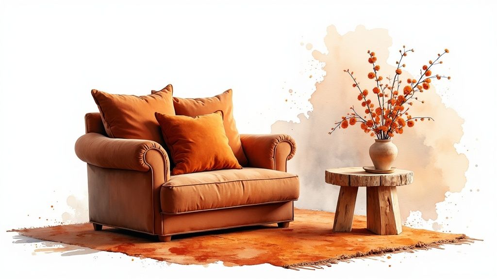
Embracing warm earth tones is one of the most effective ways to create a living room that feels grounded, cosy, and deeply connected to the natural world. This palette draws inspiration from organic elements like rich soil, sun-baked clay, and desert sand, incorporating colours such as terracotta, burnt orange, deep ochre, and warm browns. These colours for a living room work together to establish an inviting and comforting atmosphere, making the space feel like a welcoming retreat from the outside world.
Creating a Grounded and Inviting Space
Popularised by designers like Kelly Wearstler and the modern bohemian aesthetic championed by Justina Blakeney, this look is all about warmth and texture. The goal is to create a space that envelops you. Think of a living room with terracotta-coloured walls that provide a rich, warm backdrop for a tan leather sofa, jute rug, and unpainted wooden furniture. The interplay of these natural hues and materials results in a design that is both sophisticated and incredibly liveable.
Actionable Tips for Implementation
To successfully introduce this palette, focus on layering and balance to avoid an overly heavy feel.
- Layer Different Tones: Combine several earthy shades to build depth. Use a lighter tan on the walls, a deeper rust for an accent chair, and ochre for cushions and throws.
- Add Cream or White: Incorporate crisp white or soft cream accents through trim, textiles, or art to provide visual relief and keep the space feeling bright and airy.
- Embrace Natural Materials: Enhance the earthy vibe by using plenty of natural materials. Think linen curtains, stone-topped tables, rattan furniture, and ceramic décor.
- Prioritise Warm Lighting: Use warm-toned light bulbs (around 2700K) and layered lighting with floor lamps and table lamps to enhance the cosy, intimate quality of the colour scheme.
4. Serene Escape: Sage Green and Cream
For those seeking a tranquil and organic atmosphere, the combination of sage green and cream offers a perfect balance of colour and calm. This nature-inspired palette pairs a soft, muted green with the gentle warmth of cream, creating a living room that feels like a serene, restorative escape. Popularised by designers like Shea McGee and the modern farmhouse aesthetic of Joanna Gaines, this duo is one of the most versatile and soothing colour choices for a living room, evoking the peacefulness of a boutique spa or a lush garden.
Cultivating a Natural and Sophisticated Ambience
The success of a sage green and cream living room lies in its ability to feel both grounded and light. It draws inspiration directly from the natural world, making it an ideal choice for connecting your indoor space with the outdoors. Imagine soft sage walls providing a restful backdrop for a plush cream sofa, light oak furniture, and linen curtains. This approach creates a space that is not only visually pleasing but also promotes a sense of well-being and relaxation, making it a fantastic selection among the many colours for a living room.
Actionable Tips for Implementation
To bring this calming and sophisticated look into your home, focus on balance and texture.
- Create a Focal Point: Consider painting a single accent wall in a rich sage green behind your sofa or fireplace, keeping the remaining walls a warm, inviting cream to maintain an airy feel.
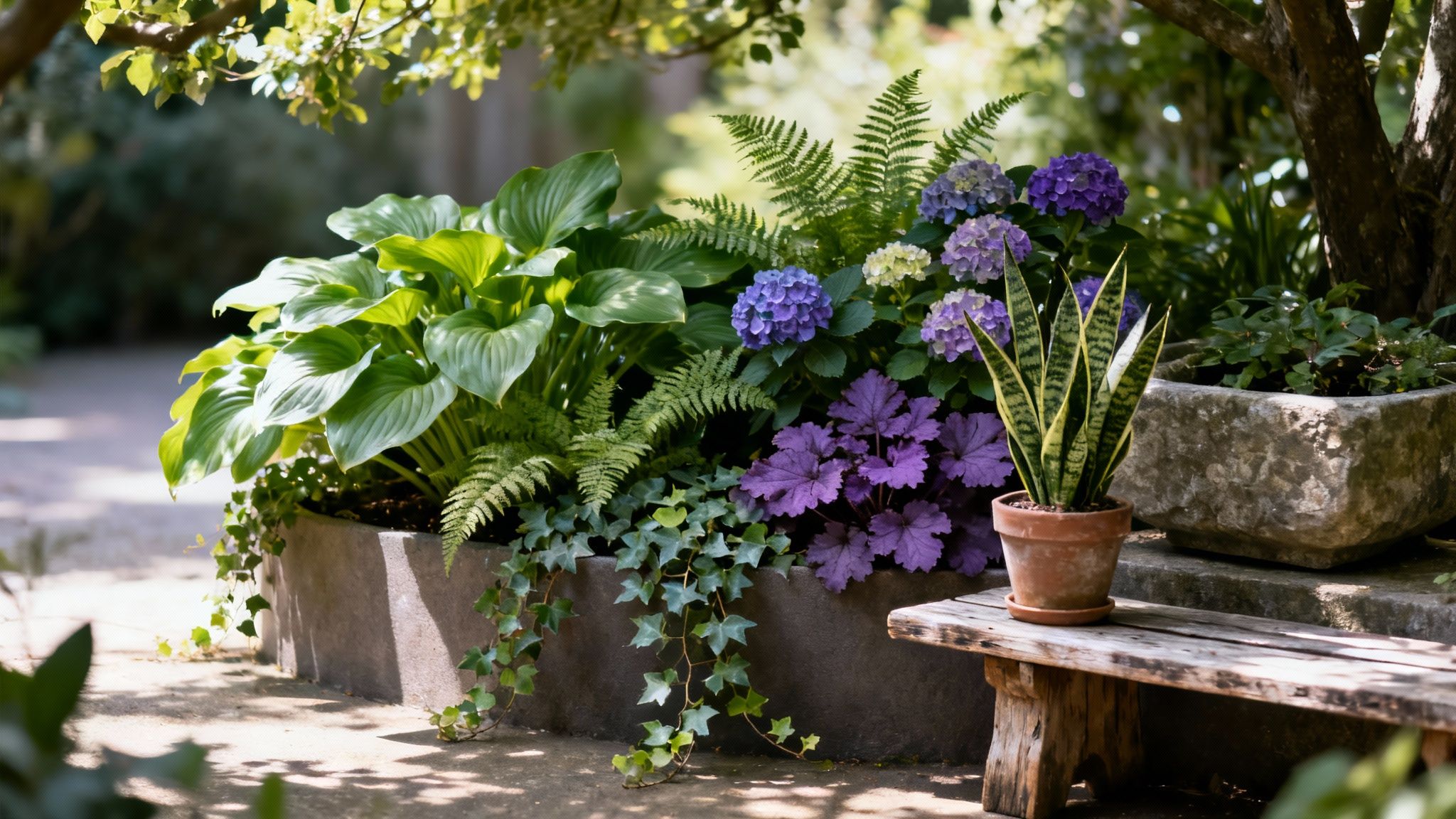
- Incorporate Live Plants: Enhance the natural theme by adding a variety of houseplants. The vibrant greens of fiddle-leaf figs or snake plants will beautifully complement the muted sage tones.
- Layer Natural Textures: Introduce materials like rattan, jute, light-toned wood, and wool in shades of cream and beige to add depth and tactile interest to the space.
- Add Sophisticated Contrast: A few carefully placed black accents, such as a thin-framed mirror, metal light fittings, or picture frames, will provide a sharp, modern contrast that grounds the soft palette.
5. Bold Jewel Tones: Creating an Opulent Atmosphere
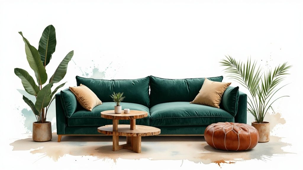
For those who wish to make a dramatic and luxurious statement, jewel tones are one of the most impactful colours for a living room. This approach embraces rich, saturated hues inspired by precious gemstones: think emerald green, sapphire blue, ruby red, and amethyst purple. The result is an opulent and sophisticated living space with immense visual character. This style, reminiscent of lavish hotel lobbies and traditional English drawing rooms, envelops you in a sense of drama and historic grandeur, making the living room a truly memorable and inviting hub.
Achieving a Rich and Balanced Look
A successful jewel-toned scheme, often championed by designers like Martin Brudnizki and colour expert Abigail Ahern, requires a considered approach to prevent the space from feeling overwhelming. The key is balance. Imagine sapphire blue walls providing a deep, velvety backdrop to a plush sofa in a softer, neutral grey. Accents of emerald green in cushions and ruby red in artwork can then be introduced to create a layered, maximalist feel that remains cohesive and intentionally curated.
Actionable Tips for Implementation
To introduce these decadent colours into your living room, focus on creating a harmonious yet dynamic palette.
- Select a Dominant Tone: Choose one jewel tone to be the primary colour, such as on the walls, and use one or two others as smaller, strategic accents in textiles or accessories.
- Balance with Neutrals: Ground the rich colours with neutral elements. A large cream rug, light-coloured wooden furniture, or crisp white trim can prevent the deep hues from overpowering the space.
- Embrace Metallic Accents: Gold, brass, and bronze are natural partners for jewel tones. Incorporate them through lighting fixtures, mirror frames, and decorative objects to enhance the luxurious feel.
- Prioritise Lighting: Good lighting is crucial. Ensure your space has ample natural light and a layered artificial lighting scheme to bring out the depth and richness of the colours, preventing them from looking flat or murky.
6. Black, White, and Gray: Modern Graphic Impact
For a look that exudes confidence and modern sophistication, the classic combination of black, white, and grey is a powerful choice for living room colours. This achromic scheme utilises the full tonal spectrum, from the brightest whites to the deepest blacks, with an endless variety of greys in between. The result is a clean, structured, and visually striking environment that feels both intentional and timeless. Popularised by icons of the Minimalist design movement like architect Mies van der Rohe, this palette allows architectural lines and statement furniture to take centre stage.
Crafting a Dynamic Achromic Space
The success of a black, white, and grey living room hinges on creating visual depth and preventing the space from feeling cold or stark. This is achieved by carefully balancing the tones and introducing a rich tapestry of textures. Consider a room with dark charcoal walls, a crisp white ceiling, and a light grey sofa. Add a black marble coffee table, a fluffy white sheepskin rug, and chrome light fittings to create a layered and engaging space where each element stands out.
Actionable Tips for Implementation
To bring this high-contrast, graphic look into your living room, focus on thoughtful balance and texture.
- Balance the Tones: Follow the 60-30-10 rule. Use a dominant shade (like light grey) for 60% of the room, a secondary shade (like white) for 30%, and use the boldest shade (black) as an accent for the final 10%.
- Mix Finishes: Contrast matte walls with glossy furniture or lacquered accessories. The interplay of light on different surfaces adds a subtle complexity to the scheme.
- Introduce Natural Softness: A touch of green from a houseplant or the warmth of a single wooden element, like a picture frame, can beautifully soften the graphic edges of the palette.
- Warm Up with Lighting: Use warm-toned light bulbs (around 2700K) in your lamps and overhead fixtures to prevent the grey tones from feeling too cold or clinical, especially in the evenings.
7. Blush Pink and Gold: Contemporary Glamour
The combination of blush pink and gold offers a beautifully romantic and luxurious palette, proving that pink is no longer reserved for juvenile spaces. This pairing marries the soft, gentle warmth of dusty or blush pink with the opulent gleam of gold accents, creating a living room that feels both contemporary and unapologetically glamorous. The key is balance; this isn't about creating an overwhelmingly feminine room, but about using one of the most sophisticated colours for a living room to build an atmosphere of soft, modern luxury, popularised by designers like Kelly Wearstler and the iconic Glossier brand aesthetic.
Achieving a Refined Pink and Gold Palette
Success with this colour scheme lies in subtlety and sophistication. Instead of painting all four walls in a vibrant pink, consider using a muted, dusty blush on an accent wall or incorporating it through significant furniture pieces like a velvet sofa. The gold should act as jewellery for the room, introduced through light fixtures, mirror frames, and the legs of coffee tables. This ensures the pink feels warm and inviting, not saccharine, and the gold adds a touch of light and luxury without being ostentatious. This approach is often seen in high-end hotel lounges and chic restaurants seeking a welcoming yet upscale vibe.
Actionable Tips for Implementation
To bring this chic combination into your living room, focus on curation and texture.
- Use Pink as an Accent: If you're hesitant, introduce blush pink through textiles. Cushions, a plush rug, or curtains can provide a significant colour impact without permanent commitment.
- Choose Warm Golds: Opt for brushed or champagne gold tones over cooler, brash brass. Warm golds complement the softness of blush pink and feel more modern and understated.
- Balance with Neutrals: Ground the scheme with a crisp white, soft cream, or even a light grey. This provides a clean backdrop that allows the pink and gold to truly shine with sophistication.
- Incorporate Rich Textures: Enhance the sense of luxury by pairing these colours with sumptuous materials. Velvet, silk, and faux fur add tactile depth that elevates the entire look.
8. Vibrant Harmony: The Blue and Orange Complementary Scheme
For those looking to create a living room with energy and personality, a blue and orange complementary colour scheme offers a bold and exciting solution. Based on colour theory, these shades sit opposite each other on the colour wheel, creating a high-contrast, dynamic partnership. This pairing generates a strong visual impact that can range from playful and vibrant to deeply sophisticated, depending on the tones you choose. It's a confident choice that proves how contrasting colours for living room design can result in a perfectly balanced and invigorating space.
Crafting a Dynamic yet Balanced Interior
The success of this scheme, often seen in mid-century modern design, lies in managing its inherent intensity. You can achieve this by selecting more muted versions, such as a deep navy with a burnt orange or a soft teal with a terracotta. This approach maintains the compelling contrast while creating a more liveable and refined atmosphere. Think of a coastal living room where a rich navy sofa is accented with coral-orange cushions, or a contemporary space featuring a teal feature wall behind a rust-coloured armchair.
Actionable Tips for Implementation
To introduce this vibrant duo into your home without it feeling overwhelming, consider these practical steps.
- Apply the 60-30-10 Rule: A foolproof method is to use your dominant colour (e.g., blue) for 60% of the room, your secondary colour (orange) for 30%, and a neutral like white or cream for the remaining 10% to provide a visual break.
- Vary the Saturation: Not all blues and oranges have to be bright. Pair a soft, sky-blue wall with a bold, burnt orange velvet sofa to create a focal point with depth.
- Incorporate Natural Wood: The warmth of natural wood tones in flooring or furniture acts as a perfect bridge between blue and orange, grounding the scheme and adding an organic touch.
- Use in Art and Textiles: If painting walls feels too permanent, introduce the combination through a large piece of abstract art, patterned rugs, or scatter cushions to test the waters.
9. Forest Green and Natural Wood
Bringing the outside in, a forest green and natural wood palette offers an organic and grounding choice for living room colours. This scheme pairs the deep, restorative quality of forest green with the warmth and texture of natural wood, creating a space that feels deeply connected to nature. It evokes the serenity of a woodland escape, making it ideal for those seeking to implement a biophilic design approach that promotes wellbeing and calm. This look feels both sophisticated and inherently comforting, turning the living room into a tranquil haven.
Creating a Biophilic Retreat
The success of this combination lies in its ability to replicate the peaceful ambience of a forest. Popularised by the English country house tradition and the modern biophilic design movement, this pairing is about balance. Imagine a feature wall in a rich, matte forest green, providing a dramatic backdrop for an oak sideboard and a leather armchair. The deep green absorbs light and creates a cosy, enveloping feel, while the wood introduces texture and organic warmth, preventing the darker shade from feeling overwhelming.
Actionable Tips for Implementation
To successfully bring this nature-inspired look into your home, focus on layering and light.
- Mix Wood Tones: Don't limit yourself to one type of wood. Combine lighter tones like ash or pine with deeper walnuts or oaks for added depth and visual interest.
- Balance with Lightness: Introduce accents of cream, off-white, or soft beige through textiles like cushions, throws, or a rug. This will lift the scheme and prevent it from feeling too heavy.
- Amplify with Lighting: Ensure the room has plenty of natural light. In the evenings, use warm, layered artificial lighting with floor and table lamps to enhance the cosy, intimate atmosphere.
- Incorporate Live Plants: Reinforce the natural theme by adding a variety of houseplants. Ferns, fiddle-leaf figs, or trailing ivy will perfectly complement the green walls and complete the biophilic aesthetic.
Living Room Colour Schemes Comparison
Bringing Your Vision to Life with Confidence
Choosing the perfect colours for your living room is far more than a simple design decision; it is the foundational act of creating a home that truly reflects your personality and supports your lifestyle. Throughout this guide, we've journeyed through a diverse spectrum of palettes, from the serene, cohesive elegance of a Neutral Monochromatic scheme to the dynamic, energising contrast of a Blue and Orange Complementary pairing. We've seen how the timeless sophistication of Navy and White can ground a space, while the organic, calming influence of Sage Green and Cream can forge a connection to the natural world.
The key takeaway is that there is no single "best" colour. The ideal choice is deeply personal and context-dependent. Your living room's unique characteristics, such as the direction and amount of natural light it receives, the architectural style, and the scale of the room, are crucial factors. The bold drama of Jewel Tones might feel magnificent in a large, well-lit space but could feel overwhelming in a smaller, darker room, where the earthy warmth of Forest Green and Natural Wood might create a cosier, more inviting atmosphere.
Your Action Plan for a Perfect Palette
To move from inspiration to implementation with confidence, follow these actionable steps:
- Shortlist Your Favourites: Review the palettes we've explored. Which one resonates most with the feeling you want to create? Are you aiming for the tranquil retreat offered by Warm Earth Tones or the modern, graphic impact of Black, White, and Gray? Select your top two or three contenders.
- Test, Don't Guess: Never commit to a colour based on a small paint chip alone. Purchase sample pots and paint large swatches (at least A4 size) on different walls in your living room. Observe how the colours change throughout the day and under artificial light at night. This step is non-negotiable for avoiding costly mistakes.
- Consider Your Existing Pieces: Unless you are starting from a completely blank canvas, your new wall colour must harmonise with your current sofa, rugs, and artwork. Place your colour samples next to these key items to ensure a cohesive look. A palette like Blush Pink and Gold might beautifully complement a velvet sofa, for instance.
Mastering the selection of colours for your living room empowers you to become the true architect of your home's atmosphere. It’s the framework upon which every memory, conversation, and moment of relaxation will be built. By thoughtfully applying these principles and trusting your own instincts, you are not just painting walls; you are crafting a backdrop for your life, creating a sanctuary that is uniquely and beautifully yours. Your dream living room is waiting to be realised, one confident brushstroke at a time.