Your hallway is more than just a passage; it's the first hello your home offers and the last goodbye it gives. This space sets the tone for your entire interior design, yet it's often the most neglected area when it comes to deliberate styling. The right colour palette can transform a narrow, dark corridor into a bright, welcoming entrance or a grand hallway into a sophisticated statement. Choosing the perfect combination of hues is the foundational step in creating an inviting atmosphere that flows seamlessly into the rest of your home.
This guide moves beyond generic advice to explore 10 distinct and actionable hallway colour schemes, curated specifically for a variety of UK homes. We will explore everything from the calming influence of sage green and soft grey to the dramatic impact of charcoal with gold accents. Each palette is broken down into practical components, complete with specific paint shade suggestions and hex codes to ensure you can replicate the look precisely.
We'll also provide expert advice on complementary elements such as lighting, flooring choices, and styling details that bring each scheme to life. Whether you reside in a period Victorian terrace or a contemporary new-build flat, you will find detailed insights to make a confident and stylish choice. Prepare to see your hallway not merely as a functional thoroughfare, but as a destination in its own right. This list provides the practical tools needed to create an unforgettable first impression.
1. Warm Neutral & Cream
A warm neutral and cream palette is one of the most enduring and sophisticated hallway colour schemes, creating an entrance that feels both welcoming and elegantly understated. This classic combination layers soft creams, beiges, and taupes to build a sense of warmth and light, making it an excellent choice for UK homes where natural light can be inconsistent. Its versatility allows it to serve as a serene backdrop in a modern minimalist space or to highlight the ornate architectural details of a period property.
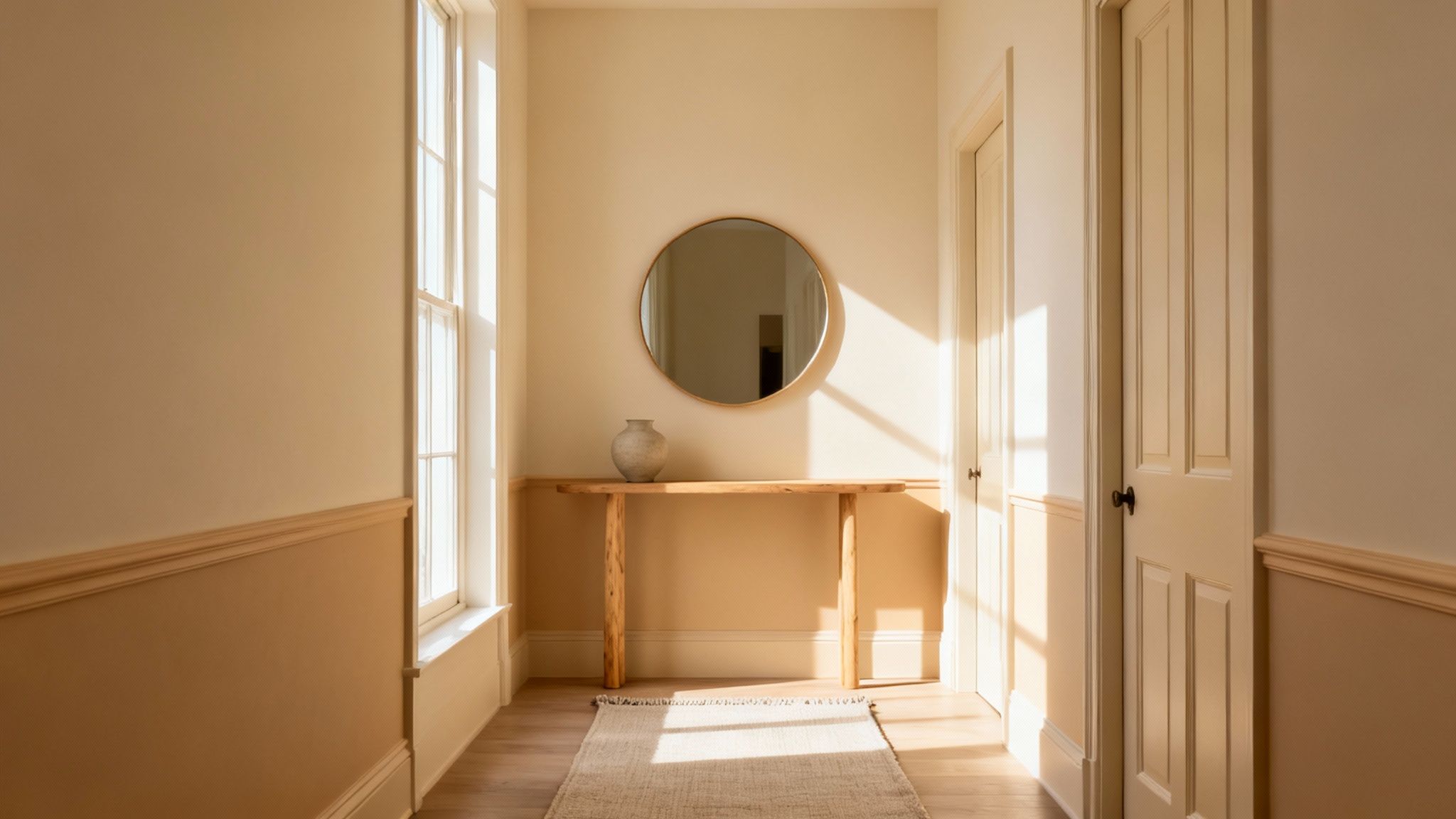
This approach is about creating quiet luxury. Think of the grand, inviting hallways in National Trust properties or high-end London townhouses, which often use these tones to feel spacious yet intimate. It’s a palette that never dates and allows for easy updates through accessories.
Colour Palette In Action
- Primary Wall Colour: A soft, warm off-white like Farrow & Ball's 'Pointing' (
#F3EEE8) creates a bright base. - Accent Wall or Panelling: A deeper beige such as Farrow & Ball's 'String' (
#D2C4A8) adds depth without overwhelming the space. - Trim & Woodwork: Use a clean, crisp cream like Little Greene's 'Slaked Lime' (
#F0EADF) for skirting boards and door frames to create subtle definition.
How to Implement This Scheme
To prevent a neutral scheme from feeling flat, focus on texture and lighting. Introduce a jute or sisal runner to add natural texture underfoot, or consider limewash paint for a soft, mottled effect on the walls.
Styling Tip: Use warm-toned LED lighting (around 2700K) to enhance the cosy, golden undertones of the paint. Avoid cool, blue-toned lights, which can make creams and beiges appear dull and unwelcoming.
Finishing touches are crucial. A large, ornate mirror can bounce light around and create an illusion of space, while a collection of black-and-white photographs in simple frames adds a personal, graphic element. For paint finishes, a modern matte or eggshell finish provides a sophisticated, low-sheen look that feels much more current than a high-gloss alternative.
2. Sage Green & Soft Grey
A sage green and soft grey palette brings a contemporary yet timeless feel to hallway colour schemes, channelling the calming essence of nature. This combination is distinctly British in its aesthetic, evoking country gardens and modernised heritage interiors. It perfectly balances warmth and coolness, creating a tranquil entrance that feels both grounded and sophisticated, making it ideal for homes that aim to be a peaceful retreat from the outside world.
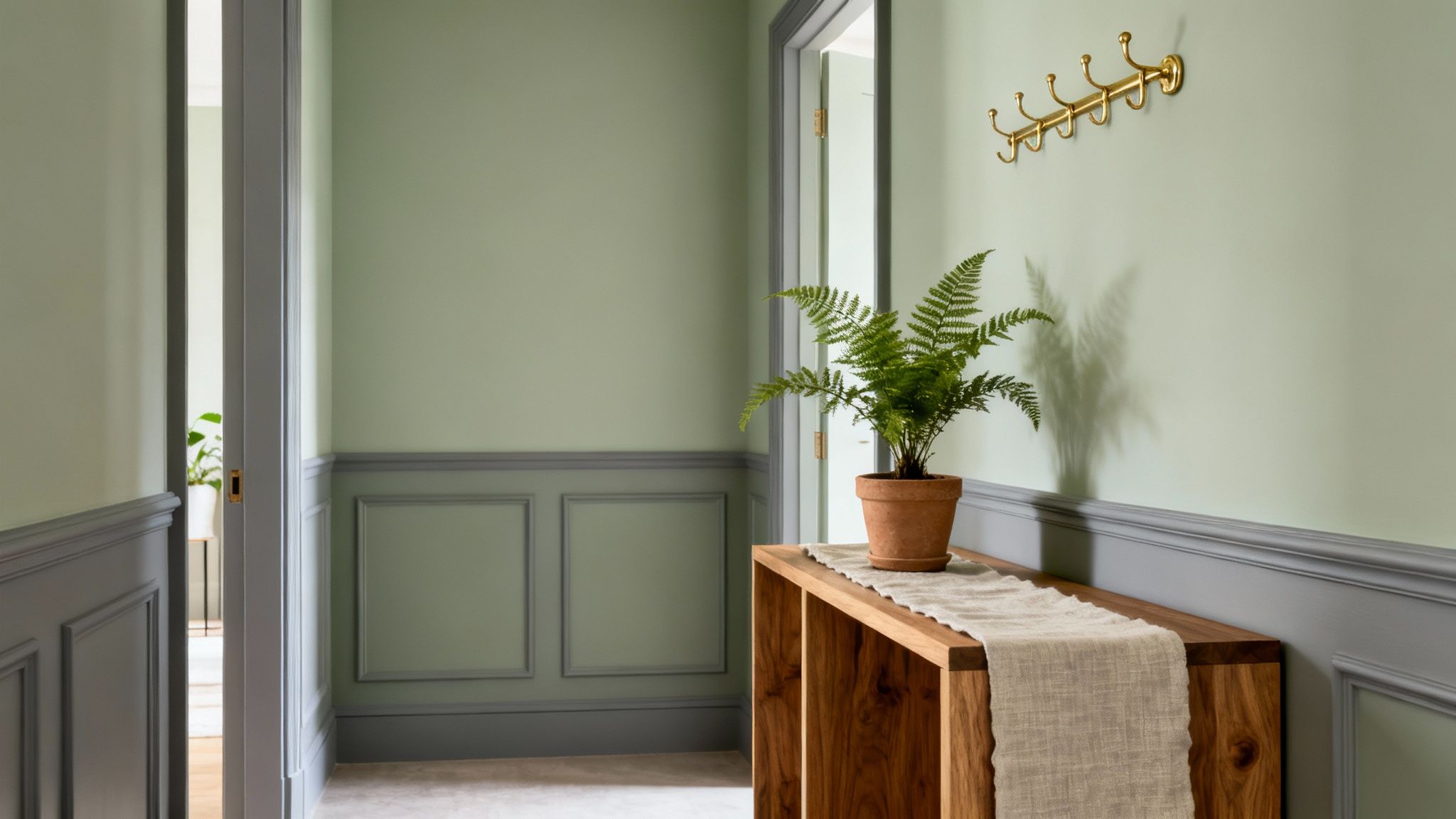
This scheme has been popularised by brands like Farrow & Ball, whose muted, earthy tones are a staple in modern British design. It works beautifully in both period properties with high ceilings and panelling, as well as new-builds needing a touch of character. The grey grounds the green, preventing it from feeling overly pastoral and giving it a chic, urban edge.
Colour Palette In Action
- Primary Wall Colour: A gentle, earthy green like Farrow & Ball’s ‘Lichen’ (
#B6B59F) creates a serene and welcoming atmosphere. - Accent Panelling or Lower Wall: A complementary soft grey such as Dulux’s ‘Perfectly Taupe’ (
#A7A099) adds structure and subtle contrast. - Trim & Woodwork: Use a clean, soft white or a very pale cream for skirting and doors to lift the scheme and maintain brightness.
How to Implement This Scheme
The key to this look is balance. Use the sage green on the upper portion of the walls to draw the eye upwards and create a sense of space, with the grounding grey on wainscoting or the lower third. Introduce natural textures like a jute runner, a light wood console table, or linen fabrics to enhance the organic feel.
Styling Tip: Incorporate warm metallic accents to prevent the cool tones from feeling flat. Brass or antique copper light fittings, mirror frames, and door handles will add a touch of warmth and luxury that beautifully complements the green and grey hues.
For a final layer of interest, consider a wallpaper with a subtle botanical print on a feature wall. This reinforces the nature-inspired theme without overwhelming the calm of the palette. An eggshell finish on the walls will provide a durable, soft sheen that is perfect for a high-traffic area like a hallway.
3. Deep Navy & Crisp White
A deep navy and crisp white palette is a bold, classic choice among hallway colour schemes, creating an entrance that feels both dramatic and impeccably defined. The deep, inky navy provides a sophisticated and enveloping backdrop, while brilliant white on the trim, ceiling, and accents delivers sharp contrast and a crucial sense of lift. This scheme is particularly striking in period properties with high ceilings, transforming a simple thoroughfare into a memorable and impressive threshold.
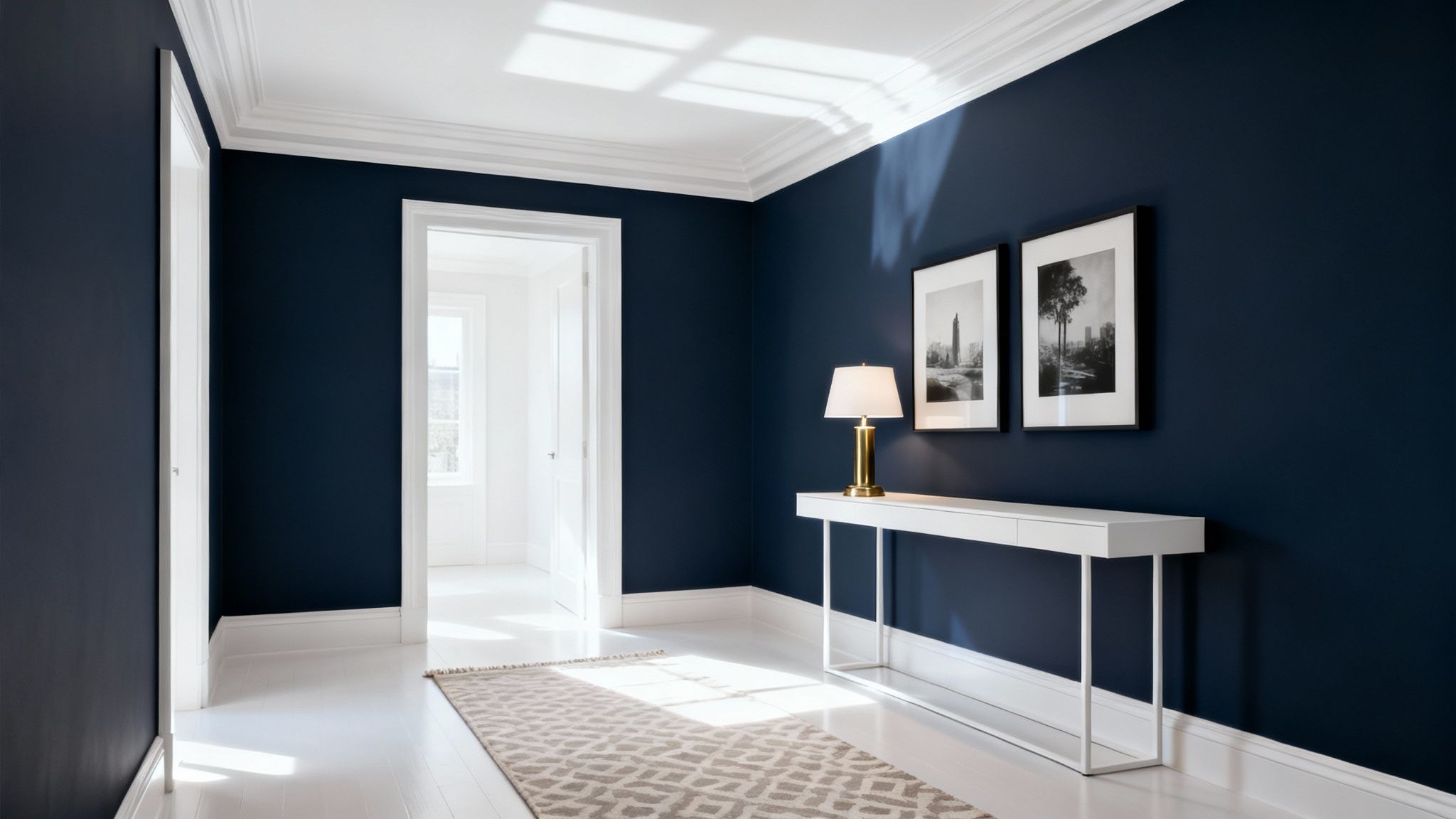
This look channels the timeless elegance of high-end London Georgian townhouses and stately homes, where confident use of colour is a hallmark of refined design. Popularised by iconic shades like Farrow & Ball's 'Hague Blue', this combination feels both traditional and modern, making a powerful first impression that speaks of confidence and style. It is a scheme that commands attention and sets a sophisticated tone for the rest of the home.
Colour Palette In Action
- Primary Wall Colour: A rich, deep navy such as Farrow & Ball's 'Hague Blue' (
#1D2F39) creates an immersive, moody atmosphere. - Accent Wall or Panelling: For a slightly softer take, use a brighter navy like Little Greene's 'Royal Navy' (
#1B385E) on a feature wall or below a dado rail. - Trim & Woodwork: A pure, clean white like Dulux's 'Absolute White' (
#FFFFFF) is essential for door frames, skirting boards, and the ceiling to maximise light and contrast.
How to Implement This Scheme
The key to successfully implementing this scheme is balancing the dark walls with bright, reflective elements. Ensure the ceiling and all woodwork are painted in a crisp white to prevent the navy from feeling oppressive, especially in narrower hallways. Introducing wooden furniture, such as an oak console table or bench, adds natural warmth and texture to the space.
Styling Tip: Elevate the look with metallic accents. Brass or polished gold hardware for door handles, light fittings, and picture frames provides a luxurious contrast against the deep blue and adds a layer of warmth.
For flooring, a light-coloured runner with a simple pattern can break up the dark floor-to-wall transition and guide the eye. When it comes to lighting, opt for warm-toned fixtures to soften the navy and create a welcoming glow. A large mirror is almost non-negotiable; it will bounce light around the space and create the illusion of greater depth, making the hallway feel grand rather than enclosed.
4. Warm Terracotta & Ochre
An earthy, Mediterranean-inspired palette, this combination of warm terracotta and ochre brings instant warmth and vibrant character to an entrance. This hallway colour scheme layers burnt orange, rich terracotta, and golden ochre tones to create an atmosphere that is both energising and grounded. It is an increasingly popular choice for UK homeowners looking to inject personality and evoke the sun-drenched feel of a holiday escape.
This scheme channels the rustic charm of Spanish villas and the rich visual language of Moroccan design, often seen in boutique hotels and lifestyle brands like Anthropologie. It is perfect for creating a memorable first impression, turning a functional transit space into a destination in its own right. The palette is surprisingly versatile, feeling cosy in winter and radiant in summer.
Colour Palette In Action
- Primary Wall Colour: A soft, muted ochre like Dulux Heritage's 'Golden Ochre' (
#E2B774) provides a warm, sunny base that isn't overwhelming. - Accent Wall or Feature: Use a rich, earthy terracotta like Farrow & Ball's 'Red Earth' (
#8D5340) on a single wall or in an alcove to add depth and focus. - Trim & Woodwork: A clean, warm off-white such as Little Greene's 'Linen Wash' (
#F1EBE1) will balance the intensity of the wall colours and keep the space feeling bright.
How to Implement This Scheme
To succeed with this bold hallway colour scheme, balance is key. Use the deeper terracotta shade sparingly to avoid making a narrow hallway feel smaller. Introduce plenty of natural materials like jute, rattan, or cork to complement the earthy tones and add textural interest.
Styling Tip: Pair these warm tones with brass or copper accents. A brass-framed mirror, copper light fittings, or hardware on a console table will echo the golden undertones and create a cohesive, polished look.
For the finish, a chalky matte or flat emulsion is ideal. These low-sheen finishes enhance the rich, velvety quality of terracotta and ochre, preventing any unwanted shine and absorbing light beautifully. Complete the look with warm-toned artwork or textiles featuring abstract patterns to reinforce the scheme's artistic, bohemian spirit.
5. Soft Blush Pink & Warm Grey
A contemporary and sophisticated choice, the pairing of soft blush pink and warm grey creates a hallway that is calming, stylish, and inviting. This modern palette elevates pink from its traditional associations, blending dusty rose and muted mauve tones with refined greys for a gender-neutral and grown-up aesthetic. It offers a gentle warmth that is perfect for establishing a welcoming threshold in modern UK homes.
This scheme is about creating an atmosphere of subtle elegance and comfort, often seen in high-end London apartments and Scandi-inspired interiors. Championed by contemporary designers and popularised by the Hygge movement, it balances warmth with a cool, modern edge, making it one of the most versatile and on-trend hallway colour schemes available.
Colour Palette In Action
- Primary Wall Colour: A warm, mid-toned grey like Farrow & Ball's 'Elephant's Breath' (
#D0C5B5) provides a sophisticated and versatile base. - Accent Wall or Nook: A dusty, muted pink such as Farrow & Ball's 'Calluna' (
#C8BDC9) introduces colour and personality without being overly sweet. - Trim & Woodwork: A crisp, clean off-white like Wimborne White (
#F3EFE7) on skirting boards and door frames will keep the look sharp and defined.
How to Implement This Scheme
The key to success with this palette is balance. Use the warm grey as the dominant colour to keep the space feeling grounded, applying the blush pink to a feature wall, the area under a dado rail, or even the ceiling for a surprising twist.
Styling Tip: Introduce cool-toned metals like brushed chrome or silver through light fittings, mirror frames, and console table legs. This creates a clean, contemporary contrast to the warmth of the pink and grey, preventing the scheme from feeling too soft.
Incorporate natural textures to enhance the scheme’s calming qualities. A light oak console table, a wool runner, or linen textiles will add depth and tactile interest. For artwork, consider abstract prints or line drawings with cool blue or green undertones to provide a refreshing counterpoint to the warm wall colours. A modern eggshell finish will offer a durable, low-sheen look that perfectly complements the refined nature of this palette.
6. Charcoal & Gold Accents
For a truly dramatic and luxurious entrance, a charcoal and gold accent palette is one of the most sophisticated hallway colour schemes available. This combination pairs deep, moody charcoal or near-black walls with the warm, reflective glow of brass and gold, creating a gallery-like atmosphere that feels both premium and intentional. It’s a bold choice that transforms a purely transitional space into a destination in its own right, perfect for modern homes aiming for a high-end, boutique hotel feel.
This scheme evokes the decadent interiors of luxury London hotels and the polished, contemporary style popularised by designers like Kelly Hoppen. It works by enveloping the space in a dark, cosy colour, which then serves as a perfect canvas for metallic elements and strategic lighting to truly shine, adding depth and opulence.
Colour Palette In Action
- Primary Wall Colour: A deep, rich charcoal like Farrow & Ball's 'Down Pipe' (
#464B49) creates an immersive and elegant backdrop. - Accent Metallic: Use polished brass or warm gold for light fixtures, mirror frames, and console table legs to introduce luminosity.
- Trim & Woodwork: Paint skirting boards and architraves in the same charcoal shade for a seamless, modern look, or use a slightly lighter grey like Farrow & Ball's 'Railings' (
#33373B) for subtle contrast.
How to Implement This Scheme
Success with this dark palette relies heavily on lighting and reflection. Incorporate multiple light sources, such as a statement gold pendant, wall sconces, and picture lights, to create layers of warm illumination. A large, gold-framed mirror is essential to bounce light around and prevent the space from feeling too enclosed.
Styling Tip: To add visual height, consider painting the ceiling a crisp white or a much lighter grey. This creates a contrast that draws the eye upwards, making the space feel taller and less compressed by the dark walls.
Elevate the scheme with luxurious textures. A velvet-upholstered bench, a marble-topped console table, or even a charcoal wallpaper with a subtle metallic sheen can add another layer of sophistication. Finish with carefully chosen artwork, highlighted by dedicated picture lights, to complete the curated, gallery-inspired aesthetic.
7. Soft White & Pale Blue
A soft white and pale blue palette offers a breath of fresh air, creating one of the most serene and uplifting hallway colour schemes. This combination evokes the crisp, airy feel of a coastal retreat or the clean lines of Nordic design, making it brilliant for hallways that need to feel brighter and more spacious. It’s a contemporary yet timeless choice that pairs the clarity of white with the calming influence of a subtle blue.
This scheme is popularised by the Scandi and hygge design movements, seen in minimalist interiors that prioritise light and tranquillity. Think of the light-filled hallways in Cornish holiday homes or modern apartments that use colour to enhance a sense of calm. The palette is versatile enough to feel both modern and classic, providing a perfect canvas for natural materials and personal touches.
Colour Palette In Action
- Primary Wall Colour: An off-white like Farrow & Ball’s ‘Wimborne White’ (
#F4F0E6) provides a clean, soft base without feeling sterile. - Accent Wall or Ceiling: A delicate, ethereal blue such as Farrow & Ball’s ‘Borrowed Light’ (
#D6E0E1) introduces colour and heightens the sense of space. - Trim & Woodwork: Use a crisp, pure white like Dulux’s ‘White Cotton’ (
#F5F4EC) on skirting and door frames for sharp, clean definition.
How to Implement This Scheme
To ensure this scheme feels inviting rather than cold, layer it with plenty of natural textures. A wool runner, a rattan console table, or a linen roman blind will add warmth and organic softness to the space. Use an off-white instead of a brilliant white to avoid a clinical feel, especially in north-facing hallways.
Styling Tip: Consider painting the ceiling in your pale blue accent colour. This draws the eye upward, creating an illusion of height and adding an unexpected, sophisticated design detail that enhances the airy atmosphere.
Artwork and mirrors are essential for adding personality and reflecting light. For flooring, pale woods like oak or ash complement the Scandi aesthetic beautifully. A matte or eggshell paint finish will maintain the soft, understated look, while warm-toned lighting (around 2700K) will ensure the blue and white tones feel cosy and welcoming, not stark.
8. Rich Emerald & Brass
For a hallway that makes a bold, luxurious statement, a rich emerald and brass scheme offers unparalleled opulence. This combination of deep, jewel-toned green with the warm, reflective quality of brass creates an entrance that feels both dramatic and invitingly glamorous. Popularised by the likes of the Soho House design aesthetic, this is one of the more daring hallway colour schemes, perfect for those wanting to inject personality and a sense of boutique hotel chic into their home.
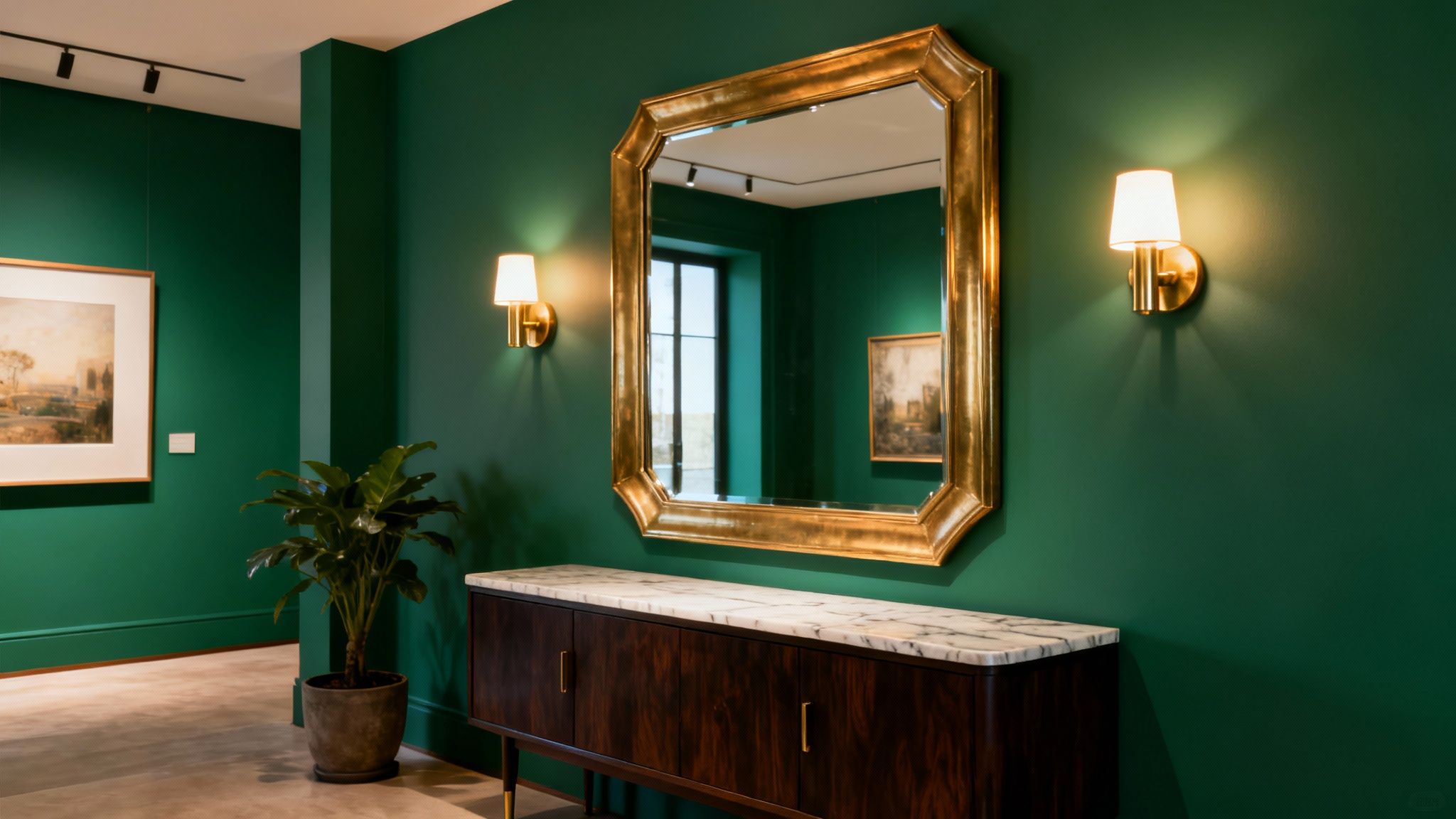
This palette transforms a transitional space into a destination in its own right, evoking the feel of a private gallery or an exclusive member's club. It works exceptionally well in both period properties, where it highlights architectural grandeur, and in modern homes, where it adds depth and character to simpler lines. The key is balancing the dark, immersive colour with bright, metallic accents to prevent the space from feeling enclosed.
Colour Palette In Action
- Primary Wall Colour: A deep, velvety emerald like Farrow & Ball's 'Hague Blue' (
#263339) which reads as a rich green-blue, or a true emerald like Graham & Brown's 'Adeline' (#2E4A40). - Accent Colour: Use warm gold or brass for all hardware, mirrors, and lighting fixtures.
- Trim & Woodwork: A crisp off-white like Farrow & Ball's 'Wimborne White' (
#F0EADF) on skirting and door frames will make the green pop, or paint them in the same emerald for a fully enveloped feel.
How to Implement This Scheme
To maximise the luxurious feel, layering is essential. Introduce a large, brass-framed mirror to bounce light around the dark walls and create an illusion of greater space. If a full emerald wall feels too intense, consider a feature wall or use a wallpaper with a subtle botanical or geometric pattern in green and gold.
Styling Tip: Incorporate rich textures to complement the colour. A polished marble-topped console table, velvet upholstery on a small bench, and a runner with warm tones will add layers of sensory appeal and stop the scheme from feeling one-dimensional.
Lighting is critical to making this dark palette work. Use multiple light sources, such as a statement brass pendant light, wall sconces, and picture lights to highlight artwork. This creates pockets of warm, ambient light that enhance the cosy, jewel-box atmosphere and bring the metallic elements to life. A modern matte or eggshell finish on the walls will absorb light beautifully, giving a soft, sophisticated look.
9. Warm Stone & Taupe Layers
A warm stone and taupe palette elevates neutral hallway colour schemes by layering multiple, nuanced tones to create an atmosphere of quiet sophistication. This approach moves beyond a single colour, combining soft stones, muted taupes, and greyed browns to build depth and visual interest. The result is a hallway that feels curated, intentional, and deeply welcoming, perfect for creating a seamless transition between rooms.
This scheme is reminiscent of luxury country hotels and high-end residential projects, where colour is used to craft a cohesive and calming experience. By using three to four complementary warm neutrals across walls, trim, and accents, the space avoids flatness and gains a rich, textural quality that feels both timeless and contemporary.
Colour Palette In Action
- Primary Wall Colour: A mid-tone, earthy stone like Farrow & Ball's 'Stony Ground' (
#D6C6B2) provides a warm, enveloping base. - Accent or Woodwork: A deeper, richer taupe such as Little Greene's 'Flint' (
#9C9284) can be used on doors or a feature wall to add gentle contrast. - Ceiling & Cornice: Use a lighter complementary neutral like Farrow & Ball's 'Skimming Stone' (
#CAC3B6) to lift the space without creating a stark divide.
How to Implement This Scheme
The key to this look is layering. Use varied textures such as wool, linen, and natural wood to enhance the earthy tones of the paint. A wool runner in a darker brown or a console table in a warm oak will echo the colours on the walls and tie the scheme together.
Styling Tip: Introduce warm metallic accents like aged bronze or soft copper through light fittings, mirror frames, or door hardware. These metals have warm undertones that will beautifully complement the stone and taupe palette.
Artwork is an excellent tool for unifying the layered tones. Choose pieces that incorporate all the shades used in your scheme, from the lightest stone to the deepest brown. For paint, an estate emulsion or modern eggshell finish will provide a sophisticated, low-sheen look that highlights the nuanced colours.
10. Black & White Maximalism
For those who believe a hallway should make an unforgettable first impression, a Black and White Maximalist scheme delivers drama, personality, and high-fashion flair. This bold approach moves beyond simple monochrome, layering graphic patterns, varied textures, and curated art to create an entrance that feels like a gallery. It’s a confident choice, perfect for modern homes and creative individuals who want to make a powerful design statement right from the front door.
This aesthetic is heavily influenced by the contemporary maximalist movement and designers like Kit Kemp, who masterfully mix pattern and scale. It transforms the hallway from a transitional space into a destination, celebrating artistic expression with a high-contrast foundation. Among the various hallway colour schemes, this one is undeniably the most daring and visually dynamic.
Colour Palette In Action
- Primary Wall Colour: A crisp, gallery-style white like Dulux's 'Absolute White' (
#FFFFFF) provides a clean canvas for patterns and art. - Accent Feature: Use a true, deep black such as Valspar's 'The Perfect Black' (
#000000) on a feature wall, the underside of a staircase, or on internal doors for dramatic impact. - Patterned Element: Incorporate a graphic wallpaper with both shades, like a bold stripe or an abstract geometric design, to tie the look together.
How to Implement This Scheme
Success with this scheme lies in balancing the boldness with visual breathing room. Start with one major patterned element, such as a geometric runner or a statement wallpaper, and build from there. Mix different finishes to add depth; pair a matte black wall with high-gloss white woodwork or a polished chrome light fitting.
Styling Tip: Keep ceilings painted brilliant white to create a sense of height and prevent the scheme from feeling oppressive. This provides a visual break and enhances the impact of the black elements below.
Artwork is non-negotiable in a maximalist space. Use large-scale abstract prints or a gallery wall with cohesive black or white frames to bridge the two colours. A sculptural floor lamp or an oversized, ornate mirror adds a final layer of glamorous interest, while a touch of greenery introduces an organic shape that softens the graphic intensity.
Top 10 Hallway Color Scheme Comparison
From Palette to Perfection: Making Your Hallway Colour Scheme a Reality
Choosing the right hallway colour scheme is the foundational step towards creating an entrance that truly reflects your home's unique style and personality. As we've journeyed through ten distinct palettes, from the serene embrace of Warm Neutral & Cream to the striking drama of Black & White Maximalism, it's clear that the perfect finish goes far beyond just a lick of paint. It's a carefully orchestrated symphony of colour, light, texture, and décor, all working in harmony to craft a cohesive and genuinely welcoming first impression.
Whether you found yourself drawn to the timeless calm of Warm Stone & Taupe, the bold sophistication of Deep Navy & Crisp White, or the contemporary chic of Soft Blush Pink & Warm Grey, you now possess a comprehensive blueprint for transformation. The true magic, however, lies in personalising these concepts. The most successful hallway colour schemes are not rigid prescriptions but flexible frameworks, ready to be adapted to the specific dimensions, light conditions, and architectural character of your home.
Key Takeaways for Your Hallway Transformation
Before you begin, let's crystallise the most critical principles we've covered. Mastering these concepts is what elevates a good hallway into a truly exceptional one.
- Light is Your Co-Designer: Remember that natural and artificial light are active participants in your colour scheme. A north-facing hallway will cool down colours, while a south-facing one will warm them up. Always test paint samples on different walls and observe them at various times of the day before committing.
- The Fifth Wall Matters: The ceiling is often overlooked, but it has immense power. A crisp white ceiling can lift a dark scheme like Charcoal & Gold, while painting it a softer shade of the wall colour can create a cosy, enveloping feel, as seen with our Sage Green & Soft Grey palette.
- Texture Adds Depth and Interest: A successful scheme engages more than just the sense of sight. Integrating different textures, a wool runner on a wooden floor, a brass-framed mirror against a matt wall, or a velvet bench, adds a layer of sophistication and sensory richness that paint alone cannot achieve.
- Finishes Fine-Tune the Mood: The same colour can look dramatically different depending on its finish. A matt or eggshell finish provides a soft, modern feel ideal for absorbing light in narrow spaces, while a satin or semi-gloss finish on trim and doors adds durability and a subtle, light-reflecting contrast.
Your Actionable Next Steps
Feeling inspired is the first step; taking action is the next. Here is a simple, practical path to bring your chosen hallway colour scheme to life:
- Select & Sample: Narrow down your top two or three colour schemes. Purchase sample pots and large A4 sheets of paper. Paint the sheets and tape them to different walls in your hallway to accurately gauge the colour in your specific lighting.
- Plan Your Layers: Think beyond the walls. How will your chosen palette translate to the woodwork, flooring, and key furniture pieces? Create a simple mood board, either physically or digitally, pulling together images of your chosen paint colours, flooring, lighting, and accessories.
- Execute with Precision: Once you've finalised your palette, focus on the details of execution. Proper preparation of surfaces is paramount for a professional finish. Consider hiring a professional decorator for complex features or if you're short on time.
- Accessorise Thoughtfully: The final 10% of the effort delivers 90% of the personality. Choose artwork, mirrors, lighting, and runners that not only complement your colour scheme but also tell a story about who lives there. This is your chance to make the space truly your own.
Your hallway is the opening chapter of your home's story. It's the first space that greets you after a long day and the first impression you offer to guests. By applying these principles and thoughtfully selecting from the diverse range of hallway colour schemes we’ve explored, you can ensure that this transitional space is no longer just a corridor but a destination in its own right. Go forth and create an entrance that is not just beautiful, but beautifully you.


