Choosing the right paint colour really comes down to three things: deciding on the mood you want, taking cues from the furniture and decor you already have, and understanding how light plays a role in it all. Get these fundamentals right, and you'll find a colour that feels like it truly belongs.
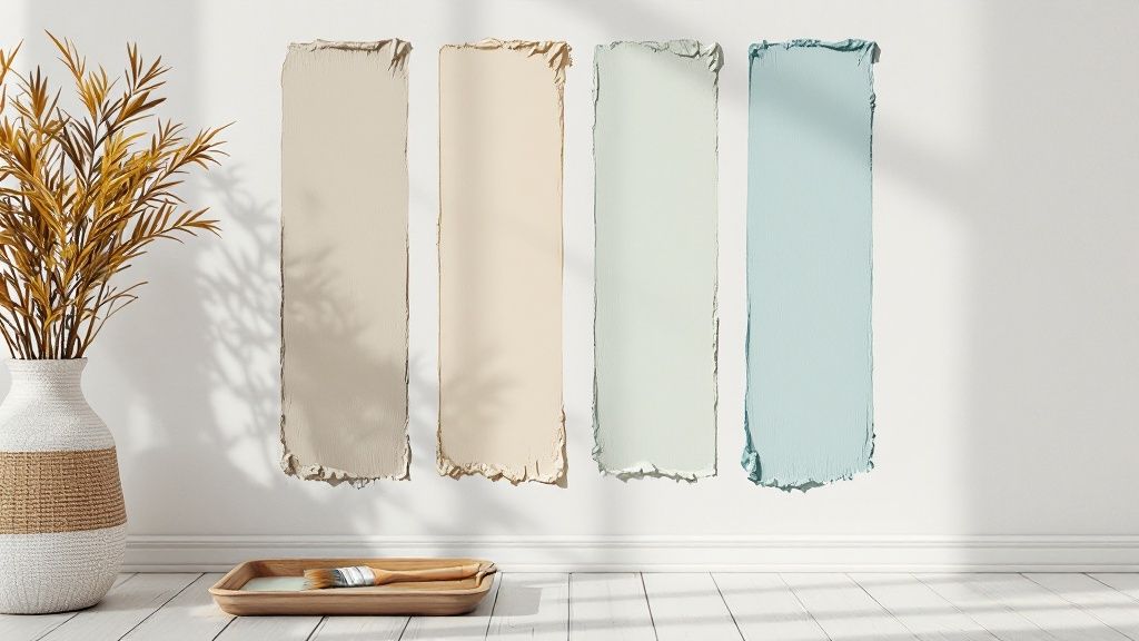
Finding Your Perfect Colour Palette
Before you even think about picking up a paint swatch, take a moment. The first question to ask yourself is, "How do I want this room to feel?" A paint colour is so much more than just a coating for your walls; it’s the backdrop that sets the entire tone for the space.
Maybe you’re dreaming of a bedroom that feels like a calm, quiet sanctuary. Or perhaps you want a kitchen that’s buzzing with energy and encourages lively conversations. Nailing down this feeling first will act as your north star, guiding all your colour choices from here on out.
Look to Your Existing Decor for Clues
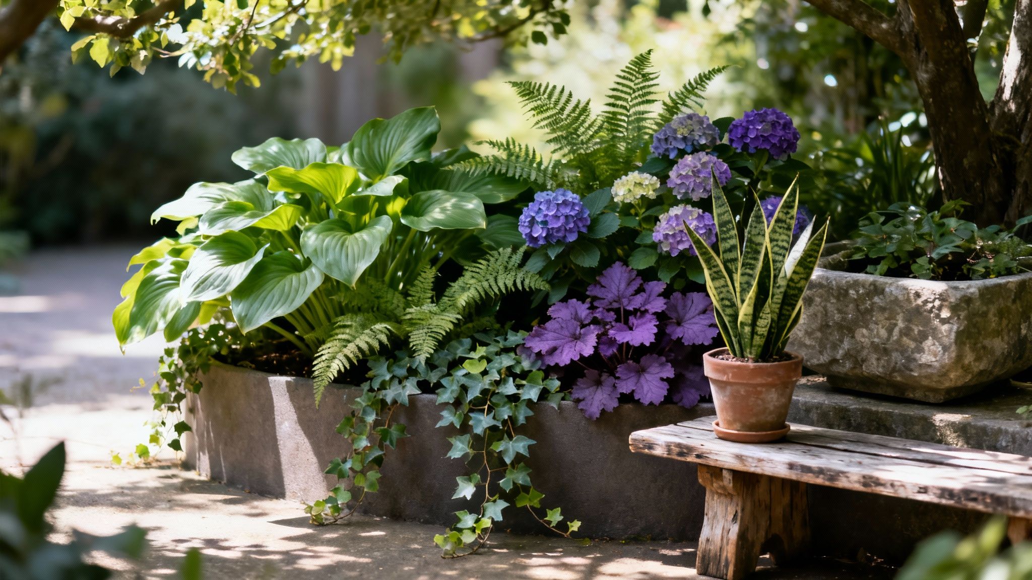
One of the best-kept secrets to building a cohesive colour scheme is to work with what you've got. Look around the room. Your furniture, art, rugs, and even the view from the window are bursting with inspiration. Trust me, it's a hundred times easier to match paint to your sofa than it is to find a sofa that matches your paint.
Here are a few places to start looking:
- The Rug: Take a closer look at your living room rug. Are there subtle flecks of sage green or a dusty blue woven into the pattern? Pulling one of those less obvious shades for the walls can tie everything together beautifully.
- A Piece of Art: A painting you love is practically a pre-made palette. You can pick out a dominant colour for a bold statement or an accent shade for a more subtle nod.
- Fabric Patterns: That pattern on your favourite armchair? It’s a goldmine. Look for a minor colour in the design to create a really sophisticated and intentional look.
Define the Room’s Atmosphere
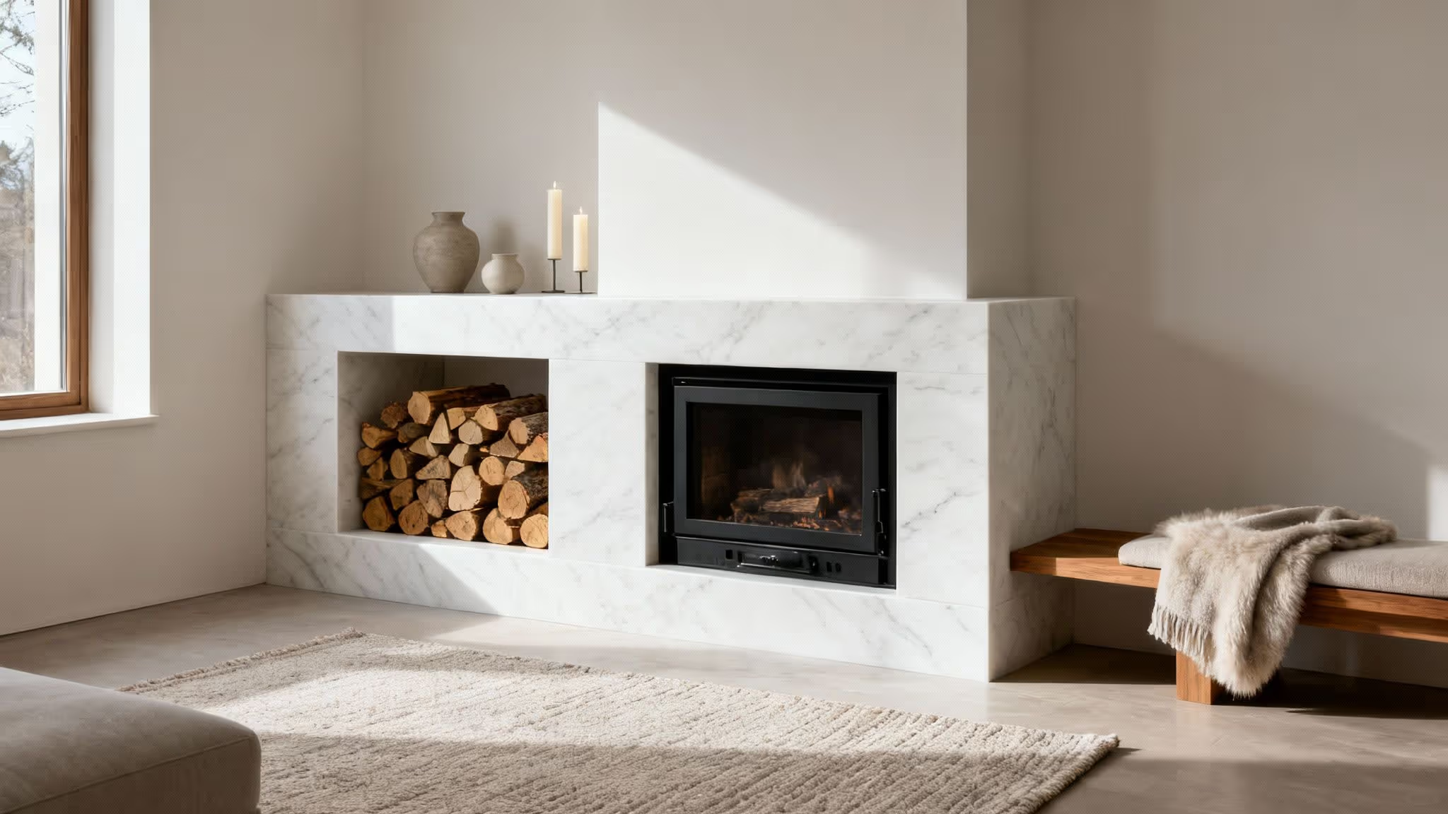
Once you have a few potential colours, circle back to that mood you wanted to create. This is the point where you go from just liking a colour to choosing one that actually works for the room. For example, a soft, muted grey pulled from the tones in a stone fireplace can instantly make a space feel more serene and grounded. If you're stuck, this is a great way to find inspiration for colours for a living room.
The secret to a well-designed room isn't about finding one "perfect" colour out of thin air. It's about selecting a colour that complements your home's existing pieces and enhances the atmosphere you want to live in.
By starting with your decor, you guarantee the final colour choice will feel thoughtful and fully integrated, not like a random decision. This approach takes so much of the guesswork out of the process, setting you up to find a shade you’ll be happy with for years.
How Lighting Changes Everything
Have you ever brought home a paint swatch you absolutely loved at the shop, only to find it looks completely different on your walls? You’re not alone. Light is the single most influential factor in how a colour truly looks in a room, yet it’s the one thing people most often forget to consider.
It’s an easy mistake to make, but the quality of light can transform a soft, subtle grey into a surprising shade of lilac or wash out a rich, deep hue until it’s barely recognisable. Understanding the unique light in your space is the real secret to choosing paint colours you’ll love. It’s not just about how bright a room is; it’s about the type of light it gets throughout the day.
Natural Light and Your Room's Direction
The direction your windows face has a huge impact on the quality and temperature of the natural light that fills the room. A colour that feels warm and inviting in one space might seem cold and stark in another, all because of the sun's position.
Here’s a quick rundown of what to expect:
- North-Facing Rooms: These rooms get a cool, blueish light that stays fairly consistent all day. This light can mute warm colours and intensify cool ones, sometimes pulling out unexpected purple or green undertones in greys.
- South-Facing Rooms: The holy grail for light in the UK. These rooms are bathed in bright, warm, yellow-toned light for most of the day. This can make colours appear much brighter and more intense, so you might want to choose a slightly more muted shade than you first think.
- East-Facing Rooms: You’ll get beautiful, clear light in the morning, which becomes cooler and more shadowed in the afternoon. The challenge here is finding a colour that works well in both the warm morning glow and the cooler afternoon light.
- West-Facing Rooms: Essentially the reverse of east-facing rooms. They can feel a bit cooler in the morning but are blessed with a stunning, warm, golden light in the late afternoon and evening. This evening sun can make colours appear incredibly rich and warm.
Working with your room’s natural light, not against it, is the golden rule. Trying to force a very cool colour into a north-facing room, for example, often results in a space that feels chilly and unwelcoming. The goal is to find a shade that harmonises with the light you have.
The Impact of Artificial Lighting
Once the sun goes down, your artificial lighting takes over, and it can dramatically alter your perception of a colour. The type of lightbulb you use is everything. We measure the colour temperature of light on the Kelvin (K) scale, which tells you if the light is warm or cool.
A warm white bulb, which is typically around 2700K, casts a cosy, yellowish glow. This will enhance the warmth in creams, beiges, and reds. On the other hand, a cool white or daylight bulb (around 4000K-5000K) gives off a much bluer light, making colours appear crisper and amplifying cool tones.
If you’re struggling with a poorly lit space, there are plenty of clever tricks you can use. You can learn more about how to brighten a dark room with smart lighting and colour choices that work together.
Before you ever commit to a full tin of paint, always check your samples under your room’s artificial lights at night. It’s a simple step that guarantees the colour you adore during the day is just as beautiful in the evening.
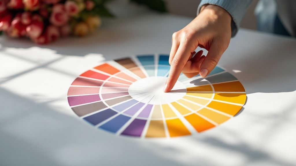
Getting to Grips with Colour Theory and Undertones
Now that we’ve looked at how light works in your room, it’s time to dive into the colours themselves. "Colour theory" might sound like something you’d learn in an art class, but understanding just a couple of core ideas can completely change how you choose paint. It's what separates a room that feels "just right" from one that feels a bit off.
One of the most useful tricks of the trade is the 60-30-10 rule. It's a classic interior design principle that gives you a simple, foolproof recipe for a balanced colour palette.
- 60% is your main colour: This is your dominant shade, the one that will cover most of the walls. It sets the overall tone for the room and acts as the canvas for everything else.
- 30% is your secondary colour: This colour is there to add depth and interest, supporting the main shade without competing with it. You'll often see this in furniture, curtains, or maybe an accent wall.
- 10% is your accent colour: These are the final flourishes, the little pops of personality that make a room sing. Think cushions, artwork, or a statement vase.
This simple ratio helps create a visual hierarchy and stops any single colour from dominating the space. It’s a brilliant way to build a cohesive look with confidence.
The Secret Language of Undertones
This is where so many people get tripped up. Beyond the obvious colour you see on the tin, every paint has a subtle, underlying hue called an undertone. It's the secret ingredient that pushes a colour towards warm or cool, and it's almost always the reason a paint you loved in the shop looks completely wrong on your wall.
Undertones are the sneaky hints of other colours that only reveal themselves when you get them home. That perfect beige might actually have a pinkish cast, while that sophisticated grey might suddenly look distinctly blue. Getting this right is the absolute key to a harmonious space. For instance, a grey with a subtle blue undertone can be stunning, as you can see in these ideas for light grey paint for a living room.
The biggest mistake I see is when people try to fight their home's existing elements. If your oak flooring glows with warm, golden undertones, putting a cool, blue-based grey next to it is almost guaranteed to create a jarring clash. You have to work with what you’ve got.
So, how do you spot these elusive undertones? A great trick is to hold your paint swatch against a sheet of pure white paper. The stark, neutral background makes it much easier to see the underlying hue. Another method is to compare it with other similar shades—you'll be surprised how a grey’s purple undertone suddenly becomes obvious when you place it next to a green-grey.
Matching Undertones with Your Finishes
This is where the magic really happens. When you deliberately align the undertones of your paint with the fixed finishes in your room—things like flooring, kitchen cabinets, and even metal fixtures—you create a seamless, professionally designed look.
If you have beautiful honey-toned wood floors, choosing a beige with a warm yellow undertone will make the whole room feel connected and intentional.
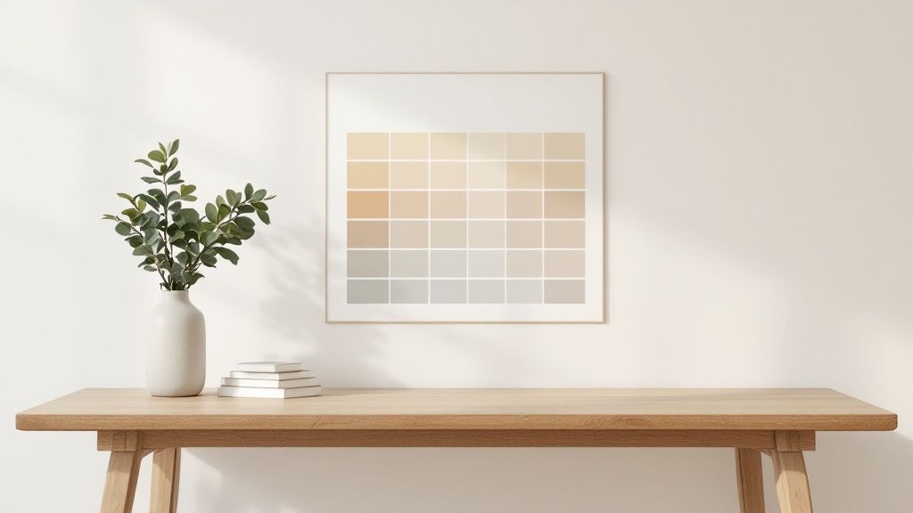
To make things easier, here's a quick guide to pairing common undertones with the finishes you might find in your home.
Matching Paint Undertones with Room Finishes
By learning to identify and match these subtle hues, you're taking the guesswork out of painting. It's the crucial step that elevates a room from feeling just "painted" to feeling perfectly pulled together.
Using Trends Without Being Trendy
It’s tempting to jump on the latest colour bandwagon, but we’ve all seen homes that look instantly dated a few years down the line. The fear is real. But the secret isn't to completely ignore what's popular; it's about using trends as a jumping-off point for a look that feels fresh but will stand the test of time.
Instead of plastering the "colour of the year" across every wall, think of it as a suggestion. A trending colour can be woven into your home's story without taking over the whole narrative. This way, you get a space that feels current, but its core character remains timeless.
Making Trends Work for You
Getting the paint colours right can have a massive impact on your home's feel and even its market value. Here in the UK, we're seeing a real shift towards comfort. For 2025, the big push is for warm neutrals, confident yellows, and those lovely, earthy muted tones. Think shades like 'Gentle Lamb' or 'Biscuit Crumbs'—soft, cosy colours with caramel undertones that just make you want to curl up with a cup of tea.
So, how do you bring a popular shade like a muted olive green or a warm biscuit into your home without it screaming "last season" in a few years?
- Go for an accent. A feature wall is the classic choice, but you can also paint the inside of a bookcase, the ceiling, or even a single piece of furniture. It’s a brilliant, low-commitment way to play with a new colour.
- Find its timeless cousin. Love the idea of a trendy sage green? Look for a version with more classic, grey undertones. It’ll have far more staying power than a punchy, vibrant lime that might feel jarring later on.
- Pair it with the classics. When you team up a trendy colour with a backdrop of reliable neutrals—an off-white, a soft grey, a deep navy—the entire look feels more grounded and sophisticated.
A trend should serve your home, not the other way around. The goal is to borrow from what's current to create a space that feels fresh, but is fundamentally rooted in your own personal style.
Grounding Trends in Your Home's Style
Always look at what you already have. Does that trendy terracotta really work with the original features of your Victorian terrace, or would a more subdued, heritage green feel like a more natural fit? The most beautiful rooms are always the ones where the colour feels like it truly belongs to the building's history and architecture.
This thoughtful approach is what makes a design choice feel intentional rather than impulsive. For more ideas on blending current styles with enduring design, take a look at our guide on the key interior design trends for 2024.
Ultimately, learning how to choose paint colours is an exercise in balance. By skilfully adapting what's popular, you can create a home that feels both modern and uniquely you, neatly sidestepping the trap of a space that quickly feels out of style.
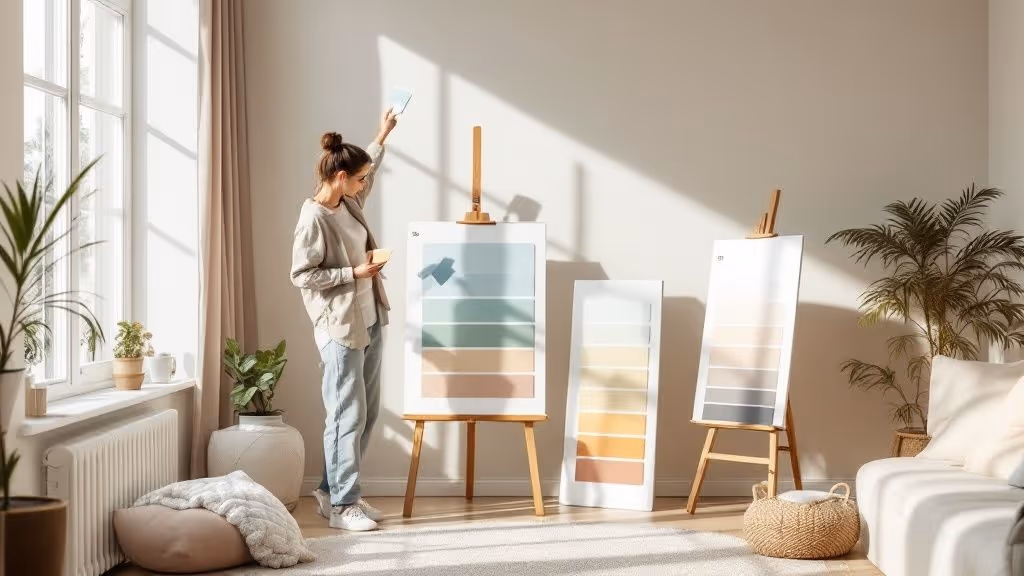
The Right Way to Test Paint Samples
So you’ve narrowed it down. You’re standing in the paint aisle, clutching a handful of those little paper swatches, feeling pretty good about your choices. But here’s a hard-earned piece of advice: making a final decision based on a tiny square under the harsh fluorescent lights of a hardware shop is one of the most common—and costly—mistakes you can make.
The light in your home is completely unique, and it’s the only light that matters. This final testing stage is where you move past the swatches and see how your top contenders truly perform in your space. It’s not just a suggestion; it's the crucial final check that separates a good result from a great one. Get this right, and you'll have complete confidence before you even think about cracking open a tin of paint.
Ditch the Wall Patches for a Better Method
We’ve all done it: painted a few small test patches directly onto the wall. It seems logical, but it's a recipe for confusion. Your current wall colour will inevitably skew how you see the new shade, subtly altering its undertones and making it impossible to get a true read.
A far better approach is to create large, mobile sample boards.
Grab a few large pieces of Bristol board or even just some sturdy card. Apply at least two coats of your sample paint to each one. This simple technique is a game-changer for a few reasons:
- You get a neutral background: This allows you to see the colour’s true character without the old paint interfering.
- They’re mobile: You can move the samples all around the room, from the darkest corners to the brightest spots by the window.
- It’s flexible: You can hold your painted board right up against your sofa, your curtains, or your flooring to see how everything works together.
Live With Your Samples for a Day or Two
A colour isn't static. It morphs and shifts as the light changes throughout the day. That’s why you need to live with your large samples for at least 24-48 hours before you commit.
Watch them in the bright, clear light of morning. See how they look in the warm, golden glow of the afternoon. And, most importantly, check them under your artificial lighting at night. A beautiful, soft grey in daylight can turn into a muddy lilac under a warm lamp.
Move your sample boards around. Lean one against the skirting board, place another next to your sofa, and hold one near the window frame. How does it look next to the wood tone of your floor? Does it clash with the pattern on your cushions?
This process removes all the guesswork, ensuring the colour you fall in love with is the one that truly works in your home. Of course, getting the colour right is only half the battle; the finish is just as important. To get every detail perfect, you can learn more about the difference between eggshell and satin and pick the perfect sheen for your space.
Got Questions About Picking Paint Colours?
Even with the best-laid plans, a few lingering questions always seem to surface right before you commit. I get it. Let’s walk through some of the most common queries I hear, so you can tackle those final decisions and feel absolutely confident in your choice.
How Can I Use Paint to Make a Small Room Feel Bigger?
This is one of the oldest tricks in the book, and for good reason—it works. Making a small room feel more expansive is all about playing with light.
You’ll want to reach for light, airy colours that bounce light around the space. Think soft off-whites, pale sky blues, and gentle, cool-toned greys. These shades recede visually, making the walls feel further away and the room feel less boxed in.
A fantastic pro-level tip is to paint the ceiling a shade or two lighter than your walls. It’s a simple move, but it really does draw your eye upward and create the illusion of height. Another great technique is to paint the walls, skirting boards, and other trim in the very same colour, just in different finishes. For example, use a modern matte on the walls and a subtle eggshell on the woodwork. This creates a seamless, cohesive look that makes the boundaries of the room blur, tricking the eye into seeing a larger space.
Which Paint Finish Should I Use in Each Room?
The finish—or sheen—of your paint is just as crucial as the colour. It impacts how the colour looks, its durability, and how easy it is to clean. The right finish really comes down to how you use the room.
- For busy, high-traffic, or damp areas, like kitchens, hallways, bathrooms, and kids’ rooms, you need something that can take a bit of a beating. Eggshell and satin finishes are my go-to recommendations here. They have a slight sheen, which makes them durable and simple to wipe down without looking overly shiny.
- In calmer, low-traffic spaces, such as living rooms and bedrooms, you can get away with a matte or flat finish. These have a gorgeous, velvety texture that’s brilliant for hiding any minor lumps and bumps on the wall surface. The lack of reflection gives the colour a real depth and richness.
- For all your woodwork and trim, like doors, window frames, and skirting boards, semi-gloss or gloss is the traditional choice. They’re incredibly hard-wearing, a breeze to clean, and create a lovely, crisp contrast against your wall colour.
Does My Whole House Need to Be the Same Colour?
Absolutely not! But for a home that feels calm and connected, having a cohesive whole-house palette is key. You don't want it to feel like you’re walking through a collection of completely separate, unrelated rooms.
I always advise clients to work with a palette of 3-5 complementary colours. Pick one main neutral shade for the big, open-plan spaces like your living room and hallways. Then, you can introduce the other colours from your palette in the other rooms—perhaps as the main wall colour in a bedroom or as a bold accent in a home office. This simple strategy ties everything together beautifully.
How Many Samples Should I Actually Bother Testing?
It’s so easy to get carried away and end up with a dozen sample pots, which only leads to confusion. The real work happens before you buy the samples. Once you’ve thought about the room’s lighting and considered the undertones, you should be able to narrow it down to just your top 2-3 contenders.
Trust me on this one: committing to testing only your strongest options will make the final decision so much easier. It’s far more effective to compare two or three carefully chosen shades on the wall than it is to stare at a patchwork of ten different colours. This focused approach saves you time, money, and a whole lot of unnecessary stress.