Choosing the right colour scheme for your living room is one of the most impactful design decisions you can make. While trends come and go, living room neutral colours offer a timeless foundation that is both calming and endlessly versatile. Forget the notion of bland, uninspired beige; today’s neutrals are complex, sophisticated, and packed with personality. From the inviting warmth of greige to the crisp modernity of cool grey, a well-executed neutral palette can create an atmosphere of understated elegance that feels both personal and polished.
This guide moves beyond generic advice to explore 10 meticulously curated neutral palettes. We will provide actionable insights to help you create a living space that is not only beautiful but also a true reflection of your style. We will delve into specific colour combinations, clever layering techniques for texture and depth, and practical tips to ensure your neutral living room is anything but ordinary. You'll learn how to select the perfect undertones for your home's lighting and how to use accent materials to bring your chosen scheme to life. Prepare to transform your central living space into a sophisticated sanctuary.
1. Warm Beige and Cream
The combination of warm beige and cream creates a timeless and inviting atmosphere, making it one of the most classic living room neutral colours. This palette is celebrated for its ability to feel both sophisticated and cosy, reminiscent of high-end hotel lobbies and expertly curated showrooms. It provides a soft, warm foundation that feels welcoming and effortlessly chic, serving as a versatile canvas for various design styles from traditional to contemporary minimalist.
This approach thrives on subtlety and layering. Instead of a flat, single-note scheme, the goal is to build visual depth through nuanced tones and textures. This duo is particularly effective in spaces that need a touch of warmth without sacrificing a light, airy feel.
How to Implement This Palette
To successfully execute this look, focus on layering and texture. A monochromatic scheme can fall flat, but introducing varied materials and finishes brings it to life.
- Vary Your Shades: Use a spectrum of beige and cream, from a deep, sandy beige on a sofa to a light, off-white on the walls. This creates a rich, tonal effect.
- Mix Textures: Combine different materials like a chunky wool-knit throw, a smooth linen-upholstered chair, and a low-pile silk-blend rug to add tactile interest.
- Incorporate Natural Elements: Warm wood furniture, such as an oak coffee table or walnut sideboards, complements the beige tones and enhances the room's inherent warmth.
- Play with Finishes: Introduce both matte and glossy surfaces. Think matte-finish walls paired with a ceramic lamp base that has a subtle sheen.
For a deeper dive into selecting the perfect foundational shades, you can explore more about choosing colours for your living room. This classic palette, championed by designers like Nate Berkus, proves that neutrals are anything but boring when applied with thoughtful detail.
2. Cool Gray and White
The pairing of cool gray and white offers a crisp, sophisticated aesthetic, establishing itself as a modern staple among living room neutral colours. This palette is celebrated for its clean, minimalist appeal, often seen in Scandinavian-inspired interiors and contemporary urban apartments. It creates a serene and orderly atmosphere that feels both airy and grounded, providing a sleek backdrop that allows architectural details and curated décor to stand out.
This combination thrives on clean lines and uncluttered spaces. Unlike warmer neutrals, cool gray and white create a tranquil and polished environment. The palette is exceptionally effective in rooms with ample natural light, as the light enhances the subtle undertones of the gray and the brightness of the white, making the space feel larger and more open.
How to Implement This Palette
To prevent this scheme from feeling cold or stark, the key is to introduce depth through layering and contrasting elements. A well-executed gray and white living room feels calming, not clinical.
- Layer Shades of Gray: Use a spectrum of grays, from a pale dove gray on the walls to a deep charcoal on an accent chair or rug. This tonal variation adds dimension.
- Introduce Warm Textures: Soften the cool tones by incorporating materials like a chunky wool throw, velvet cushions, or a soft linen sofa to add tactile comfort.
- Incorporate Natural Wood: Accents like an oak-framed mirror or a light wood coffee table introduce natural warmth, beautifully balancing the coolness of the gray.
- Play with Metallic Finishes: Add a touch of glamour with metallic elements. Brushed nickel or chrome complement the cool palette, while brass or gold can add a surprising pop of warmth.
For more guidance on choosing the right shades for your space, you can discover more about how to choose paint colours. This modern palette, popularised by brands like West Elm, demonstrates how a simple colour combination can achieve a refined and elegant look.
3. Taupe and Greige Fusion
The sophisticated blend of taupe (grey-brown) and greige (grey-beige) offers a perfect middle ground between warm and cool tones, establishing it as one of the most versatile living room neutral colours. This harmonious fusion creates a refined, modern aesthetic that feels both grounded and elegant. Popularised by designers like Amber Interiors, this palette provides a complex, layered backdrop that adapts beautifully to changing light and seasons, making a space feel current yet timeless.
Unlike simpler neutrals, greige and taupe have rich undertones that prevent them from appearing flat. This makes the palette exceptionally adaptable, pairing equally well with crisp whites for a contemporary look or with deeper, moodier shades for a dramatic effect. Its inherent balance makes it a go-to choice in high-end residential projects and boutique hotels.
How to Implement This Palette
Success with this palette lies in understanding its nuanced undertones and building a layered, textural environment.
- Test Your Tones: Always test paint samples in your space. Greige and taupe can shift dramatically under different lighting conditions, appearing more grey, beige, or even violet throughout the day.
- Mix Metallic Finishes: The palette’s balance allows you to mix both warm and cool metals. Combine brushed brass light fittings with black or chrome furniture frames for a curated feel.
- Layer Natural Textures: Introduce materials like linen curtains, a jute rug, and warm wood accents to prevent the scheme from feeling too sterile and enhance its organic warmth.
- Add Sophisticated Accents: Use soft pastels like dusty rose or muted jewel tones like emerald green or sapphire blue as accent colours to add a touch of personality and luxury.
To see how these complex neutrals can transform a room, you can find more inspiration with these living room colour ideas. This palette proves that neutrals can deliver incredible depth and character.
4. Warm Gray and Ivory
Combining warm gray with ivory strikes a perfect balance between contemporary sophistication and timeless warmth, making it one of the most elegant living room neutral colours. This palette offers the clean, modern edge of gray while the soft ivory undertones prevent the space from feeling cold or sterile. It creates a serene and polished atmosphere, popular in modern farmhouse designs and high-end residential spaces that aim for understated luxury.
This duo is ideal for creating a peaceful and refined backdrop that feels both inviting and organised. Its versatility allows it to support a range of décor styles, from minimalist to classic, providing a neutral foundation that highlights architectural details and carefully chosen furnishings.
How to Implement This Palette
Success with this pairing lies in balancing the cool and warm tones and layering textures to add depth and personality.
- Define with Contrast: Use a mid-tone warm gray on the walls and crisp ivory for trim, skirting boards, and ceilings. This classic technique adds architectural definition and makes the space feel structured.
- Layer with Textiles: Introduce a variety of textures through soft furnishings. Think of a plush ivory area rug, warm gray linen curtains, and velvet scatter cushions to build a sense of comfort.
- Add Warm Metallics: Accents of brushed brass, bronze, or soft gold complement the warm undertones in the gray. Use them for light fixtures, picture frames, or decorative objects to add a touch of glamour.
- Embrace Natural Light: This palette shines in well-lit rooms. Maximise natural light with sheer window treatments or strategically placed mirrors to enhance the airy, open feel.
Popularised by designers like Joanna Gaines, this combination proves that a gray-based scheme can feel incredibly cosy and welcoming when paired with the right complementary shade.
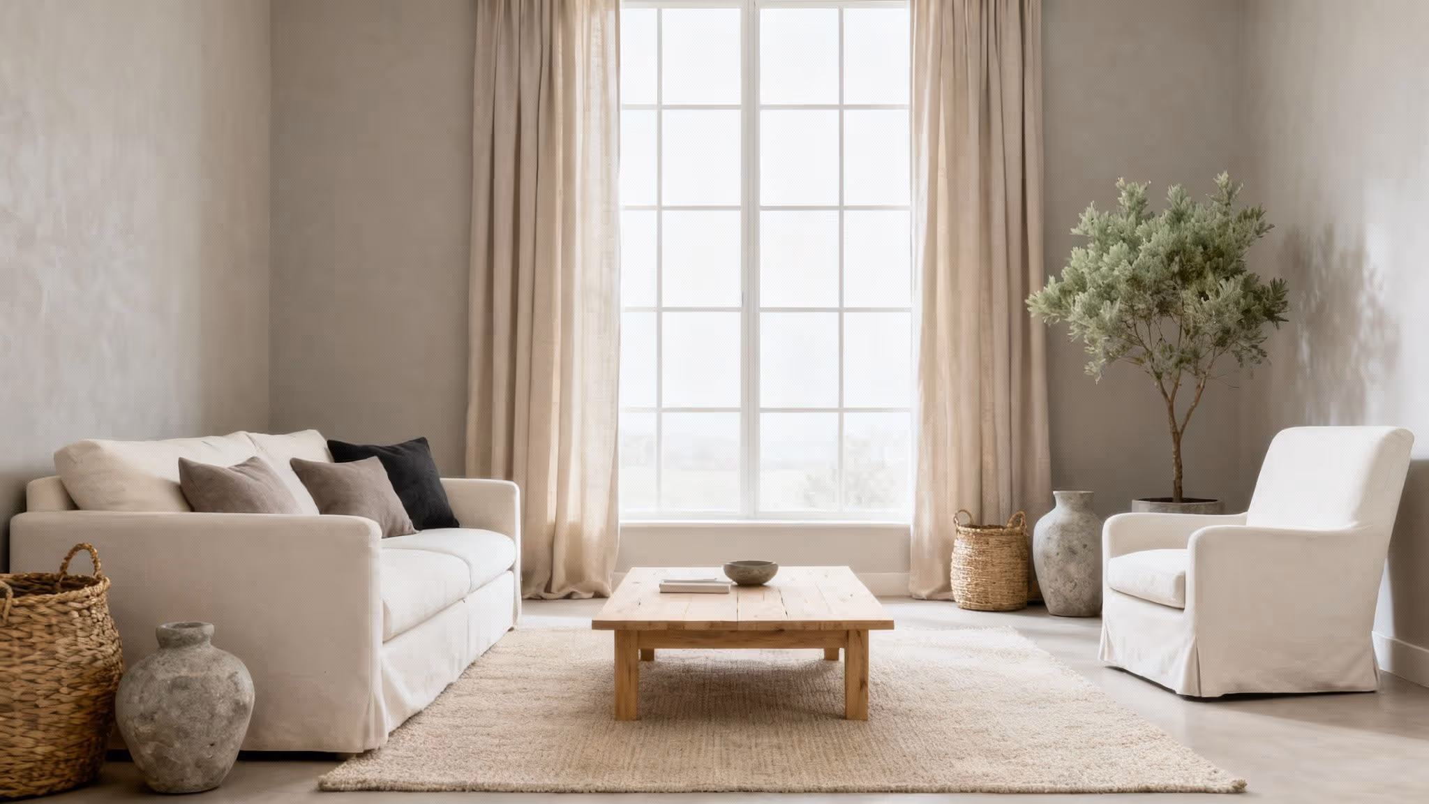
5. Soft White and Natural Wood
Pairing soft whites with natural wood tones creates a serene and organic atmosphere, rooted in minimalist design principles. This palette is a cornerstone of styles like Scandinavian and Japanese minimalism, delivering a sense of calm and connection to nature. It's one of the most effective living room neutral colours for crafting a space that feels both grounded and refreshingly light. This combination moves beyond mere aesthetics to create a mindful, uncluttered environment that is both warm and spacious.
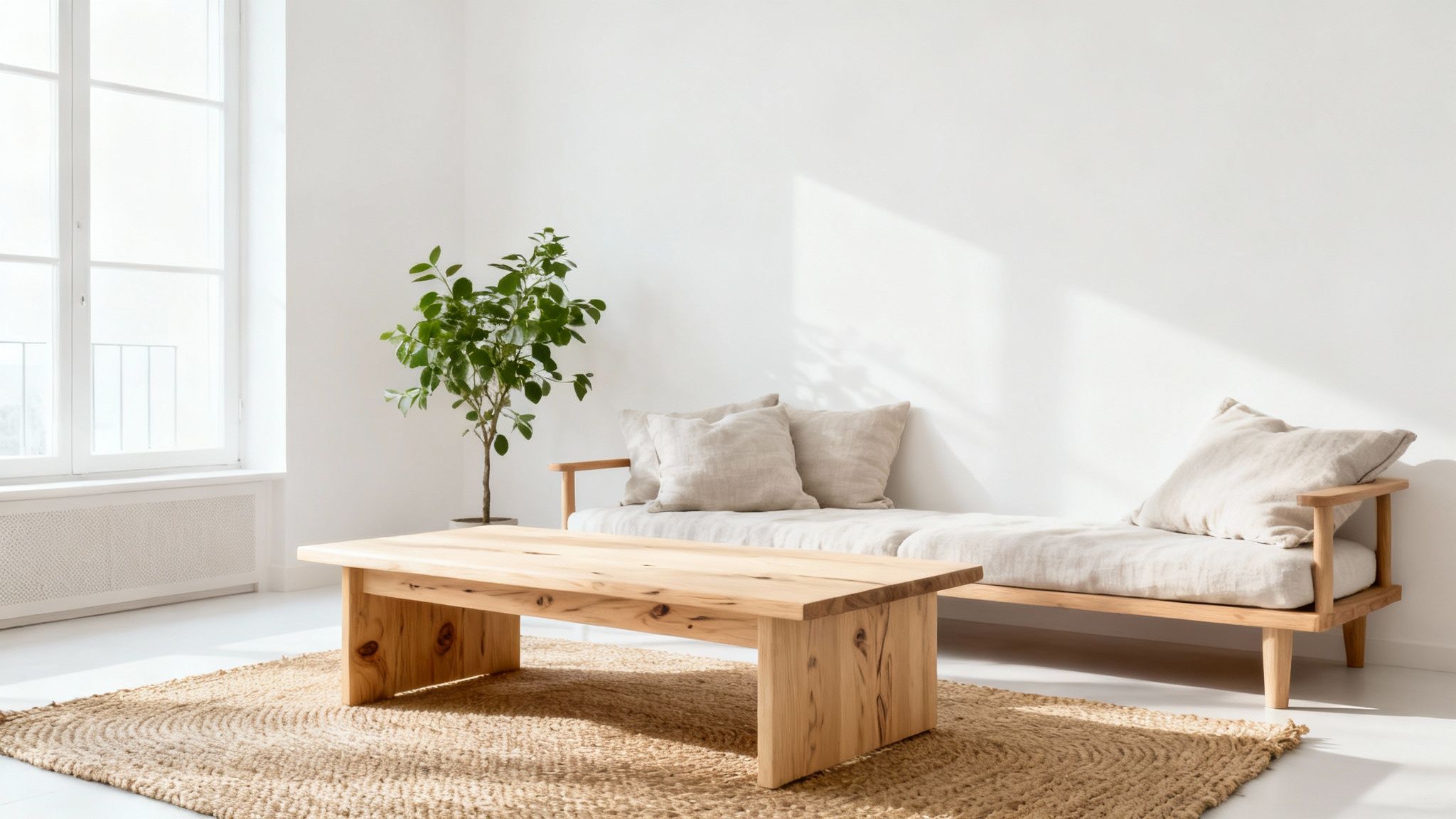
The success of this palette lies in its celebration of raw materials and simple forms. The soft white walls act as a clean backdrop, allowing the texture, grain, and warmth of the wood to become the room's focal point. It's an approach favoured by sustainable design advocates like Emily Henderson, who often champions schemes that feel both timeless and deeply connected to the natural world.
How to Implement This Palette
To bring this nature-inspired look to life, the key is to balance simplicity with textural richness. The goal is to create a layered, tactile experience that feels authentic and peaceful.
- Mix Wood Tones: Don’t be afraid to combine different woods. Pair a light oak floor with a darker walnut coffee table and teak accents to build depth and visual interest.
- Incorporate Natural Fibres: Enhance the organic feel with textiles made from linen, wool, and jute. Think of linen curtains, a woollen area rug, or a jute pouffe.
- Add Greenery: Introduce houseplants to amplify the connection to nature. The vibrant green will pop beautifully against the neutral backdrop of white and wood.
- Focus on Texture: Layer in tactile elements like woven baskets, unfinished wood decorative objects, and rough-hewn ceramics to add character and warmth to the minimalist scheme.
6. Charcoal Gray and Soft White
For those seeking a bolder, more dramatic take on living room neutral colours, the combination of charcoal gray and soft white offers a striking and sophisticated solution. This high-contrast palette creates visual depth and definition, lending an air of modern elegance to any space. It’s a powerful duo that feels both intentional and timeless, perfect for contemporary, transitional, and minimalist interiors that aim for a clean yet impactful aesthetic.
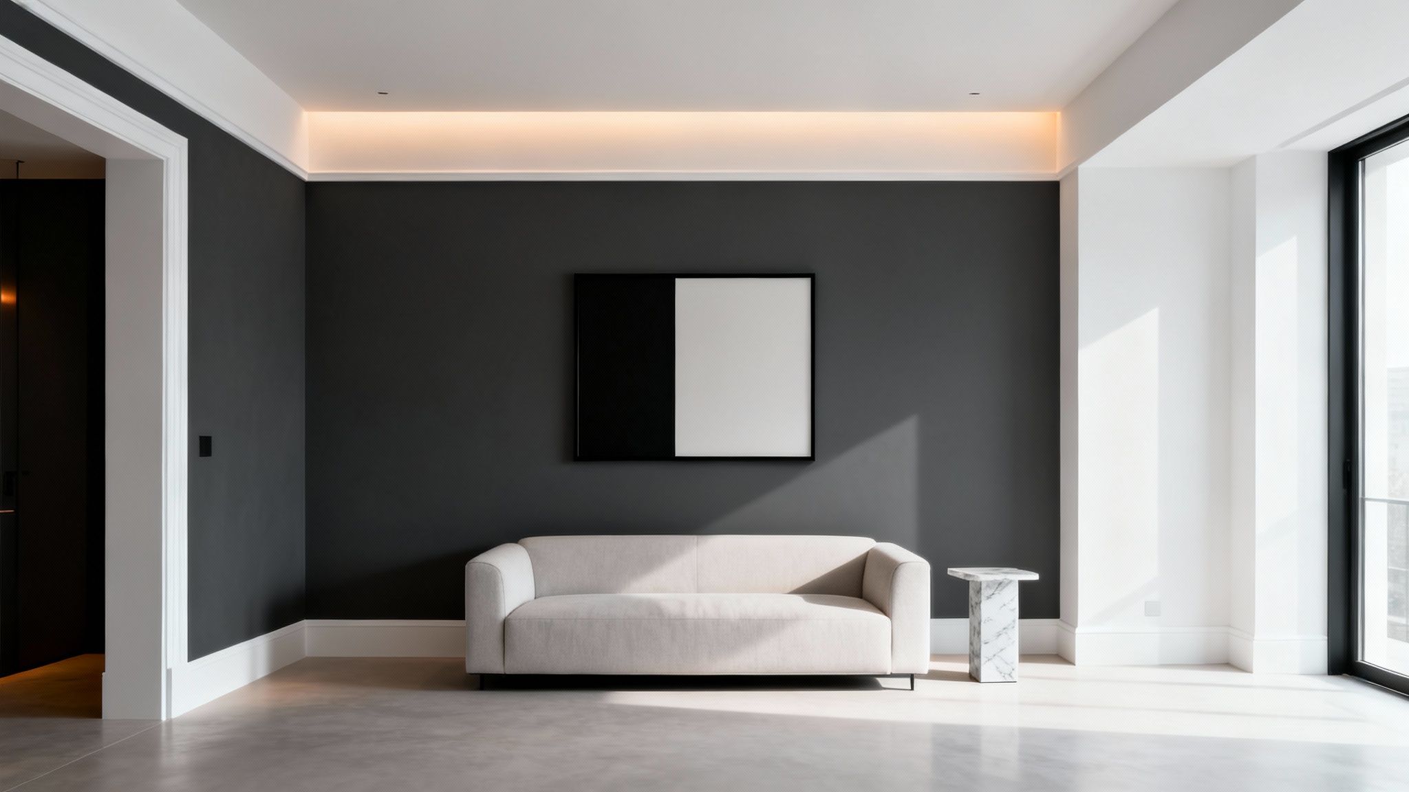
The key to this palette is balance. While the deep, moody tones of charcoal ground the space and add a cosy, enveloping feel, the soft white lifts the room, preventing it from feeling too heavy. This interplay between light and dark is what gives the scheme its dynamic and polished character, making it a favourite in modern lofts and luxury urban apartments.
How to Implement This Palette
Successfully using this dramatic pairing involves a strategic approach to ensure the room feels balanced rather than stark. The goal is to create a harmonious tension between the two dominant shades.
- Create an Accent Wall: Use charcoal gray on a single feature wall, perhaps behind the sofa or fireplace, to create a focal point without overwhelming the space.
- Emphasise Trim and Ceiling: Paint the trim, skirting boards, and ceiling in a crisp soft white to create a sharp, clean outline that makes the charcoal walls pop.
- Balance with Light Furnishings: Offset a dark wall or large charcoal sofa with lighter furniture pieces, such as a white armchair, a light-coloured rug, or pale wood tables.
- Incorporate Strategic Lighting: Good lighting is crucial. Use a mix of ambient, task, and accent lighting to highlight the textures in the room and brighten the darker corners.
For more inspiration on integrating this sophisticated shade, you can discover a variety of ideas for light grey paint for your living room. This palette proves that neutrals can be daring and full of personality when thoughtfully executed.
7. Oatmeal and Linen White
The pairing of oatmeal and linen white creates a soft, understated palette that is the epitome of relaxed sophistication. This combination elevates living room neutral colours by focusing on comfort and a lived-in aesthetic, drawing inspiration from natural fibres and serene, light-filled spaces. It offers a gentle warmth that feels both calming and refined, reminiscent of the relaxed elegance found in Restoration Hardware collections or luxury spa retreats.
This palette is less about strong contrast and more about creating a cohesive, peaceful environment through subtle tonal shifts. It excels in rooms where the goal is to establish a tranquil sanctuary, making it ideal for cosy family homes and spaces designed for unwinding. The key is to build depth not with colour, but with texture and organic materials.
How to Implement This Palette
To prevent this soft palette from feeling one-dimensional, focus on layering diverse textures and introducing subtle visual interest through pattern and finish.
- Layer Multiple Textures: Combine a variety of natural materials. Think a linen-upholstered sofa, a chunky wool throw, cotton cushions, and a jute or sisal rug to create a rich tactile experience.
- Vary Fabric Sheens: Mix matte finishes with those that have a slight lustre. For instance, pair a matte cotton armchair with silk-blend drapery that catches the light, adding subtle depth.
- Incorporate Neutral Art: Add character with neutral art and black-and-white photography. These elements provide focal points without disrupting the calming colour scheme.
- Use Subtle Patterns: Introduce gentle patterns through a tone-on-tone area rug, upholstered furniture with a subtle weave, or cushions with a delicate print.
This approach is especially effective for making a space feel larger and more luminous. For more ideas on enhancing your room’s brightness, you can explore tips on how to brighten a dark room.
8. Mushroom and Dove Gray
The pairing of mushroom and dove gray creates a deeply sophisticated and complex backdrop, standing out among more common living room neutral colours. This palette combines the earthy warmth of mushroom, a soft grey-brown, with the cool, gentle nature of dove gray. The result is a nuanced, layered scheme that feels both modern and timeless, often seen in high-end residential projects and luxury hotel interiors. It offers a subtle depth that elevates a space beyond a simple one-note neutral.
This combination thrives on the subtle interplay between its warm and cool undertones. It’s perfect for creating a serene and contemplative environment that feels curated and intentional. This palette is particularly effective in transitional design styles, where it bridges the gap between classic and contemporary aesthetics with effortless grace.
How to Implement This Palette
To master this look, focus on layering shades and introducing complementary finishes that highlight the colours' inherent complexity. This isn't a palette for a single paint colour but a dialogue between tones.
- Layer Multiple Shades: Use a spectrum of mushroom and gray. Consider a lighter dove gray for the walls and a richer mushroom hue for a feature piece like a sofa or cabinetry to create visual depth.
- Incorporate Metallic Finishes: Polished silver, brushed bronze, or soft gold accents cut through the muted tones beautifully. A silver-framed mirror or a bronze side table can add a touch of glamour.
- Balance with Natural Materials: Introduce textures like light oak, marble, or soft linen to prevent the scheme from feeling too sterile and enhance its organic quality.
- Use Strategic Lighting: Thoughtful lighting design is crucial. Use a mix of ambient, task, and accent lighting to highlight the different undertones in the paint and textiles throughout the day.
Popularised by high-end paint manufacturers like Farrow & Ball, this intelligent pairing proves that neutrals can be profoundly characterful and chic.
9. Sand and Stone Palette
The sand and stone palette draws inspiration from coastal landscapes and serene desert environments, creating a grounded and deeply calming atmosphere. This combination merges the warm, soft tones of sand with the cooler, solid feel of stone grey, making it one of the most organic living room neutral colours. This pairing evokes a sense of natural balance and tranquillity, ideal for crafting a retreat-like space that feels connected to the outdoors. It's a sophisticated take on earthy tones, perfect for modern coastal or minimalist organic design schemes.
This palette is all about capturing the raw beauty of natural elements. The warmth of sandy beige prevents the cooler stone greys from feeling stark, while the grey adds a crisp, contemporary edge. It’s a versatile foundation that works beautifully in rooms with abundant natural light, enhancing the subtle tonal shifts throughout the day and creating a peaceful, airy feel.
How to Implement This Palette
To bring this naturalistic scheme to life, focus on texture and raw materials to underscore the earthy inspiration. The key is to create a layered look that feels authentic and lived-in.
- Balance Warm and Cool: Use sandy tones for larger elements like walls or a sofa, and introduce stone grey through accent chairs, a concrete coffee table, or slate floor tiles.
- Embrace Organic Textures: Layer with materials that echo nature. Think of a jute or sisal rug, rattan furniture, linen curtains, and weathered wood finishes.
- Incorporate Natural Materials: Use actual stone or stone-effect finishes in features like a fireplace surround or decorative objects. Sand-coloured woods like light oak or ash also fit perfectly.
- Use Nature-Inspired Artwork: Complement the palette with artwork depicting seascapes, abstract landscapes, or botanical prints to reinforce the connection to the natural world.
Popularised by coastal design specialists and advocates for organic interiors, this palette proves that neutrals drawn from nature can create a powerful and restorative living environment.
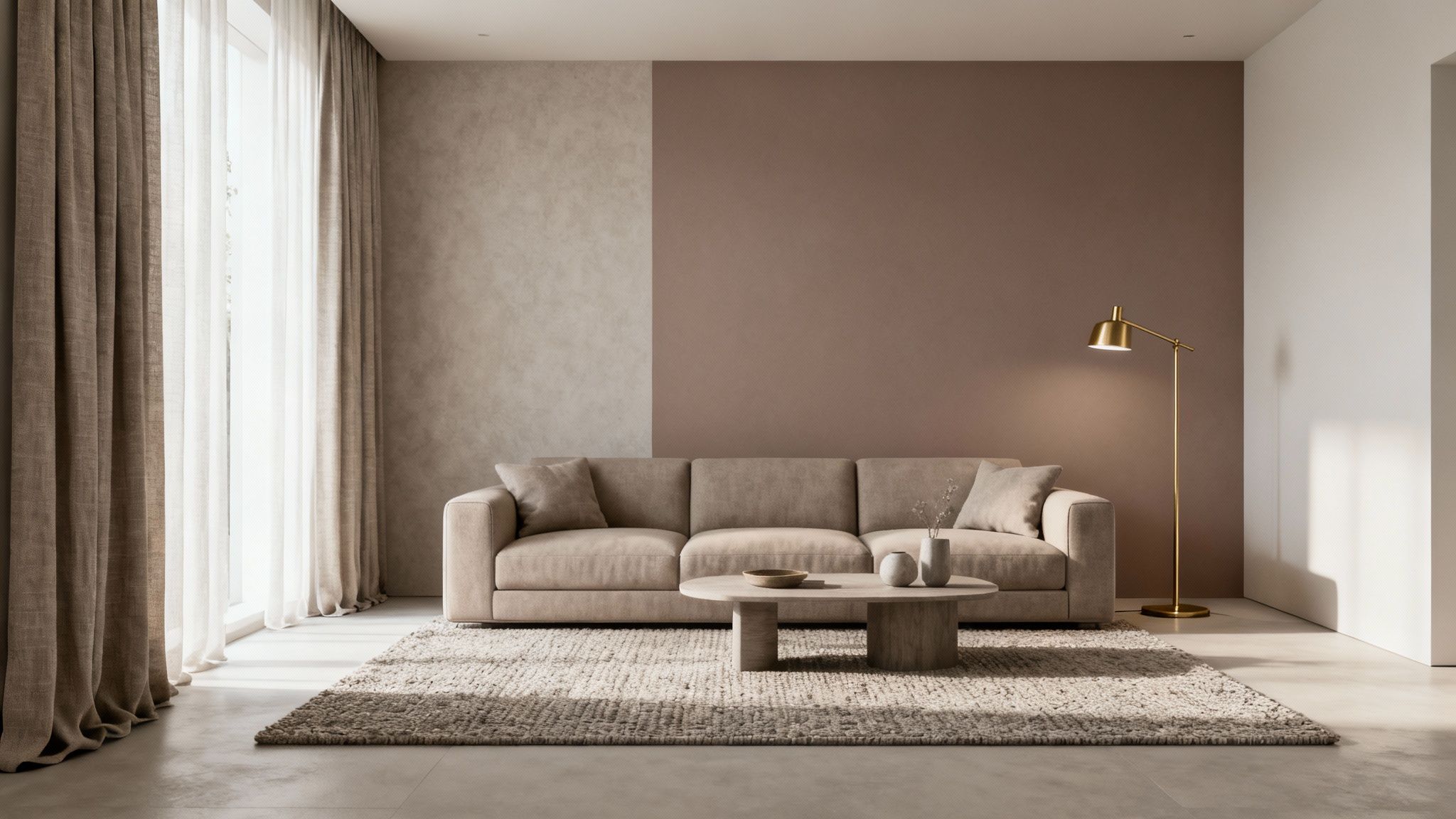
10. Warm Greige with Soft Black Accents
The combination of warm greige with soft black accents offers a sophisticated and contemporary take on living room neutral colours. This palette strikes a perfect balance between the warmth of beige and the cool elegance of grey, creating a versatile greige foundation. The addition of soft, near-black or charcoal details provides sharp, modern contrast without feeling harsh, anchoring the space with a sense of deliberate design. It is an ideal choice for modern, industrial, or minimalist interiors.
This approach is about creating visual tension and definition. The soft black elements act as punctuation marks in the room, drawing attention to architectural features, framing views, and giving structure to the overall design. This palette feels curated and high-end, often seen in contemporary urban lofts and modern art galleries where the background needs to be neutral yet impactful.
How to Implement This Palette
Success with this scheme lies in the strategic and balanced use of black accents against the calming greige base. The goal is sophistication, not starkness.
- Use Black Strategically: Introduce soft black through window frames, door trim, or a slim-profile metal coffee table. A single piece of black-framed art can also serve as a powerful focal point.
- Balance with Lightness: Ensure plenty of white space or lighter greige tones to prevent the black accents from overwhelming the room. Think light-coloured sofas, rugs, and curtains.
- Incorporate Warm Textures: Soften the clean lines and contrast by adding textures. A bouclé armchair, a warm wool rug, or velvet cushions can prevent the space from feeling too clinical.
- Add Metallic Finishes: Brushed brass, bronze, or matt black metallic details in lighting fixtures and décor objects enhance the contemporary feel and complement the black accents beautifully.
Popularised by modern design firms and Scandinavian-inspired brands, this palette proves that a neutral scheme can be both bold and serene.
10 Neutral Living Room Palette Comparison
Crafting Your Perfect Neutral Haven
As we’ve explored, the world of living room neutral colours is far more expansive and dynamic than a simple choice between beige and white. The true art of crafting a serene and sophisticated space lies not in a single shade, but in the thoughtful orchestration of complementary tones, varied textures, and strategic accents. From the inviting warmth of an oatmeal and linen white combination to the bold, contemporary statement made by warm greige with soft black details, each palette offers a unique canvas for your personal style.
The journey to your ideal neutral living room is a personal one. The key takeaway is that neutrals are the foundation, not the final word. They provide a versatile, calming backdrop that allows other elements of your décor, such as artwork, textiles, and personal treasures, to truly shine. Mastering these palettes means creating a home that feels both timeless and deeply personal, a space that can evolve with you over time without requiring a complete overhaul.
Your Actionable Next Steps
To move from inspiration to implementation, consider these final steps:
- Revisit Your Favourites: Review the palettes discussed in this article. Which one resonated most with the feeling you want to create? Was it the earthy connection of a sand and stone palette or the crisp elegance of cool grey and white?
- Gather Samples: Before committing, always test your chosen colours. Paint large sample boards and move them around the room at different times of the day. Observe how natural and artificial light alter their appearance. This step is crucial for avoiding costly mistakes.
- Layer with Texture: Remember the power of texture. Once your core colours are selected, begin planning your layers. Think about a chunky wool throw, a smooth leather armchair, a raw silk cushion, or a heavily grained wooden coffee table. These elements prevent a neutral scheme from feeling flat.
- Plan Your Accents: Decide on your accent strategy. Will you introduce a subtle pop of colour through accessories, create contrast with metallic finishes, or add drama with a few carefully chosen black elements?
Ultimately, designing with living room neutral colours is an exercise in creating balance and harmony. It’s about building a sanctuary that feels cohesive, comfortable, and effortlessly chic. By embracing the nuances of tone and the richness of texture, you are not just painting a room; you are setting the stage for a life well-lived. Your perfect neutral haven awaits, ready to be brought to life with confidence and creativity.