The right paint colour can completely transform your living room, turning it from a simple space into the true heart of your home. It sets the mood, reflects your personality, and creates a backdrop for all of life's moments. But with an endless spectrum of shades, choosing the perfect one can feel overwhelming. Are you seeking a serene sanctuary, a vibrant social hub, or a sophisticated, cosy retreat? This guide is designed to provide clear, actionable inspiration.
We will explore nine distinct and versatile paint colour ideas for your living room, moving beyond generic advice to offer fresh perspectives. Each selection includes practical guidance on complementary colour palettes, furniture pairings, and specific styling tips to help you create a cohesive and beautiful look that feels uniquely yours. Prepare to discover the perfect hue to redefine your space. For homeowners who enjoy discovering new décor solutions, joining a community like Spruce Collective can provide access to curated editorials and member-only giveaways, further sparking your home styling creativity and making the design journey even more rewarding. Get ready to find the colour that will breathe new life into your most-loved room.
1. Classic White: The Versatile Foundation
White is far more than just a default choice; it’s a deliberate and powerful design tool. As one of the most enduring paint colour ideas for a living room, a classic white creates a serene and sophisticated foundation. It excels at maximising natural light, making even the most compact rooms feel more expansive and airy. This unmatched versatility allows it to serve as a blank canvas, providing endless flexibility for furniture, art, and decor, regardless of your personal style.
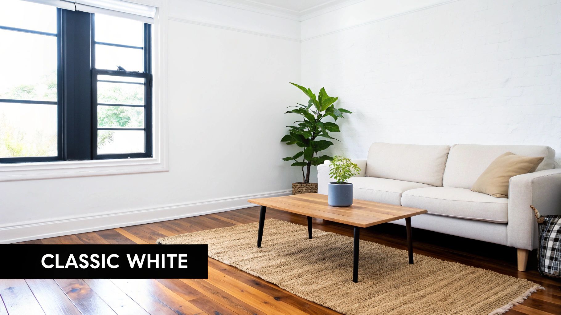
From the clean lines of Scandinavian design paired with natural woods to the crisp backdrop for bold, modern furniture, white walls adapt effortlessly. They are equally at home in a rustic farmhouse aesthetic, often seen on shiplap walls, where they create a feeling of authentic, lived-in comfort.
How to Perfect a White Living Room
To prevent a white space from feeling clinical or cold, focus on layering and nuance. Selecting the right shade and finish is paramount to achieving a welcoming atmosphere.
- Choose Warmth: Opt for a white with subtle yellow, pink, or beige undertones, such as Benjamin Moore’s Cloud White. These "warm whites" feel cosier and more inviting than stark, cool whites which can have blue or grey undertones.
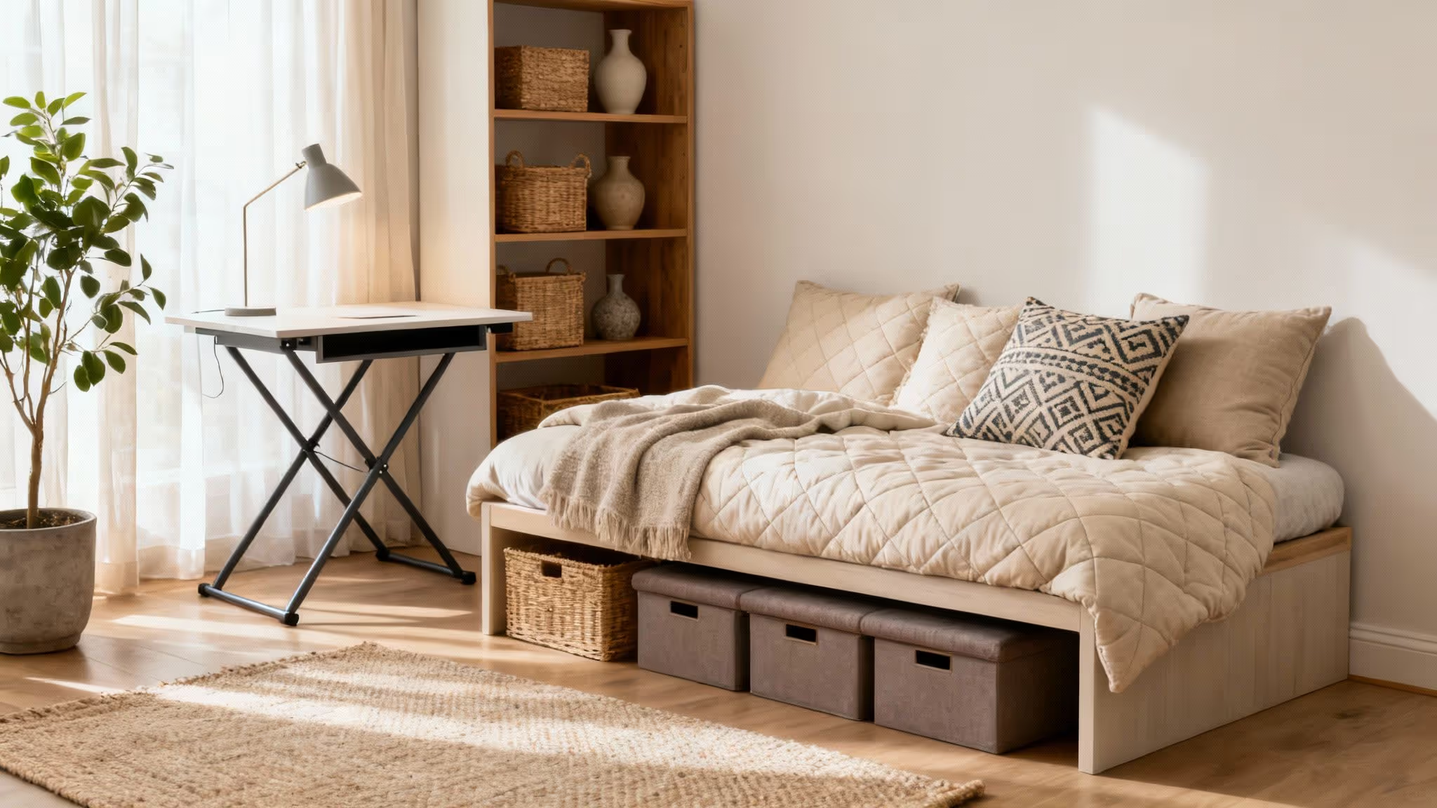
- Introduce Texture: Counteract the simplicity of white walls by incorporating rich textures. Think boucle armchairs, linen curtains, chunky knit throws, and plush rugs to add depth and tactile warmth.
- Vary the Sheen: Create subtle visual interest by using different paint finishes. A common strategy is to use a modern matt finish for the walls and a durable satin or eggshell for skirting boards, doors, and trim. This contrast catches the light differently and adds a layer of quiet sophistication.
2. Warm Gray: The Sophisticated Neutral
Warm gray offers a perfect middle ground between the starkness of white and the intensity of darker colours. It stands out as one of the most sophisticated paint colour ideas for a living room, blending contemporary style with inviting warmth. Infused with subtle beige or taupe undertones, this versatile "greige" provides more depth than a standard neutral while complementing both warm and cool-toned décor, making it an incredibly adaptable choice.
This modern neutral is ideal for transitional living rooms that mix traditional and modern elements, creating a cohesive and elegant backdrop. It also excels in open-concept homes, where its gentle hue can unify large spaces without feeling bland. In urban lofts, warm gray walls can soften industrial accents like exposed brick and metal, adding a touch of cosy refinement.
How to Perfect a Warm Gray Living Room
The key to a successful warm gray space is balancing its undertones and leveraging its chameleon-like quality. Popularised by shades like Sherwin-Williams’ Agreeable Gray, it’s a designer favourite for good reason.
- Test in Situ: Warm grays are highly sensitive to light. Always test samples on different walls in your room to see how the colour shifts from morning to evening, ensuring you love how it looks in both natural and artificial light.
- Lean into Warmth: Enhance the cosy feel of warm gray by pairing it with natural wood tones in furniture, flooring, or shelving. Materials like oak, walnut, and teak create a rich, organic contrast.
- Inject Personality: Use the neutral walls as a canvas for pops of colour. Vibrant artwork, patterned cushions, or a bold statement rug can add personality and prevent the scheme from feeling too muted. Consider blues, greens, or even deep burgundies for a striking effect.
3. Soft Blue: A Breath of Calm Serenity
Soft blue is an exceptional choice among paint colour ideas for a living room, known for its ability to create a peaceful and calming atmosphere. Gentle hues, from airy sky blues to muted powder tones, evoke a sense of tranquility and openness. This colour family introduces a subtle touch of personality without overwhelming the space, making the room feel both restful and sophisticated.
Popularised by the enduring coastal design movement and revered in traditional American and modern aesthetics alike, soft blue is remarkably versatile. It provides a serene backdrop for a coastal-themed room with white-washed furniture and natural fibres. Equally, it brings a classic elegance to traditional homes when paired with antique wood furnishings and refined textiles.
How to Perfect a Soft Blue Living Room
To ensure a soft blue living room feels inviting rather than chilly, the key is to balance it with warmth and contrast. The right pairings and details will elevate the colour from simply pretty to truly captivating.
- Introduce Warm Accents: Counteract blue’s cool nature by incorporating warm materials. Brass or gold light fixtures, warm wood tones in flooring or furniture, and tan leather accents provide a beautiful and necessary contrast.
- Use Crisp Trim: Frame the gentle blue walls with crisp white or off-white trim on skirting boards, cornices, and door frames. This classic combination creates a clean, polished finish that makes the wall colour pop.
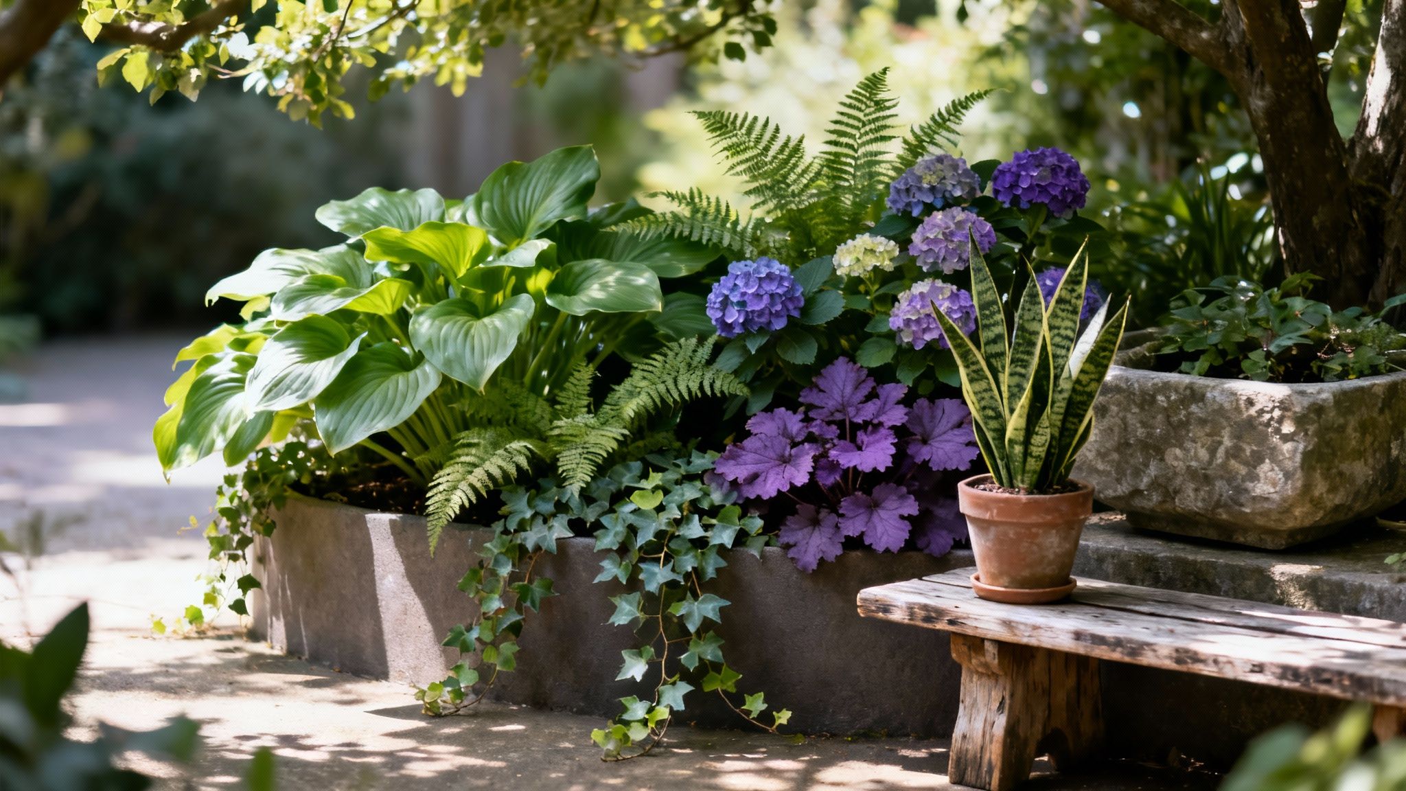
- Bring in Nature: Enhance the colour's inherent connection to nature by adding plenty of houseplants. The vibrant green of foliage against a soft blue wall creates a fresh, organic, and life-affirming palette.
- Consider the Light: Pay attention to your room's natural light. North-facing rooms receive cooler light, so choose a blue with subtle warm or grey undertones to prevent it from feeling icy. South-facing rooms can handle cooler, purer blues.
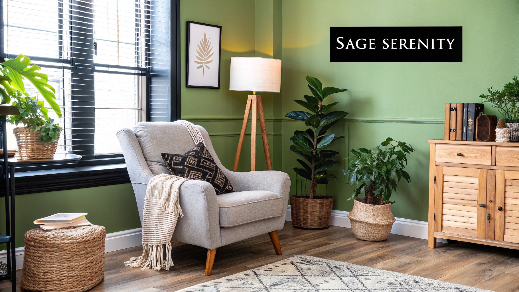
4. Sage Green: The Calming Connection to Nature
Muted sage green offers a sophisticated way to bring the tranquillity of nature indoors. This earthy, organic hue is one of the most calming paint colour ideas for a living room, promoting relaxation and a sense of wellbeing. Its inherent versatility allows it to bridge the gap between traditional and modern aesthetics, creating a restful, spa-like atmosphere without feeling overpowering. Sage green provides a soft hint of colour that feels both grounding and refreshingly modern.

Popularised by the biophilic design movement, this colour works beautifully in a modern farmhouse setting alongside natural wood tones, or in Scandinavian-inspired spaces paired with crisp whites and minimalist furniture. In transitional homes, it acts as a gentle, unifying backdrop for a mix of classic and contemporary furnishings, proving its adaptability. Shades like Sherwin-Williams' Clary Sage have become staples for interior design influencers for this very reason.
How to Perfect a Sage Green Living Room
To maximise the serene and sophisticated potential of a sage green room, focus on complementary textures and strategic accents. The goal is to create a layered, cohesive space that feels connected to the natural world.
- Embrace Natural Textures: Enhance the earthy quality of sage green by pairing it with materials like jute, rattan, linen, and light-toned woods. A woven jute rug, linen curtains, or a wooden coffee table will amplify the room’s organic feel.
- Layer with Lighter Neutrals: Use crisp white or soft cream for trim, ceilings, and skirting boards. This creates a clean definition that makes the sage colour pop, preventing it from looking murky, especially in lower light.
- Incorporate Plant Life: Add life and deepen the connection to nature by styling the room with plenty of houseplants. The vibrant greens of live plants create a stunning, layered look against the muted sage walls.
- Use Warm Lighting: Ensure your lighting is warm (around 2700K) to prevent the green from feeling too cool or clinical. Well-placed floor lamps and table lamps will create a cosy, inviting glow in the evenings.
5. Warm Beige/Greige: The Sophisticated Neutral
For those seeking a middle ground between the starkness of grey and the traditional feel of beige, greige offers the perfect solution. This sophisticated hybrid colour expertly blends grey and beige, creating a versatile neutral that provides more warmth than pure grey while retaining a contemporary edge. As a top paint colour idea for a living room, greige acts as a bridge between cool and warm palettes, making it incredibly adaptable to almost any interior design style.
Greige is exceptionally effective in open-concept homes, where it provides a seamless, cohesive flow between spaces. It is also a favourite among interior designers for transitional living rooms, flawlessly uniting modern furniture with classic architectural details. Its inherent balance makes it a safe yet stylish choice that enhances a room’s best features without overpowering them.
How to Perfect a Greige Living Room
The beauty of greige lies in its subtle complexity, which can be enhanced through careful selection and thoughtful styling. The key is to leverage its unique undertones to build a layered and inviting space.
- Test the Undertones: Greige can lean warm or cool. Sample paints like Sherwin-Williams' Accessible Beige (warmer) or Benjamin Moore’s Classic Gray (cooler) on your walls. Observe how they look in both natural daylight and with artificial evening light to find the perfect balance for your room.
- Layer with Texture: To prevent a greige scheme from feeling flat, introduce a rich variety of textures. Consider a soft wool rug, velvet cushions, linen curtains, and accents of raw wood or brushed metal to create tactile and visual depth.
- Mix Warm and Cool Accents: Play up greige’s chameleon-like quality by incorporating both warm and cool elements. Pair it with cool blue or charcoal accents alongside warm wood tones, leather, and brass finishes for a dynamic and professionally curated look.
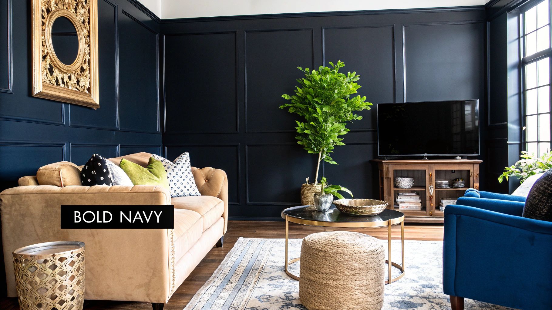
6. Deep Navy Blue: The Sophisticated Statement
For a living room that exudes confidence and character, deep navy blue is a superb choice. This rich, classic colour serves as a sophisticated alternative to black, creating a dramatic and enveloping atmosphere without feeling overly harsh. As a key paint colour idea for a living room, navy provides a sense of depth and tradition, making a space feel both grand and intimate. It is a surprisingly versatile neutral that anchors a room and allows other design elements to shine.
Navy is a timeless colour that transitions seamlessly between various aesthetics. It can establish a stately, traditional feel reminiscent of a classic library when paired with leather and dark wood, or create a sharp, contemporary look with crisp white trim and metallic accents. In coastal-inspired homes, it provides the perfect nautical contrast to natural textures like jute and linen.
How to Perfect a Navy Blue Living Room
The key to a successful navy living room is balance. Proper lighting and thoughtful accent choices prevent the deep hue from overwhelming the space, ensuring it remains elegant and inviting.
- Balance with Lightness: To avoid a cavernous feel, pair navy walls with light-coloured elements. Crisp white ceilings, skirting boards, and window frames will create a sharp, clean contrast. Lighter-coloured furniture, such as a beige sofa or cream armchairs, will also stand out beautifully.
- Embrace Warm Accents: Counter the coolness of blue with warm materials. Brass, copper, and gold accents in light fixtures, picture frames, or décor add a touch of glamour and warmth. Natural wood tones in flooring or furniture also help to ground the space.
- Start with an Accent Wall: If you are hesitant to commit to a full navy room, an accent wall is an excellent starting point. Painting the wall behind your sofa or fireplace, such as with the popular Hale Navy by Benjamin Moore, can add dramatic impact without darkening the entire room.
7. Soft Pink/Blush: The Nurturing Neutral
Gentle pink tones, from barely-there blush to dusty rose, have moved far beyond their traditional associations to become a sophisticated and nurturing choice for modern living rooms. This family of colours offers a unique warmth that can make a space feel welcoming and serene. As a surprisingly versatile paint colour idea for a living room, soft pink creates a gentle backdrop that is both contemporary and comforting, pairing beautifully with a wide range of styles.
The modern appeal of pink lies in its subtlety. A muted blush can act as a new neutral, providing a soft glow that enhances natural light without overwhelming the room. It’s a perfect partner for Scandinavian design, where it warms up minimalist white and grey palettes, and equally effective in eclectic spaces, where it can ground bolder patterns and colours.
How to Perfect a Soft Pink Living Room
To ensure a pink living room feels chic and grown-up rather than overly sweet, focus on the right shade and the right partners. The key is balance and sophistication.
- Choose Muted Tones: Opt for sophisticated, dusty pinks with grey or beige undertones, like Farrow & Ball's Setting Plaster. These shades are more complex and feel more grounded and timeless than brighter, more saturated pinks.
- Balance with Neutrals: Anchor the room by pairing blush walls with substantial pieces of furniture in neutral colours like charcoal grey, deep navy, or creamy off-white. This contrast creates a refined and balanced scheme.
- Add Metallic Accents: Introduce a touch of glamour and prevent the colour from feeling too soft by incorporating metallic finishes. Polished brass, warm copper, or sleek chrome accents on lighting, mirror frames, and side tables add a layer of modern elegance.
8. Earthy Terracotta: A Warm, Global Embrace
Terracotta brings an instant feeling of warmth and history to an interior. This earthy, clay-inspired hue is one of the most inviting paint colour ideas for a living room, creating a space that feels grounded, cosy, and connected to the natural world. It channels the sun-baked tones of Mediterranean villas and Southwestern adobes, offering a rich, saturated colour that is both comforting and sophisticated. Its inherent warmth makes it perfect for crafting an intimate and welcoming atmosphere.
This versatile shade thrives in diverse design schemes. In a bohemian living room, terracotta walls pair beautifully with global textiles and rattan furniture. It also serves as a cornerstone of modern Southwestern or desert-modern styles, especially when combined with natural wood and leather. Even in an eclectic setting, a terracotta accent wall can elegantly tie together vintage and contemporary pieces.
How to Perfect a Terracotta Living Room
The key to using this powerful colour is balance. While its richness is its strength, it can become overwhelming if not tempered with lighter elements and thoughtful styling.
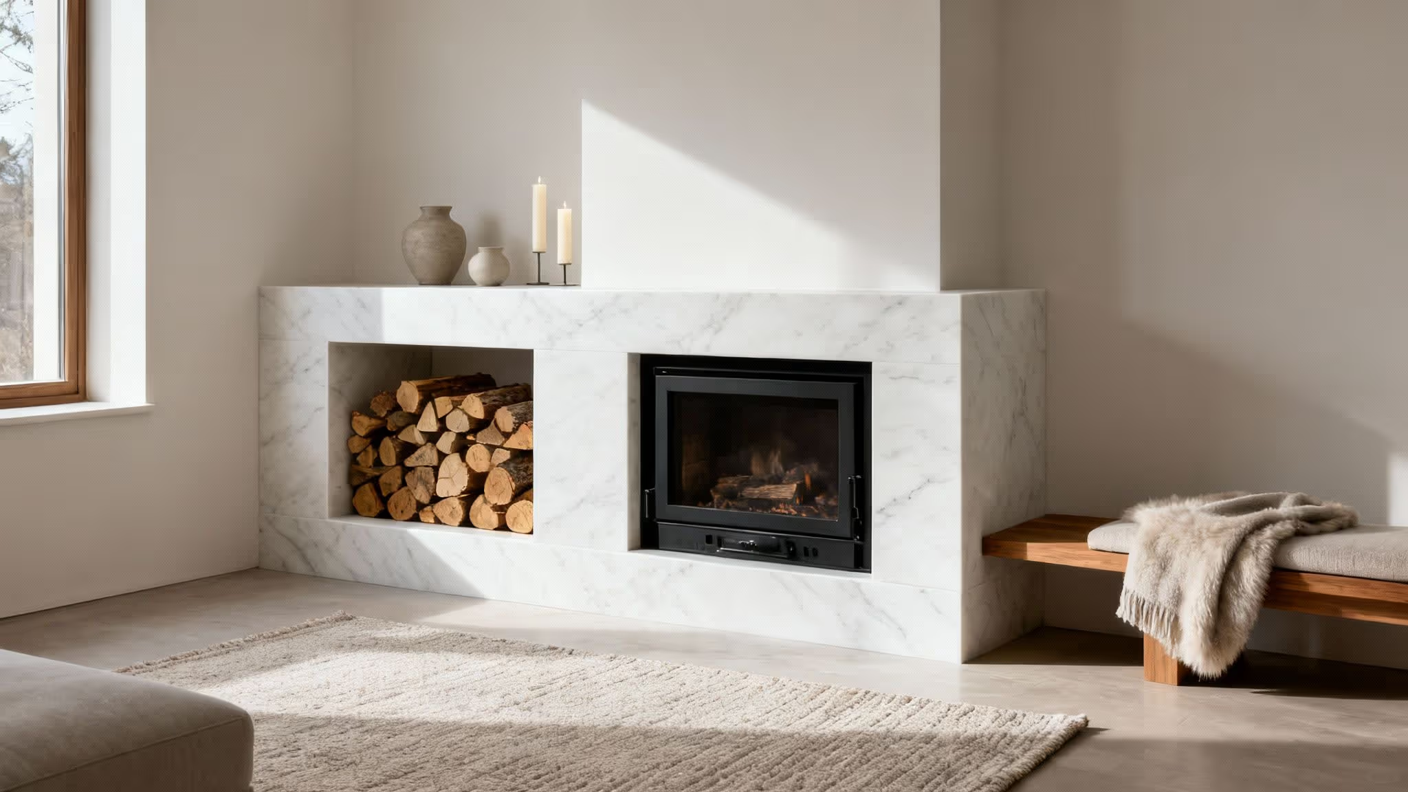
- Balance with Neutrals: To prevent the room from feeling too dark, pair terracotta with plenty of crisp white or soft cream on the ceiling, trim, and even in large furniture pieces. This contrast makes the terracotta pop while keeping the space feeling bright and airy.
- Embrace Natural Textures: Lean into the earthy vibe by incorporating natural materials. Think jute or sisal rugs, linen upholstery, wooden furniture, and woven baskets. These elements complement the colour and add layers of tactile interest.
- Add a Touch of Green: The contrast between earthy red-orange and vibrant green is a classic pairing found in nature. Incorporating plenty of houseplants, from trailing pothos to bold monsteras, will bring life and a fresh, organic contrast to the warmth of the walls.
9. Moody Black: The Ultimate Dramatic Statement
Embracing black paint is a bold and sophisticated move that creates an unforgettable living room. Far from making a space feel small, a deep, moody black provides a luxurious and intimate atmosphere. It is one of the most powerful paint colour ideas for a living room, acting as a dramatic backdrop that makes metallic accents, vibrant art, and rich textiles truly pop. This daring choice creates a cocooning effect, perfect for crafting a cosy and glamorous retreat.
This look is exceptionally versatile. In a modern setting, black walls provide a gallery-like quality for colourful contemporary art. In more traditional spaces, they pair beautifully with rich velvets and ornate gold frames. For an industrial loft aesthetic, a black wall beautifully complements exposed brick, metal conduits, and raw wood finishes, adding a layer of polished grit.
How to Perfect a Black Living Room
Successfully using black requires careful planning to ensure the room feels chic and intentional, not cavernous or gloomy. The key is to balance its intensity with light, texture, and strategic accents.
- Embrace Ample Lighting: Black walls absorb light, so it’s crucial to have excellent sources of both natural and artificial light. Large windows are ideal, but you can also use a combination of layered lighting- a statement ceiling fixture, floor lamps, and table lamps- to create a bright, inviting space.
- Balance with Lightness: To prevent the mood from becoming too heavy, incorporate plenty of white and other light colours. A crisp white ceiling, light-coloured flooring or a large pale rug, and furniture in shades of cream, beige, or grey will create a stunning and harmonious contrast.
- Invest in Quality Paint: A high-quality, pigment-rich paint like Farrow & Ball’s Railings or Benjamin Moore’s Black Beauty is essential for achieving a deep, even finish. A matt or flat finish provides a modern, velvety look that minimises imperfections, while a soft sheen can add a touch of reflective glamour.
Living Room Paint Colors Comparison Guide
Choosing Your Colour and Making It Happen
We have journeyed through a spectrum of possibilities, from the crisp, versatile canvas of classic white to the bold, enveloping drama of moody black. The wide array of paint colour ideas for the living room presented here demonstrates that your walls can be so much more than a simple backdrop; they are a fundamental component of your home's character and atmosphere. The perfect hue is a deeply personal choice, one that resonates with your aesthetic, supports your daily activities, and ultimately makes you feel completely at home.
The path from inspiration to a beautifully finished room is paved with thoughtful preparation. The single most crucial step, as we've emphasised, is sampling. Never underestimate the transformative power of natural and artificial light. A colour that looks perfect on a small paint chip can appear entirely different on a large wall.
Your Action Plan for Colour Success
To move forward with confidence, follow this simple, structured approach:
- Shortlist Your Favourites: Review the ideas we've explored, from serene sage green to sophisticated navy. Select your top three or four contenders that align with your home’s existing elements and the mood you wish to cultivate.
- Test, Test, Test: Purchase sample pots or peel-and-stick swatches. Apply large squares (at least 30cm x 30cm) on multiple walls, particularly one that receives direct sunlight and one that sits in shadow.
- Live with Your Choices: Observe the samples over several days. Notice how they shift from morning to night. See how they complement your sofa, rug, and artwork. This observation period is vital and will prevent costly mistakes.
- Consider the Finish: The sheen of your paint (e.g., matte, eggshell, satin) will also affect the final look. A matte finish hides imperfections and provides a velvety, modern look, while an eggshell finish offers a soft glow and better durability for high-traffic areas.
By committing to this process, you are not just painting a room; you are curating an environment. You are making a deliberate choice about how you want to feel in the space where you relax, entertain, and live your life. A new coat of paint is arguably the most cost-effective, high-impact design tool at your disposal. Embracing one of these paint colour ideas for your living room is an investment in your daily comfort and happiness. So, take the insights you've gathered, trust your instincts, and get ready to create a living room that is a true reflection of you.
Ready to bring your vision to life with premium, eco-friendly paint and curated home décor? Join the Spruce Collective today to gain exclusive access to member-only discounts, expert design advice, and a community of fellow home enthusiasts. Discover your perfect shade and the accessories to match at Spruce Collective and start your transformation.
Article created using Outrank