The dining room is far more than just a place to eat; it's a central hub for connection, conversation, and creating lasting memories. The colours you choose for this vital space can dramatically influence its atmosphere, transforming a simple meal into a truly special occasion. Selecting the right dining room colours is fundamental to setting the stage, whether you’re aiming for intimate family dinners, lively celebrations with friends, or sophisticated, formal soirees. A thoughtfully chosen palette does more than just decorate the walls; it can enhance the dining experience, spark engaging conversation, and make every guest feel instantly welcome and at ease.
This guide moves beyond generic advice to explore nine distinct and inspiring colour schemes, each designed to create a specific mood. We will provide practical advice and actionable tips to help you curate a dining space that perfectly reflects your personal style and elevates every gathering. From the comforting embrace of warm earth tones to the striking elegance of bold black and gold, you'll discover how to implement these palettes effectively. Let's delve into the colour combinations that can redefine your dining room, establishing it as the true heart of your home.
1. Warm Earth Tones: Grounded and Inviting
Warm earth tones create a dining room palette that feels inherently cosy and welcoming. Drawing inspiration from natural elements like soil, clay, and stone, this colour scheme utilises rich, muted hues such as terracotta, deep ochre, burnt orange, and warm browns. This approach is perfect for crafting an intimate atmosphere where conversation flows easily and guests are encouraged to relax and linger. The inherent connection to the natural world makes it one of the most comforting and timeless dining room colours available.
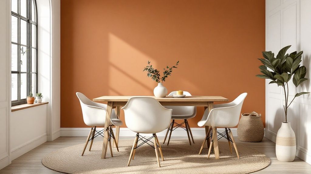
This palette is incredibly effective at making a space feel grounded and stable, transforming your dining area into a sanctuary from the outside world. It’s a popular choice seen in rustic Tuscan-inspired eateries and Southwestern Adobe-style homes, where the goal is to foster a sense of warmth and community.
How to Implement This Look
To successfully use warm earth tones without overwhelming the space, consider a balanced approach. Lighter shades like beige or cream on the largest surfaces, such as walls, can keep the room feeling airy, while deeper terracotta or brown tones can be used for a dramatic accent wall or on soft furnishings.
- Create Contrast: Use a crisp off-white or cream for skirting boards, window frames, and doors. This provides a clean, sharp definition that makes the warmer colours pop.
- Embrace Texture: Depth is key to making this palette feel rich and authentic. Incorporate natural materials like a jute rug, linen tablecloths, rattan placemats, or a rustic wooden dining table.
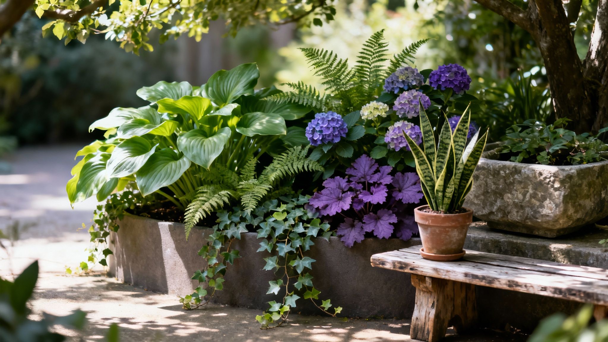
- Add Freshness: Balance the inherent warmth of the palette by introducing greenery. Potted plants, a vase of fresh foliage, or even botanical prints can add a vital touch of life and prevent the scheme from feeling too heavy.
2. Classic Navy and White: Timeless Sophistication
The combination of classic navy and crisp white offers a dining room palette that is both sophisticated and endlessly versatile. This timeless pairing evokes a sense of refined elegance, reminiscent of coastal Hamptons-style homes and the polished interiors popularised by designers like Ralph Lauren. It creates a clean, fresh, and orderly atmosphere that is perfect for formal dinners and relaxed family meals alike. The deep, grounding quality of navy blue provides a beautiful contrast to the bright, airy feel of white, making it a powerful choice among dining room colours for a space that feels both bold and balanced.

This palette is incredibly effective at crafting a look that feels both classic and contemporary. It can be adapted to suit nautical, traditional, or even modern aesthetics depending on the furniture and accessories chosen. The striking contrast ensures the dining area always feels smart and put-together, providing a stunning backdrop for entertaining guests. For those looking to explore similar cool-toned palettes, you can find inspiration for blue and grey living room ideas that share this sophisticated character.
How to Implement This Look
To master the navy and white look, the key is achieving the right balance between the deep blue and the bright white. Using white as the dominant colour on walls with navy as a powerful accent prevents the room from feeling too dark or enclosed.
- Add Warmth with Wood: Introduce a dining table, chairs, or flooring in warm wood tones. This prevents the cool-toned scheme from feeling stark and adds a welcoming, organic element.
- Play with Proportions: For a traditional feel, consider painting the lower half of the walls navy with a white chair rail, or paint a single feature wall in a rich navy hue for a modern focal point.
- Incorporate Natural Textures: Enhance the coastal or classic feel with materials like rattan placemats, linen curtains, or a sisal rug. These textures add depth and softness to the crisp colour scheme.
3. Sage Green and Natural Wood: Serene and Organic
Sage green paired with natural wood creates a dining room that feels both calming and deeply connected to nature. This biophilic colour scheme blends the muted, earthy tones of sage with the warmth and texture of various wood finishes, promoting a tranquil atmosphere. It’s an ideal choice for crafting a space that encourages mindful dining and quiet conversation, bringing the serenity of the outdoors inside. This combination of dining room colours has become a modern classic, celebrated for its sophisticated yet understated appeal.
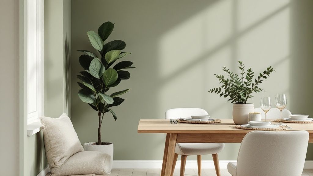
This palette is frequently seen in Scandinavian and modern farmhouse designs, championed by influencers like Joanna Gaines and paint companies such as Farrow & Ball. It transforms the dining area into a peaceful retreat, perfect for unwinding after a long day. The gentle green hue has a restorative quality, while the wood elements add grounding and organic texture.
How to Implement This Look
To achieve this serene aesthetic, focus on balance and layering. Use sage green as the primary wall colour or on cabinetry, and let natural wood take centre stage in your furniture choices, such as the dining table and chairs. Cream or soft white accents will keep the space feeling light and airy.
- Layer Greens: Don't limit yourself to one shade. Introduce depth by using slightly different tones of green in textiles, artwork, or a statement vase. This creates a richer, more dynamic look. For more ideas on using this versatile colour, you can explore various green living room ideas that translate beautifully to the dining space.
- Mix Wood Tones: Combine different wood finishes for a more curated feel. A light oak table can pair beautifully with darker walnut chairs or a vintage sideboard. The key is to maintain a similar undertone (warm or cool) for cohesion.
- Add Metallic Accents: Introduce a touch of elegance with warm metallic hardware. Brass or brushed gold tapware, light fittings, or cabinet handles provide a subtle contrast that elevates the entire scheme.
4. Monochromatic Gray Scale: Sophisticated and Modern
A monochromatic gray scale creates a dining room palette that is exceptionally sophisticated and chic. This approach moves beyond a single shade, layering various tones from deep charcoal to light pearl grey to build a look rich in depth and nuance. It is the perfect choice for a modern, minimalist aesthetic, allowing architectural details, statement lighting, and vibrant artwork to become the undisputed stars of the show. The result is a calm, composed atmosphere that feels both high-end and timelessly elegant.
This palette is a favourite in contemporary art galleries and high-end minimalist restaurants, where the environment is designed to enhance the main event, be it art or cuisine. By removing the distraction of multiple colours, a grey scale scheme fosters a focused and refined dining experience, making it one of the most versatile dining room colours for contemporary homes.
How to Implement This Look
To prevent a monochromatic scheme from feeling flat or cold, the key is to introduce a wide variety of textures and tones. Start with a mid-tone grey for the walls to create a neutral backdrop that works well in different lighting conditions. Deeper charcoals can then be used for drama, perhaps on a feature wall or through cabinetry. For more tips on selecting the right shade, you can explore the use of light grey paint in other spaces to understand its versatility.
- Embrace Texture: This is crucial. Combine different materials like a plush velvet dining chair, a polished concrete-effect table, silk curtains, and a chunky knit rug. These textural contrasts add visual weight and warmth.
- Introduce Metallics: A touch of glamour prevents the scheme from feeling too sterile. Incorporate polished chrome, brushed brass, or warm copper through light fittings, mirror frames, or tableware to reflect light and add a luxurious finish.
- Add Organic Life: Balance the structured, urban feel with natural elements. A large potted plant, a vase of fresh, vibrant flowers, or a bowl of green apples provides a necessary pop of organic colour and vitality.
5. Jewel Tone Elegance
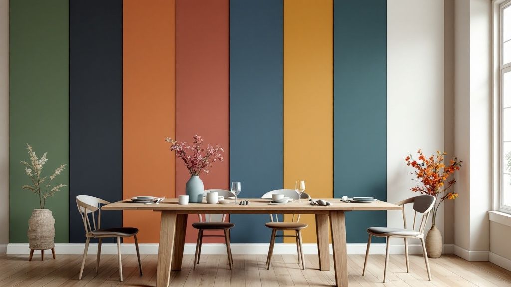
For a dining room that exudes drama, luxury, and sophistication, jewel tones offer an unparalleled richness. This palette draws its inspiration from precious gems, using saturated colours like emerald green, sapphire blue, amethyst purple, and ruby red. These deeply vibrant hues create an opulent and theatrical setting, perfect for formal dinners and special occasions. The intensity of these dining room colours stimulates conversation and creates a memorable, high-impact atmosphere.
This bold approach is reminiscent of lavish Victorian-era mansions and the exclusive dining rooms of luxury hotels, where the goal is to create a sense of grandeur and indulgence. Using jewel tones transforms a meal into an event, making guests feel like they are somewhere truly special. It is an excellent choice for homeowners who want their dining space to be a confident and glamorous statement.
How to Implement This Look
Successfully incorporating jewel tones requires a careful balance to prevent the space from feeling overwhelming. Often, focusing on one or two key colours and pairing them with grounding neutrals is the most effective strategy. While these rich colours are often associated with larger rooms, they can also work well in smaller spaces to create a cosy, cocooning effect.
- Choose a Dominant Colour: Select one jewel tone, like a deep emerald green, for the walls or a significant piece of furniture. Use others, such as sapphire or ruby, as smaller accents in artwork or tableware.
- Balance with Neutrals: Temper the intensity of the colours with soft greys, charcoal, or even black. Metallic accents are crucial; polished brass or gold fixtures, cutlery, and mirror frames will enhance the luxurious feel. For those seeking more guidance on using these shades in other social spaces, you can find a wealth of ideas on how to incorporate bold colours in your living room.
- Layer with Luxurious Textures: This palette begs for sumptuous materials. Think velvet dining chairs, silk curtains, or a high-pile rug. These textures add depth and absorb light, which softens the bold colours and adds to the overall sense of opulence.
6. Soft Blush and Cream: Gentle and Romantic
Soft blush and cream create a dining room palette that feels gentle, romantic, and wonderfully sophisticated. This colour scheme uses soft, muted hues like dusty rose, blush pink, and warm off-whites to craft an intimate and nurturing atmosphere. It's an ideal choice for creating a light-filled space that encourages quiet family meals and romantic dinners, making it one of the most subtly charming dining room colours.
This gentle palette is highly effective at making a dining area feel airy and elegant. It evokes the relaxed sophistication seen in French country bistros and romantic bed-and-breakfast dining rooms. Popularised by the Shabby Chic aesthetic, this look transforms the dining room into a serene and welcoming retreat, perfect for fostering a cosy and intimate setting.
How to Implement This Look
To create a balanced and chic blush and cream dining room, avoid letting the pink tones become overpowering. Use blush as a feature colour against a backdrop of warm cream or soft white to maintain a light, sophisticated feel. The key is to layer tones and textures for a rich, inviting look.
- Strike a Balance: Use warm cream or a soft off-white on the walls to provide a neutral base. Introduce blush through chairs, a feature wall, or elegant table linen.
- Ground the Space: Prevent the scheme from feeling overly sweet by incorporating natural wood elements. A light oak or whitewashed dining table can add a rustic, grounding touch.
- Incorporate Metallics: Add a touch of glamour with metallic accents. Rose gold or brushed brass cutlery, light fixtures, or candle holders complement the warm blush tones beautifully.
- Play with Texture: Build depth by mixing textures. Think about linen napkins, a soft wool rug under the table, and smooth ceramic dinnerware to create a multi-layered, tactile experience. You can find more inspiration by exploring other cosy home ideas.
7. Bold Black and Gold: Sophisticated and Glamorous
For the ultimate in drama and luxury, a bold black and gold palette delivers an unforgettable dining experience. This high-contrast combination creates a sense of occasion and opulence, turning every meal into a special event. The deep, grounding nature of black provides a powerful backdrop, while shimmering gold accents introduce warmth, light, and a touch of glamour. This is one of the most sophisticated dining room colours, ideal for creating an elegant, formal space designed for entertaining.
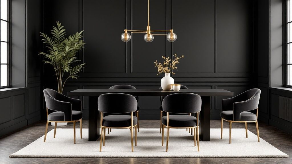
This striking look is heavily influenced by the Art Deco movement and Hollywood Regency style, often seen in upscale steakhouses and luxury hotel dining rooms. The scheme is designed to feel indulgent and curated, making it perfect for homeowners who want their dining area to be a glamorous focal point for hosting guests and celebrating milestones.
How to Implement This Look
Achieving a black and gold dining room requires a careful balance to avoid making the space feel too dark or heavy. The key is to use black strategically and allow gold to lift and illuminate the room.
- Balance with Light: Use black on a feature wall or on lower cabinetry rather than painting the entire room. Pair it with a soft cream or off-white on the remaining walls to maintain a sense of space and light.
- Incorporate Metallics: Layer in plenty of gold accents. Think a statement chandelier, gold-framed mirrors, metallic-legged chairs, or even gold-rimmed dinnerware to catch the light and add a luxurious sheen.
- Embrace Rich Textures: Introduce soft, tactile materials to add depth and comfort. Black or jewel-toned velvet dining chairs, a silk-blend rug, and polished marble surfaces will enhance the opulent feel and prevent the scheme from feeling flat.
8. Mediterranean Blue and Terracotta: Coastal Escape
The Mediterranean Blue and Terracotta palette transports the warmth and vibrancy of coastal European life directly into your dining room. This colour scheme combines the deep, calming azure of the sea with the sun-baked warmth of terracotta clay, balanced by creamy whites and subtle olive green accents. It’s a combination designed to evoke feelings of a leisurely holiday, creating a relaxed and convivial atmosphere perfect for long, enjoyable meals with family and friends. This is one of the most evocative dining room colours for a space that feels like a permanent getaway.
This aesthetic is famously seen in Greek tavernas and Italian coastal restaurants, where the goal is to create a setting that is both spirited and deeply relaxing. By balancing the cool blue with the earthy terracotta, the palette remains inviting and comfortable, encouraging guests to unwind as if they were overlooking the sea.
How to Implement This Look
To capture the Mediterranean spirit, focus on texture and a balanced application of colour. Use creamy white or a very light sandy beige as your base for the walls to keep the space bright and airy, reflecting the sun-drenched coastal architecture. Terracotta and blue can then be layered in through decor, textiles, and feature elements.
- Create Contrast: Use blue sparingly as a powerful accent. Consider a feature wall in a textured blue paint, cobalt blue dining chairs, or patterned ceramic tiles for a backsplash. This prevents the cool tone from overpowering the room's warmth.
- Embrace Texture: Natural materials are crucial. Introduce elements like a rustic wooden table, linen napkins, woven seagrass placemats, and handmade ceramic dinnerware. These textures add depth and an authentic, handcrafted feel.
- Add Freshness: Bring the outdoors in with Mediterranean foliage. A small potted olive tree in a corner, a vase of olive branches on the table, or pots of lavender and rosemary on a windowsill will complete the look and add a beautiful, natural aroma. Wrought iron details in lighting or chair legs can also add a classic touch.
9. Forest Green and Copper: Sophisticated and Natural
Forest green paired with lustrous copper accents creates a dining room palette that is both sophisticated and deeply connected to nature. This colour scheme channels the rich, calming atmosphere of a dense woodland, using deep, saturated green as its foundation and warm metallic highlights to add a touch of luxury. The combination is perfect for crafting an elegant and inviting space that feels both traditional and current. This blend of natural and refined elements makes it one of the most distinguished dining room colours for a memorable setting.
This palette effectively establishes a moody yet cosy ambience, ideal for intimate dinners and special occasions. It is a signature look found in classic English country pubs, luxurious lodge-style restaurants, and traditional hunting lodges, where the goal is to create a sense of distinguished comfort and timeless style.
How to Implement This Look
To achieve a balanced forest green and copper scheme, it's crucial to manage the deep green to prevent the room from feeling too dark. Use lighter neutrals to lift the space and let the copper elements shine as focal points.
- Balance with Neutrals: Use a soft cream or off-white on ceilings, woodwork, and even one or two walls. This will contrast beautifully with the forest green and keep the room feeling bright and spacious.
- Incorporate Metallic Accents: Introduce copper through key decorative pieces. Think pendant lights over the dining table, cabinet hardware, cutlery, or the frame of a mirror. These touches will catch the light and add warmth.
- Add Natural Wood: Ground the scheme with natural wood tones. A solid oak or walnut dining table, wooden flooring, or timber shelving will enhance the connection to nature and complement both the green and copper.
- Bring in Fresh Foliage: Enhance the woodland feel with fresh plants or a vase of eucalyptus. Greenery adds another layer of texture and life, reinforcing the natural inspiration behind the palette.
Dining Room Color Schemes Comparison
Bringing Your Vision to Life with Colour
The journey through the world of dining room colours reveals a fundamental truth: the right palette does more than just decorate walls; it sets the stage for life's most cherished moments. From the comforting embrace of Warm Earth Tones and the rustic charm of Sage Green and Natural Wood, to the sophisticated drama of Bold Black and Gold, each colour scheme we've explored offers a distinct emotional landscape. Your dining room is the heart of hospitality in your home, and selecting the perfect colours is the first step in crafting an environment that truly reflects your personal style and the atmosphere you wish to cultivate.
From Inspiration to Implementation
As you move forward, the key is to translate inspiration into a cohesive, actionable plan. It's easy to admire a palette like Classic Navy and White for its timeless appeal or Jewel Tone Elegance for its luxurious depth, but successful execution lies in the details. Remember that the colours on your walls are part of a larger conversation with your furniture, lighting, and décor. This is where your personal touch transforms a concept into a customised reality.
To begin this transformation, consider these practical next steps:
- Create a Mood Board: Before purchasing a single tin of paint, gather physical or digital samples. Combine paint swatches with fabric scraps, wood finishes, and metal hardware to see how the elements interact in different lighting conditions. This is a crucial step in visualising the final look and ensuring harmony.
- Test, Test, and Test Again: Never underestimate the power of a sample pot. Paint large test patches on different walls within your dining room. Observe how the colour changes throughout the day, from the bright morning light to the warm, artificial glow of your evening light fixtures. The perfect dining room colour should look just as intentional at breakfast as it does during a dinner party.
- Layer with Confidence: A truly dynamic space is built in layers. Once your primary dining room colours are chosen, focus on introducing texture and contrast. Think about how the metallic sheen of Forest Green and Copper plays against soft textiles, or how the tactile nature of Mediterranean Blue and Terracotta can be enhanced with woven placemats and rustic ceramics.
Crafting Your Unique Dining Experience
Ultimately, the goal is to create a space that feels uniquely yours. Use the palettes we’ve discussed not as rigid rules, but as creative springboards. Perhaps you love the softness of Blush and Cream but want to introduce an unexpected edge with dark, moody artwork. Maybe the sleekness of a Monochromatic Gray Scale appeals to you, but you decide to inject a single, vibrant accent colour through your dining chairs or a statement rug.
The power to transform your dining room is entirely in your hands. By thoughtfully selecting your dining room colours and paying close attention to how they interact with light, texture, and décor, you create more than just a beautiful room. You build an environment that fosters connection, encourages conversation, and turns every meal into a memorable occasion. Now is the time to pick up that paintbrush and bring your colourful vision to life.