Choosing the right dining room colour is about so much more than just picking a shade you like. It’s about setting the scene for connection. The best colours are the ones that capture the energy you want for your gatherings, whether it’s a fiery red to get the conversation flowing or a calm blue for long, lingering meals. Think of your colour palette as the secret ingredient for every dinner party you host.
How Colour Shapes Your Dining Experience
Imagine your dining room's wall colour as the background music to every meal. It works quietly behind the scenes, shaping moods, conversations, and even appetites without anyone really noticing. It’s a powerful little trick for designing a space that just feels right, whether you’re hosting a lively weekend get-together or sitting down for a quiet family breakfast. The right shade can make guests feel chatty and energised or calm and settled.
This is why getting your head around a bit of colour psychology is so useful. It’s not about following strict rules, but about understanding how different hues can subtly influence the feel of a room.
The Energy of Warm and Cool Tones
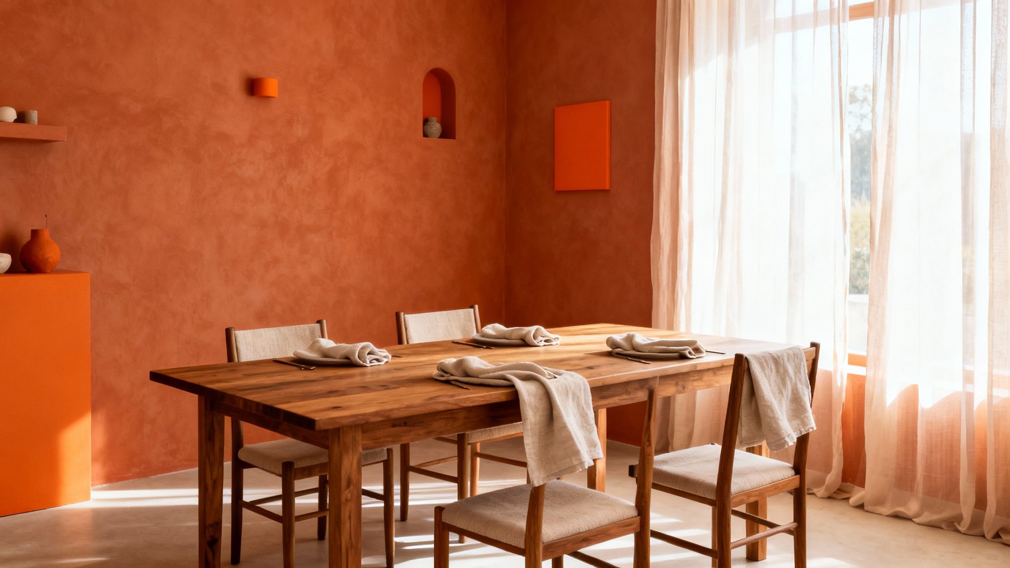
Warm colours – think reds, oranges, and earthy terracottas – are known for being stimulating. They have a way of visually ‘advancing’, which basically means they make a space feel cosier and more intimate. These shades are brilliant for encouraging social buzz and are even said to whet the appetite, which is why they’re such a classic choice for dining spaces.
On the flip side, cool colours like blues, greens, and greys bring a calming, soothing effect. These shades tend to recede, which can make a room feel bigger and more serene. A deep navy or a soft sage green can create a sophisticated backdrop, perfect for more formal dinners or for anyone who prefers a tranquil atmosphere.
Perception and Visual Tricks
Beyond just setting the mood, colour has this incredible ability to mess with our perception of a room’s size and light. And that’s a crucial little secret when you’re picking out paint.
A well-chosen colour scheme can visually fix a room's flaws. Lighter colours bounce more light around, making a small or dim dining room feel more open and airy, while darker hues absorb light, adding drama and intimacy to a larger space.
This is exactly why a fresh coat of paint is one of the quickest and most effective ways to completely transform a room. For more tips on making a space feel brighter, you can check out our guide on how to brighten a dark room. Once you get the hang of these principles, you can choose a palette that not only looks beautiful but actually works harder to make your dining room the perfect stage for memorable meals.
Finding the Perfect Palette for Your Space
Choosing a colour for your dining room can feel a bit like staring at a restaurant menu with a thousand options. The secret? Stop looking at the endless paint swatches and start looking at your room. The best clues are already there: the light, the size of the space, and the furniture you already love.
Think of these three elements as your personal design compass. They’ll guide you to a palette that feels completely intentional, saving you from any beige regrets later on. It’s all about working with your space, not against it.
Work With Your Natural Light
Of all the factors, the way natural light moves through your room is probably the most important. A colour that looks soft and inviting in the morning sun can feel completely different by the time you're lighting candles for dinner. It's a total game-changer.
The direction your room faces plays a huge part. North-facing rooms get a cool, blue-ish light all day, which can make some colours feel a bit stark. The trick is to warm things up. Think creamy whites, gentle beiges, or even rich, earthy tones like a soft terracotta or a splash of mustard yellow to create a welcoming glow.
South-facing rooms, on the other hand, are drenched in warm, bright light. This gives you so much more freedom. You can go for cooler shades—pale blues, soft greens, sophisticated greys—without any risk of them feeling chilly. They'll look balanced and beautifully serene in all that sunshine.
Consider the Size and Scale of Your Room
Next up is the size of your dining room. The right colour can work wonders, visually stretching a small space or making a large one feel more intimate and inviting.
For smaller dining rooms or cosy nooks, there's a reason light colours are the classic choice. Off-whites, pale greys, and muted pastels are brilliant at bouncing light around, creating an illusion of space. The room instantly feels bigger, airier, and less cluttered.
Got a larger dining room? This is your chance to be a bit more dramatic. Dark, moody colours like a deep navy, forest green, or charcoal grey can make a vast space feel cosier and more sophisticated. These saturated shades absorb light, drawing the walls in to create an enveloping atmosphere that’s perfect for dinner parties.
Remember, 'dark' doesn't have to mean gloomy. A rich, deep colour paired with good lighting and reflective surfaces like mirrors and metallics can create a dining space that feels luxurious and incredibly inviting.
Harmonise With Your Existing Furniture
Unless you’re starting from scratch, your dining table, chairs, and flooring are the perfect jumping-off point for your colour scheme. These are often the biggest investments in the room, so it just makes sense to pick a wall colour that sings in harmony with them, rather than shouting over them.
Take a proper look at the undertones in your wood. A warm oak or cherry table pairs beautifully with colours that share those warm undertones—creamy whites, beiges, or even a warm, sagey green. Cooler woods like ash or a dark espresso finish? They often look fantastic with greys, blues, or a crisp, clean white.
The colour wheel is your best friend here. For a simple, pulled-together look, an analogous scheme uses colours that sit side-by-side (like blue and green). For something with a bit more punch, a complementary scheme uses colours from opposite sides (like blue and orange).
Even a subtle nod to these ideas can give your room that polished, designer feel. If you want to go a little deeper, learning more about how to choose paint colours can really build your confidence. By looking at these three simple elements, you'll be well on your way to a dining room that feels deeply personal and just right.
Popular Dining Room Colour Schemes in the UK
Gone are the days when a UK dining room was automatically painted magnolia. Homeowners are getting much braver, choosing colours that tell a story and set the perfect mood for everything from chaotic family dinners to quiet weekend brunches. What’s emerging is a beautiful blend of contemporary taste with a real love for classic, heritage design.
You can see this split personality in what people are searching for online. A peek at Google UK search data shows that "modern dining room" and "Victorian dining room" are neck and neck, with 3,832 and 3,826 monthly searches. "Scandi dining room" isn't far behind with 3,634 searches. It shows we’re a nation torn between sleek, muted palettes and rich, historical jewel tones – and we love both. You can see more on this in a detailed analysis of British home styles.
Let’s dive into three of the most popular looks shaping our dining rooms right now.
Popular UK Dining Room Colour Palettes
Here’s a quick look at three influential styles, breaking down the core colours and the feeling they create. Each one offers a completely different dining experience, proving just how much personality you can pack into one room.
As you can see, the choice of palette goes far beyond the paint on the walls – it's about the entire sensory experience, from the textures under your fingertips to the overall atmosphere of the room.
The Modern Minimalist Palette
If you crave a clean, sophisticated space where the furniture and architectural details do the talking, modern minimalism is your answer. It's about creating a calm, collected atmosphere that feels both timeless and perfectly now.
This look is built on a quiet foundation of refined neutrals. Think of a sophisticated greige (that perfect sweet spot between grey and beige), soft off-whites, and gentle, stony greys. The key is to introduce a bold accent to stop it from feeling flat.
- Styling Tip: The magic of minimalism is in the contrast. Pair pale grey walls with a dark wood dining table and chairs with sleek black metal legs. It’s an instant recipe for understated drama.
- Finishing Touches: Less is definitely more here. A single piece of abstract art, a sculptural pendant light, and simple ceramic tableware are all you need to complete the look without creating clutter.
The Cosy Heritage Look
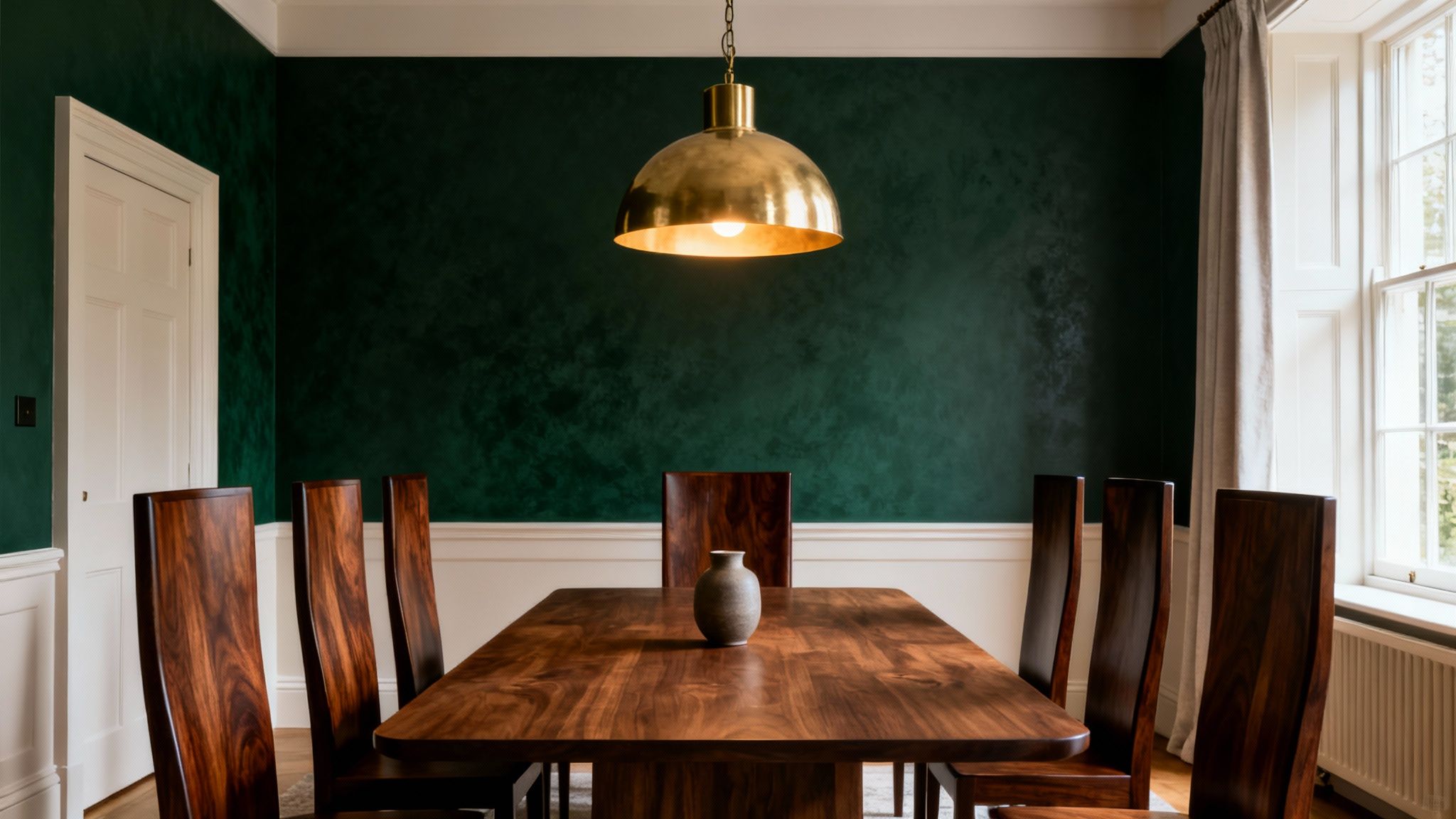
This is for anyone who wants their dining room to feel like a warm hug. Drawing inspiration from grand, historic British homes, this look is all about depth, drama, and a touch of nostalgia – perfect for long, candlelit dinners where the conversation flows late into the night.
The secret lies in rich, saturated jewel tones. These are colours with character and a bit of historical weight, turning a simple room into an intimate, inviting retreat.
A deep, heritage colour doesn't just decorate a wall; it builds an atmosphere. Shades like forest green or navy blue create an instant sense of intimacy and luxury, making every meal feel like a special occasion.
- Styling Tip: To stop a dark colour from overwhelming the space, bring in some sparkle. Pair deep green walls with warm brass or aged gold in your light fittings, mirror frames, and even cutlery. That metallic warmth cuts through the richness beautifully.
- Material Pairing: This palette sings when paired with traditional materials like dark oak furniture, plush velvet on the dining chairs, and the soft gleam of antique silverware.
The Scandi-Inspired Palette
A perennial favourite for a reason, the Scandi-inspired look is the ultimate trick for making any room feel brighter and more serene – an absolute gift in often-grey British weather. It’s all about simplicity, function, and bringing the calm of nature indoors.
The palette is light, airy, and grounded. It’s a gentle approach that creates a tranquil vibe, turning the dining room into a peaceful escape from the daily hustle.
- Styling Tip: The key to stopping a white or pale grey room from feeling cold is texture. Pair your light walls with pale woods like ash or oak, and layer up with linen tablecloths and woolly throws draped over the chairs.
- Let There Be Light: This look is designed to bounce light around. Keep window dressings minimal with sheer, lightweight curtains that allow as much natural daylight as possible to flood in and amplify that airy feeling.
Coordinating Ceilings, Trim and Accents
A truly finished dining room is more than just four beautifully painted walls. The secret to that professional, cohesive look often lies in the details—the trim, the ceiling, and any architectural accents. These elements are the supporting cast that can either make your main wall colour sing or fall completely flat.
Think of it like framing a piece of art. The right frame enhances the painting and draws your eye to its best features. In the same way, the colours you choose for your skirting boards, window frames, doors, and ceiling frame your room, defining its character and giving it a polished feel.
The Timeless Appeal of White Trim
There’s a reason crisp white trim is a classic in interior design. It never goes out of style. It creates a clean, sharp border that makes any wall colour—from the softest neutral to the deepest jewel tone—pop with vibrancy. This high-contrast look is brilliant for showing off lovely architectural details.
Using a bright, clean white on your trim has a few clear advantages:
- It defines the space: Those sharp white lines cleanly separate the walls, floor, and ceiling, giving the room a structured and organised feel.
- It enhances the wall colour: The contrast makes your chosen wall shade appear richer and more intentional.
- It creates a sense of freshness: A brilliant white just feels clean and light, which works in almost any style of room.
This approach is a safe yet sophisticated bet for any dining room. It provides a versatile backdrop that lets your furniture and decor take centre stage.
Exploring Modern Alternatives for Trim
While white is a dependable choice, contemporary design has embraced more adventurous and sophisticated approaches to trim. Moving beyond the standard is a great way to create a uniquely tailored and immersive atmosphere.
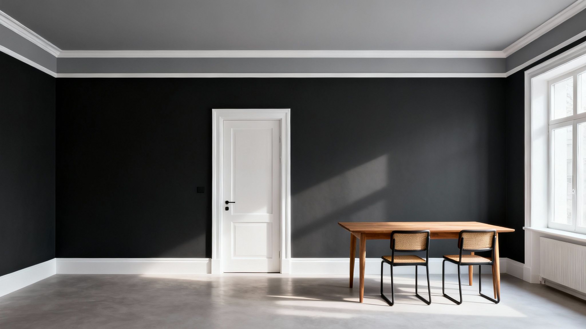
One popular technique is to paint the trim the same colour as the walls. This monochromatic look, sometimes called 'colour drenching', creates a seamless, elegant effect. It blurs the boundaries of the room, which can make a smaller dining space feel larger and more unified. It works especially well with mid-to-dark tones, creating a chic, enveloping cocoon of colour.
Another option is to go for a darker, contrasting trim. Painting skirting boards and window frames in a deep grey, charcoal, or even black against a lighter wall adds instant architectural drama. This bold choice highlights the room's structure, lending it a confident and grounded feel.
Your ceiling is often called the 'fifth wall' for a good reason. Leaving it as a plain white afterthought is a huge missed design opportunity. The colour you choose overhead can dramatically alter the entire mood of your dining space.
Mastering the Fifth Wall The Ceiling
The ceiling has a profound impact on how spacious or intimate your dining room feels. The standard move is to paint it brilliant white to reflect light, but a little strategic colour theory can achieve so much more.
A ceiling painted a few shades lighter than the walls (or in a soft off-white) creates a subtle lift, making the room feel taller and airier. This is a great trick for dining rooms with lower ceilings, as it draws the eye upward without you even realising it.
Conversely, a darker ceiling can foster a wonderfully cosy and dramatic atmosphere. In a room with high ceilings, a deep navy, charcoal, or rich claret can bring the ceiling down visually, making the space feel more intimate and perfect for those long, candlelit dinners. This choice is also brilliant for creating effective mood lighting, an area you can explore further with our guide to ceiling lights ideas.
Finally, don't overlook architectural features like a chimney breast or an alcove. Painting these in an accent colour—either a darker shade from the same family or a bold complementary hue—adds depth and a focal point, preventing the room from feeling one-dimensional. By thoughtfully coordinating these details, you elevate your dining room from simply painted to truly designed.
Selecting the Right Paint Finish for Durability
You’ve landed on the perfect dining room colour—fantastic. But before you get the dust sheets out, there’s one last crucial decision to make: the finish. The sheen of your paint does more than just tweak how a colour looks on the wall; it’s what makes it liveable. In a space that sees clinking glasses, lively dinners, and the occasional spag bol incident, durability is every bit as important as aesthetics.
Think of the paint finish as the invisible armour for your walls. The more shine it has, the more resins are in the paint, creating a tougher, more resilient surface. A flatter finish has fewer resins, giving it that soft, chalky look we all love. For a hardworking room like the dining room, finding that sweet spot between style and strength is everything.
Understanding Common Paint Sheens
Choosing a finish isn't just a technicality you leave to the decorator; it's a practical choice that dictates how easy your beautiful new walls will be to live with and look after. Let's break down the main contenders.
- Matt Finish: This gives you that gorgeous, velvety look with almost no shine. Its biggest plus is its ability to hide lumps and bumps on less-than-perfect walls because it doesn't reflect light. The downside? That beautiful surface can be a nightmare to clean without leaving shiny marks, making it a bit risky for high-traffic zones.
- Eggshell Finish: Named because it has the very subtle lustre of an eggshell, this is the interior designer's secret weapon. It’s the perfect compromise for dining and living rooms, offering a more durable, wipeable surface than matt while keeping that sophisticated, low-reflection look.
- Satin Finish: A step up in sheen from eggshell, satin has a soft, noticeable glow. That little bit of extra lustre makes it even tougher and easier to clean, which is a massive win in a room prone to splashes and spills.
What’s the magic behind it? The slight sheen in eggshell and satin paints creates a tighter, less porous surface. Spills are less likely to soak in, giving you a precious window to wipe them away before they can stain.
The Best Finishes for Dining Room Walls and Trim
So, what's the ultimate combination for a dining room that’s both beautiful and bombproof? Most pros agree that a two-finish strategy is the way to go.
For the main walls, an eggshell finish is pretty much the perfect choice. It delivers that elegant, soft look but has enough clout to handle the odd scuff or sticky fingerprint. You get the premium aesthetic without having to tiptoe around your own home.
For the trim – think skirting boards, door frames, and window sills – a satin finish is your best bet. These are the high-impact zones that get all the abuse, from chair backs knocking against them to hands pushing doors. Satin’s higher sheen provides top-tier resistance to wear and tear, and its smooth surface is a breeze to wipe clean, keeping all those crisp details looking sharp. If you're weighing up the options, you can dive deeper into the difference between eggshell and satin in our detailed guide. By pairing them up, you create a dining room that not only looks stunning but is built for real life.
How to Refresh Your Dining Room Seasonally
The beauty of a great wall colour is that it’s the gift that keeps on giving. Once you’ve landed on that perfect backdrop, there’s no need to repaint every few years to stop things from feeling stale. Instead, think of your walls as the permanent stage and your decor as the rotating cast of actors, changing their costumes with the seasons.
It’s a smart, budget-friendly way to play with new colours and trends without the commitment of a full redecoration. This way, your space always feels ready for whatever you’re hosting, from a lazy summer lunch to a full-blown Christmas dinner.
Adapting Your Palette Through the Year
Making these seasonal shifts is all about layering in new colours and textures through accessories – the things that are easy to swap out when the mood strikes.
When autumn rolls around, for example, you can dial up the warmth without even thinking about a paintbrush.
- Table Linens: Switch out summery fabrics for runners and napkins in rich, earthy tones like terracotta, mustard yellow, or a deep, comforting rust.
- Artwork: Hang a print featuring a warm, atmospheric landscape to instantly shift the mood.
- Centrepieces: Pull together an arrangement of dried branches, amber-coloured glass, and a few seasonal gourds for an effortless touch.
Then, when spring makes a comeback, the process is just as simple. Pack away the heavier textures and welcome in lighter, brighter accents. Think fresh floral arrangements, cushions in soft pastel shades, and crisp white or pale green linens to make the whole room feel airy and new again. For more ideas, take a look at our guide to easy styling tweaks that instantly refresh any room.
Simple Maintenance for a Lasting Finish
While you’re swapping your decor around, it’s the perfect time for a little maintenance to keep your walls looking pristine. A bit of gentle care will ensure your paintwork stays looking its best for years.
For most minor marks – like scuffs from chairs or fingerprints – on a durable eggshell or satin finish, a soft cloth dampened with water and a tiny drop of washing-up liquid will do the trick. Just remember to test it on a hidden spot first, wipe gently, and then pat it dry.
For small chips or scuffs that won’t budge, a quick touch-up is your best friend. This is why you should always keep a small, clearly labelled tester pot of your wall and trim colours. A tiny artist's brush is perfect for dabbing paint onto minor imperfections, making them disappear seamlessly.
It’s clear this approach is catching on. While neutrals remain a popular base in the UK, a recent survey found that even though 58% of UK dining rooms are neutral, 41% of owners plan to add stronger colours through decor. It’s a definite shift towards creating more characterful spaces, and you can see more about the latest British design trends and how this is playing out in homes across the country.
Common Questions About Dining Room Colours
Even after you think you’ve settled on a colour, a few last-minute wobbles are completely normal. Picking a paint shade feels like a big commitment, and it’s smart to iron out any lingering doubts before you crack open the tin. Let’s tackle some of the most common dilemmas.
This is your chance to troubleshoot those tricky spots and land on a colour you’ll genuinely love living with.
How Should I Treat an Open-Plan Space?
This is the big one for open-plan living: does the dining area have to match the lounge? While one continuous colour creates a lovely, seamless flow, you absolutely don’t have to stick to it. A great designer trick is to define the dining zone with a complementary accent on a feature wall.
Another clever approach is to use different shades from the same colour family for a subtle separation. So, if your living area is a soft, gentle grey, try a deeper charcoal or even a rich navy in the dining space. It carves out a distinct, sophisticated zone that still feels perfectly connected.
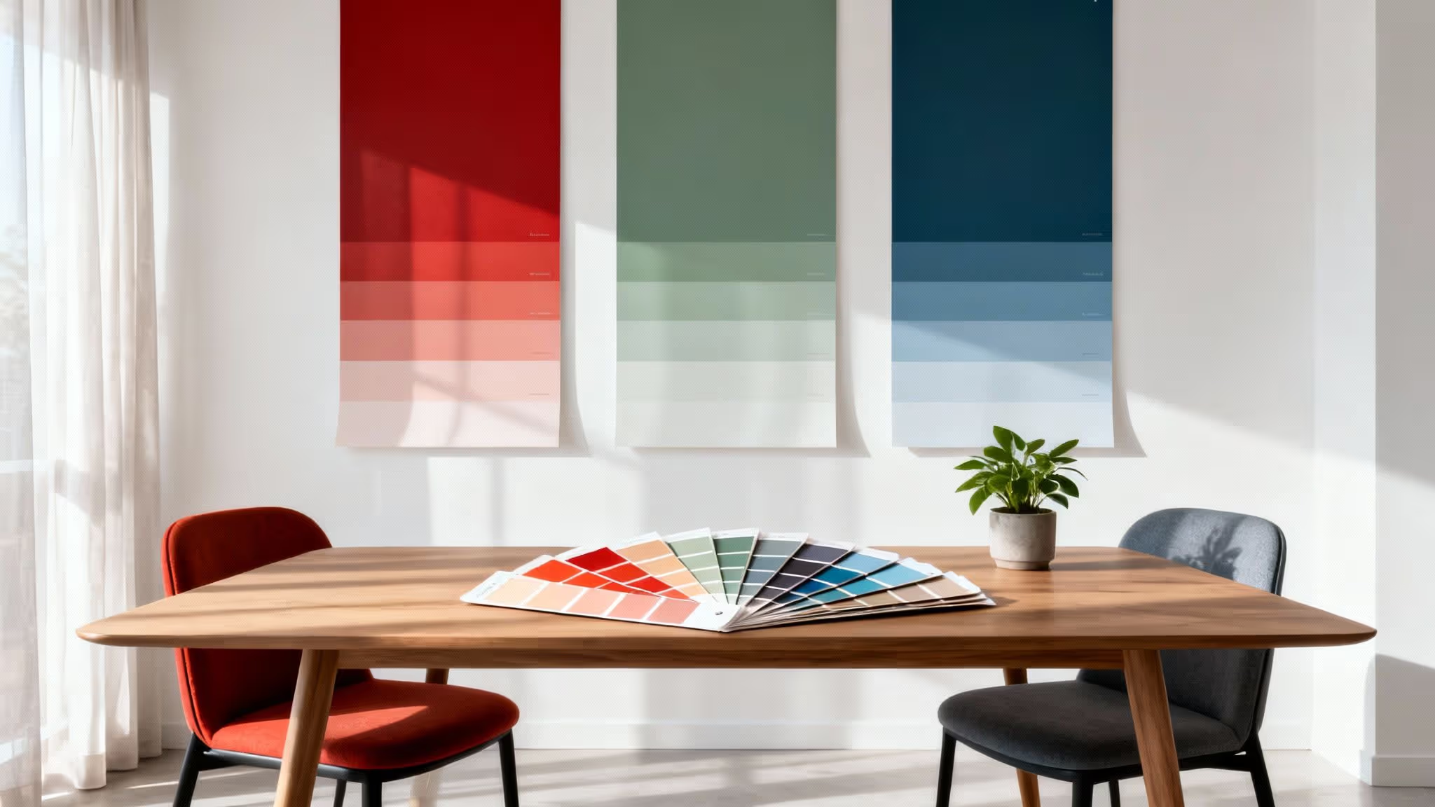
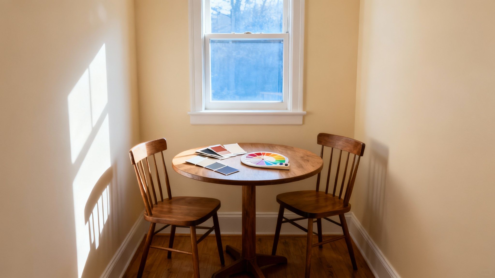
What Is the Best Way to Test Paint Colours?
The golden rule is to always use tester pots, but whatever you do, don't paint them straight onto your existing wall. The current colour will completely throw off how the new shade looks, leading to a nasty surprise when the whole room is finished.
For a true sense of your chosen colour, paint large swatches—at least A4 size—onto plain white paper. Tape these samples to different walls and watch them throughout the day. You’ll see exactly how the colour shifts in the morning light, afternoon sun, and under your lamps in the evening.
Can I Combine Bold Paint and Wallpaper?
Absolutely! Pairing a statement wallpaper with a coordinating paint colour is a brilliant way to get a high-impact, designer look. It’s a technique that adds layers of depth and personality without making the room feel chaotic.
The classic approach is to pick a bold, patterned wallpaper for one feature wall. Then, pull out a softer, secondary colour from within the paper’s design and use that exact shade for the other three walls. It creates a beautifully cohesive scheme where the paint and wallpaper work together in harmony, rather than fighting for the spotlight.