Picking the right neutral colours for your living room is about more than just playing it safe with white or beige. It’s about creating a calm, sophisticated space that feels completely, uniquely you. The secret is using a thoughtful palette to build a timeless foundation that can grow and change with your style.
Beyond Beige: Unlocking the Potential of Neutral Palettes
Let’s be honest, the phrase "neutral colours" can bring up images of bland, uninspired rooms. For a long time, interior design played it very safe with stark white walls or that once-everywhere grey sofa. While those have their place, the real magic of a neutral scheme lies in its incredible depth and versatility.
Your living room is the heart of your home—it should be a canvas for comfort, relaxation, and your own personality. Choosing a neutral palette isn't a shortcut; it's a clever design decision that lets other elements, like texture, lighting, and your favourite decor pieces, really shine.
What Makes Neutrals So Powerful?
When you get them right, neutral colours create a sense of calm and cohesion that’s tough to achieve with bolder hues. They give you a beautiful backdrop that can evolve over time, meaning you can easily switch things up with new cushions, art, or accessories whenever you fancy a change.
Here’s why they work so well:
- Timeless Appeal: A good neutral palette doesn’t fall out of fashion, so your living room will feel current for years.
- Light-Enhancing: Lighter neutrals are brilliant at bouncing natural light around, making any space feel bigger, brighter, and more open.
- Ultimate Versatility: They complement almost any design style you can think of, from modern minimalist to a cosy farmhouse vibe.
The key to a stunning neutral living room is to stop thinking about a single colour and start embracing a layered palette. Once you understand undertones and start playing with textures, you can create a space that feels rich, complex, and anything but boring.
Crafting Your Personal Sanctuary
In this guide, we'll walk you through everything you need to know to choose the perfect neutral colours for your living room. The focus has really shifted from following trends to creating personal, welcoming spaces that truly feel like home.
We’ll dig into how to spot undertones, figure out your room’s natural light, and use texture to add warmth and character. For a little more inspiration, you might like our guide to contemporary living rooms. This is all about turning a simple concept into a beautiful reality.
Understanding the Secret Language of Neutral Colours
To really get neutrals right, you need to learn their secret language. It’s a language spoken in subtle whispers, not bold statements. We’re moving beyond just white and grey to explore the rich, complex world of taupe, greige, and even those muted greens and blues that feel surprisingly neutral.
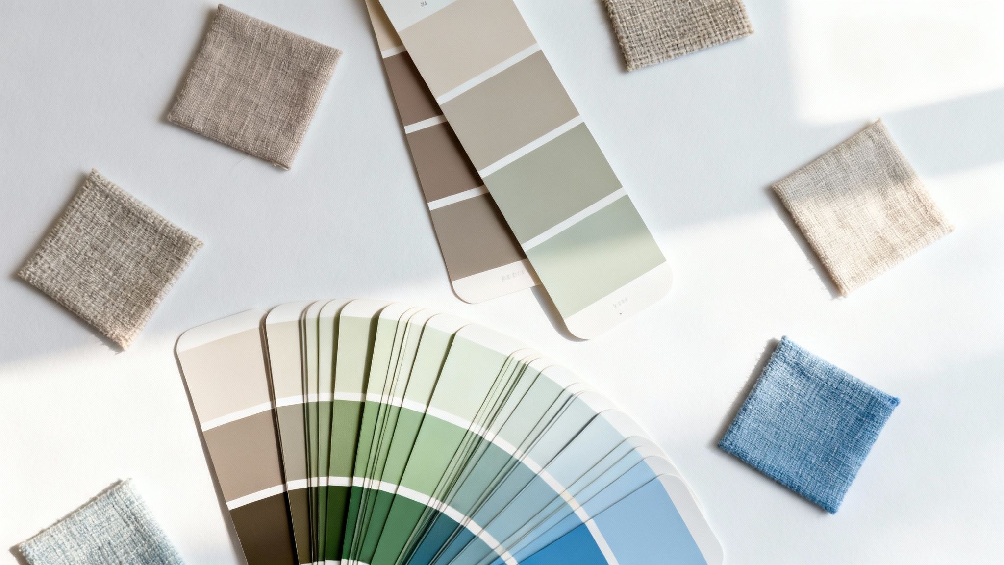
The key to unlocking this world is understanding undertones. An undertone is that quiet hint of colour hiding just beneath the surface of a neutral. It’s the whisper of pink in a soft beige, the hint of green in a stormy grey, or the touch of violet in a complex taupe.
Think of it like the tasting notes in a good coffee. The main flavour is coffee, of course, but you might also detect a hint of chocolate or citrus. In the same way, a paint might be labelled "grey," but its undertone—whether blue, green, or violet—is what truly gives it character and decides how it will feel in your room.
Why Undertones Are a Big Deal
Getting the undertone right is the difference between a living room that feels calm and pulled-together, and one that just feels slightly… off. You know the feeling, but you can’t quite put your finger on why. It’s often clashing undertones. Pairing a yellow-based beige sofa with a pink-based beige wall, for instance, can create a subtle but unsettling visual fight.
Get it right, though, and you’re golden. When you harmonise the undertones in your paint, furniture, and fabrics, you create a layered, sophisticated space. This is the secret behind those effortlessly stylish rooms you see in magazines.
If you want to dig deeper into the practical side of this, our guide on how to choose paint colours is a great next step.
Getting to Grips with Warm, Cool, and Green Undertones
Neutrals generally fall into one of three undertone camps. Learning to spot them is the first step to building a palette that genuinely works for your home.
- Warm Undertones: These neutrals have a base of red, yellow, or pink. Think creamy whites, oatmeal shades, and those lovely warm greys (often called ‘greige’). They wrap a room in a cosy, inviting feel, perfect for living rooms where comfort is everything.
- Cool Undertones: These shades have hints of blue, purple, or a true, crisp green. This family includes brilliant whites, stony greys, and cool taupes. They bring a sense of calm, airiness, and modern crispness to a space.
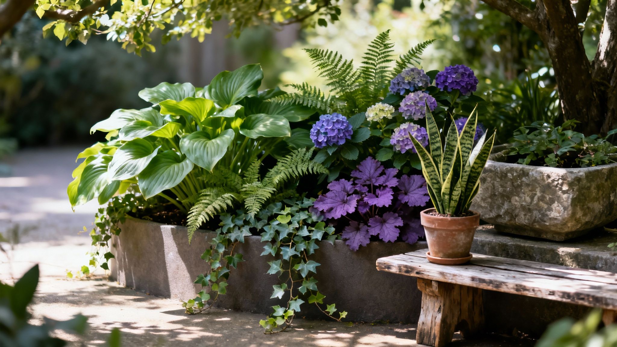
- Green Undertones: Some neutrals, especially certain beiges and greys, have a distinct olive or khaki undertone. These are fantastic for blurring the lines between indoors and out, and they look beautiful with natural materials like wood and stone.
To help you get your eye in, here's a quick cheat sheet for decoding those subtle hues.
Decoding Neutral Undertones
Remember, this is about training your eye, not following rigid rules. The best trick is comparison.
Pro Tip: To see a colour's true undertone, hold the paint chip or fabric swatch against a sheet of pure white paper. Its hidden character will almost always pop right out.
While hard data on the popularity of specific undertones in UK homes is tricky to find, design trends consistently show our love for neutrals that connect us with the natural world. You can often see the latest colour palettes taking centre stage on platforms like House Beautiful UK.
Ultimately, choosing the right neutral isn't about finding one "safe" colour. It’s about curating a family of shades that speak to each other. By paying attention to their subtle undertones, you can build a living room palette that feels rich, intentional, and completely you. It’s this thoughtful approach that turns a simple space into a real sanctuary.
How Light and Space Influence Your Colour Choices
We’ve all been there. You spend weeks hunting down the perfect neutral paint, slap a tester patch on the wall, and… it looks completely different. You’re not imagining things. The two most powerful (and often overlooked) interior designers in any home are natural light and the size of the room itself.
A colour is never really seen on its own; it’s always in conversation with its surroundings.
Understanding how these elements play with your chosen neutral colours for a living room is the secret to getting the look you were actually picturing. It’s about working with your home's unique quirks, not against them, to create a space that feels calm, considered, and just right.
The Decisive Role of Natural Light
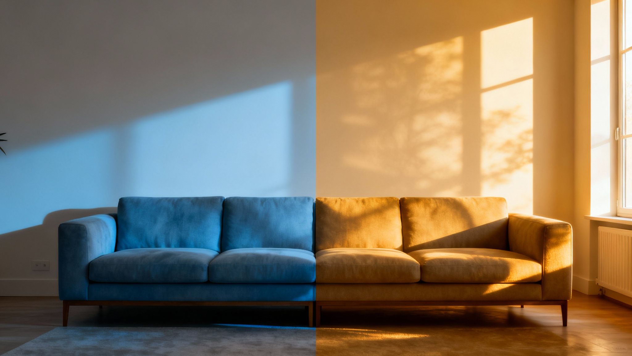
Natural light is your number one design tool. And here in the UK, its quality shifts dramatically depending on which way your living room windows face. This light casts its own subtle colour, which will mix with your paint’s undertones and can change everything.
North-Facing Rooms: These rooms get a cool, indirect light for most of the day. This blue-ish light can make cool greys feel chilly or a bit sterile. To warm things up, lean into neutrals with warm undertones—think greige, creamy off-whites, or a beige with a whisper of pink to balance out the coolness.
South-Facing Rooms: Lucky you! These spaces are bathed in warm, golden light all day long. This beautiful glow makes most neutrals sing, but it can make very warm shades (like a yellow-based beige) feel a little too intense. Here, cool neutrals with blue or green undertones can offer a crisp, refreshing contrast.
East and West-Facing Rooms: These rooms are true chameleons. East-facing rooms get bright, warm light in the morning before cooling down in the afternoon. West-facing rooms are the opposite, starting off cooler and ending the day with a fiery glow. A well-balanced neutral without strong undertones, like a true taupe or a soft grey, is your best bet for adapting to these changing conditions.
If you're really struggling with a gloomy space, our guide on how to brighten a dark room is packed with practical, light-boosting tricks.
Using Colour to Shape Your Space
Beyond the light, the actual size and shape of your living room have a huge say in how a colour feels. You can use this to your advantage, essentially tricking the eye and reshaping the atmosphere with just a lick of paint.
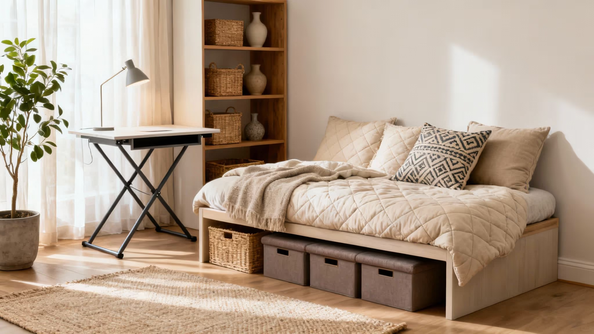
For most of us with smaller living rooms, the goal is to make the space feel bigger. Lighter neutrals are your secret weapon.
Lighter colours are brilliant at reflecting light, which creates an illusion of space. A soft, off-white or a pale, cool grey on the walls can make them appear to recede, making a compact room feel airy and much more open.
This is a classic designer trick for a reason. Light, cool colours are recessive, meaning they seem farther away, while dark, warm colours are advancing, making them feel closer and more intimate.
Creating Cohesion in Different Spaces
But what if you have the opposite problem? A large, open-plan living area or a room that just feels a bit cavernous and cold? This is where deeper, moodier neutrals really come into their own.
For Smaller, Cosier Living Rooms:
- The Goal: Make the room feel as spacious and bright as possible.
- The Strategy: Stick with light neutrals like off-white, pale grey, or a soft beige. Painting the skirting boards and ceiling in the same colour (or a shade lighter) creates a seamless effect that stretches the space.
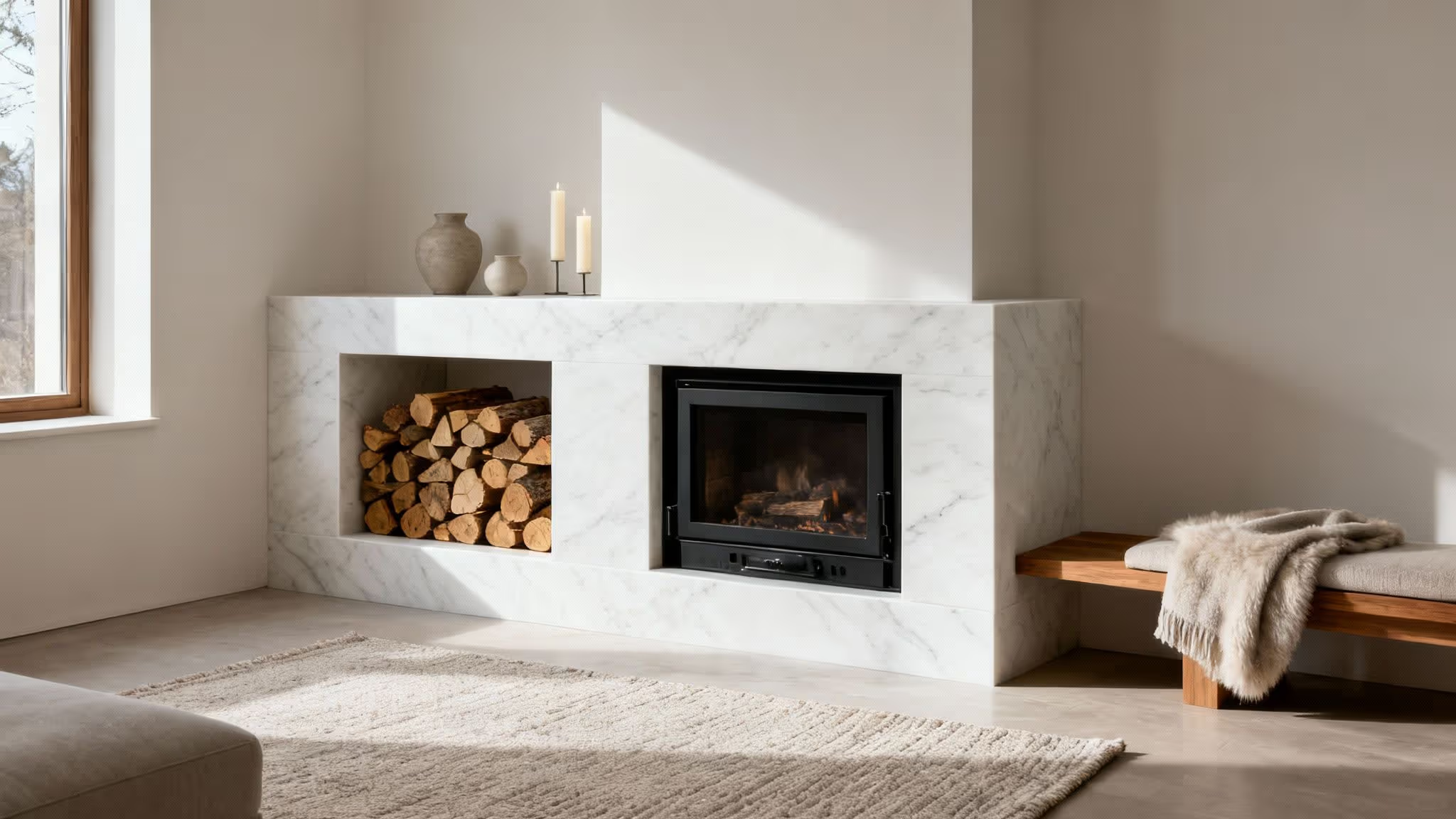
For Larger, Expansive Living Rooms:
- The Goal: Create a sense of intimacy and define different zones.
- The Strategy: Don’t be afraid to go dark. A feature wall in a deep charcoal, a warm taupe, or even a muted olive green can add depth and make a large space feel cosier and more grounded. These deeper tones absorb light, which visually brings the walls inward for a more intimate feel.
Ultimately, the perfect neutral for your living room is one that works in harmony with the light it gets and the space it fills. When you start thinking about these factors, you move from just picking a colour to properly designing an environment.
Your Guide to Selecting the Perfect Neutral Palette
Right, you’ve got your head around undertones and how light plays tricks on colour. Now for the fun bit: putting it all into practice. This is where we move from theory to action, with a clear, repeatable process for building a beautiful neutral palette from the ground up.
Forget staring at hundreds of paint swatches and hoping for the best. This is about making smart, intentional choices that guarantee a living room you’ll love. And it all starts not with a paint tin, but with one single thing you already own.
Find Your Anchor Piece
Every gorgeous room needs a starting point. In the design world, we call this an anchor piece. It's that one item in your living room you absolutely love—the thing you’d save in a fire—and it’s going to guide every other colour decision you make.
Your anchor piece can be anything with a bit of colour and pattern to it. Think:
- A beautiful rug: Those subtle threads of colour woven into the design? That’s your instant palette right there.
- A piece of art: Paintings and prints are fantastic sources of inspiration, practically handing you a curated colour scheme.
- Your sofa: As the biggest piece of furniture, your sofa’s colour is already a huge influence in the room.
- Statement curtains: The fabric’s pattern and shade can set the whole mood.
Once you’ve picked your piece, look at it closely. What’s the main neutral? Are there any secondary shades? What are the undertones doing? This one item holds the key to your entire palette, ensuring everything that follows feels connected and completely intentional.
Use the 60-30-10 Rule for Balance
So, you’ve got your colours sorted, but how do you actually use them without the room feeling either chaotic or just… flat? This is where a classic interior design trick comes in handy: the 60-30-10 rule. It’s a beautifully simple formula for creating a balanced, layered look.
Imagine your colours are a team, and each one has a specific job:
- 60% Dominant Colour: This is your main neutral, the one that will cover about 60% of the room. It’s almost always your wall colour, setting the overall tone for the space.
- 30% Secondary Colour: This shade should take up roughly 30% of the room. Think curtains, an accent chair, or maybe a feature wall. It’s there to support the main colour, not fight it.
- 10% Accent Colour: And here’s where you add the personality. This final 10% is for the small things—cushions, throws, vases, and other accessories that add that little pop of interest.
This isn't about getting out a measuring tape; it’s about creating a visual hierarchy. The rule ensures your room feels thoughtfully put together, preventing any one colour from completely taking over.
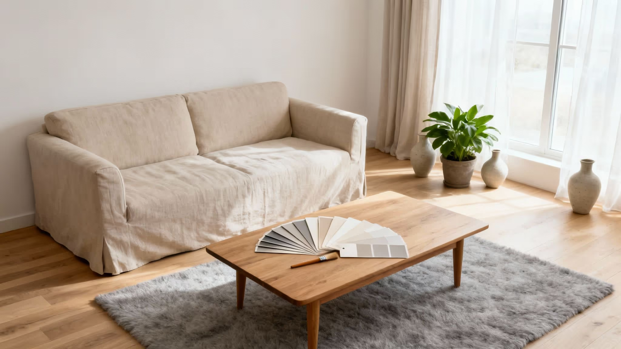
The Critical Step: Test Your Paint Samples Properly
You’ve found your anchor, planned your palette with the 60-30-10 rule, and you’re ready to go. But hold on. The last, and most crucial, step before you even think about buying paint is testing. Skipping this is easily the biggest—and most expensive—mistake people make.
That tiny paint chip you picked up from the shop? It’s not going to tell you a thing about how that colour will actually look on your walls, in your light. To get the real story, you have to test your samples properly.
Here’s how to do it right:
- Go Big: Don’t just daub a tiny square on the wall. Paint a large sample, at least two feet by two feet. Even better, paint two coats onto a big piece of card or poster board so you can move it around the room.
- Test in Multiple Locations: Pop your sample boards on different walls. The colour on the wall opposite the window will look completely different to the one right beside it. If you’re leaning towards grey, our guide on choosing a light grey paint for your living room has some great tips on this.
- Observe Over 24 Hours: This one’s non-negotiable. Watch how the colour changes throughout the day. Check it in the bright morning light, the warm afternoon sun, and—most importantly—under your artificial lights at night. A lovely daytime beige can turn a sickly yellow under a lamp, so you need to see how it behaves at all hours.
This simple testing process takes all the guesswork out of the equation. It lets you see exactly how a colour will interact with your home’s unique light, saving you from that sinking feeling of realising you’ve chosen the wrong shade after the whole room is finished. Now you can build your palette with total confidence, knowing the final result will be just right.
Curated Neutral Palettes for Every Living Room Style
Alright, you’ve got the theory down. Now for the fun part. Understanding undertones and lighting is one thing, but seeing how neutral colours for a living room actually come together to create a specific vibe is where the magic happens. A great palette does more than just colour your walls; it sets a mood and tells a story.
To get you started, we’ve pulled together three distinct palettes. Each one is built around a popular design aesthetic and comes with colour ideas and styling tips to help you get the look in your own home. Let's explore how to create a mood, from calm and clean to warm and inviting.
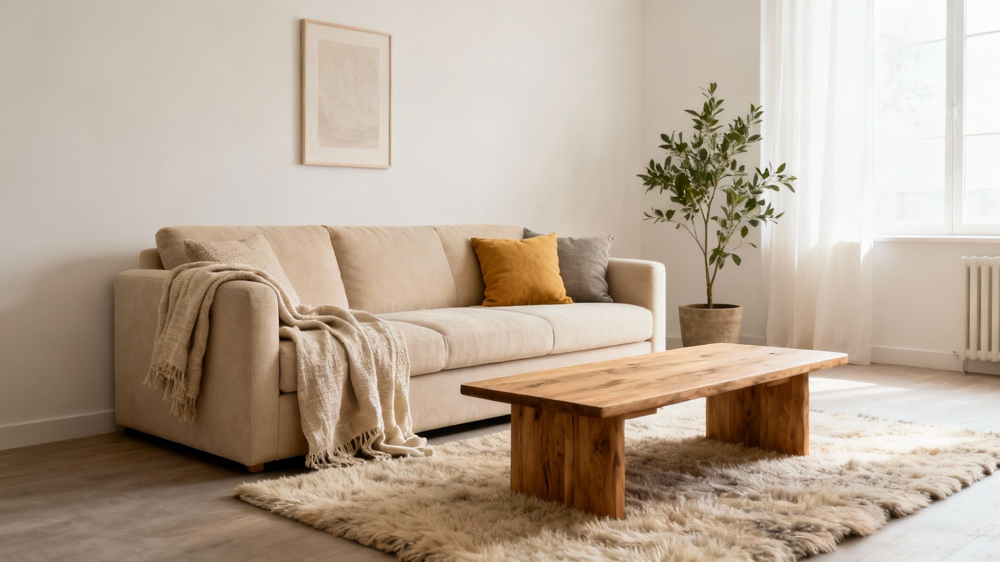
The Calm Scandi Palette
The whole Scandinavian aesthetic is built on light, simplicity, and a connection to nature. This style is all about creating a feeling of calm contentment, making it a perfect match for a soft neutral palette. The goal isn’t a lack of colour, but a layered, light-reflecting space that just feels good to be in.
- Core Colours: Start with a base of soft, chalky off-whites that have a slightly warm undertone, so the room doesn’t feel stark or cold. Layer in gentle, light greys with a subtle hint of blue or green.
- Styling Tips: Bring in plenty of natural wood through furniture like a pale oak coffee table or birch shelving. Texture is your best friend here: think chunky woollen throws, linen cushions, and simple ceramic vases to add warmth without clutter. Keep the lines clean and let the light breathe.
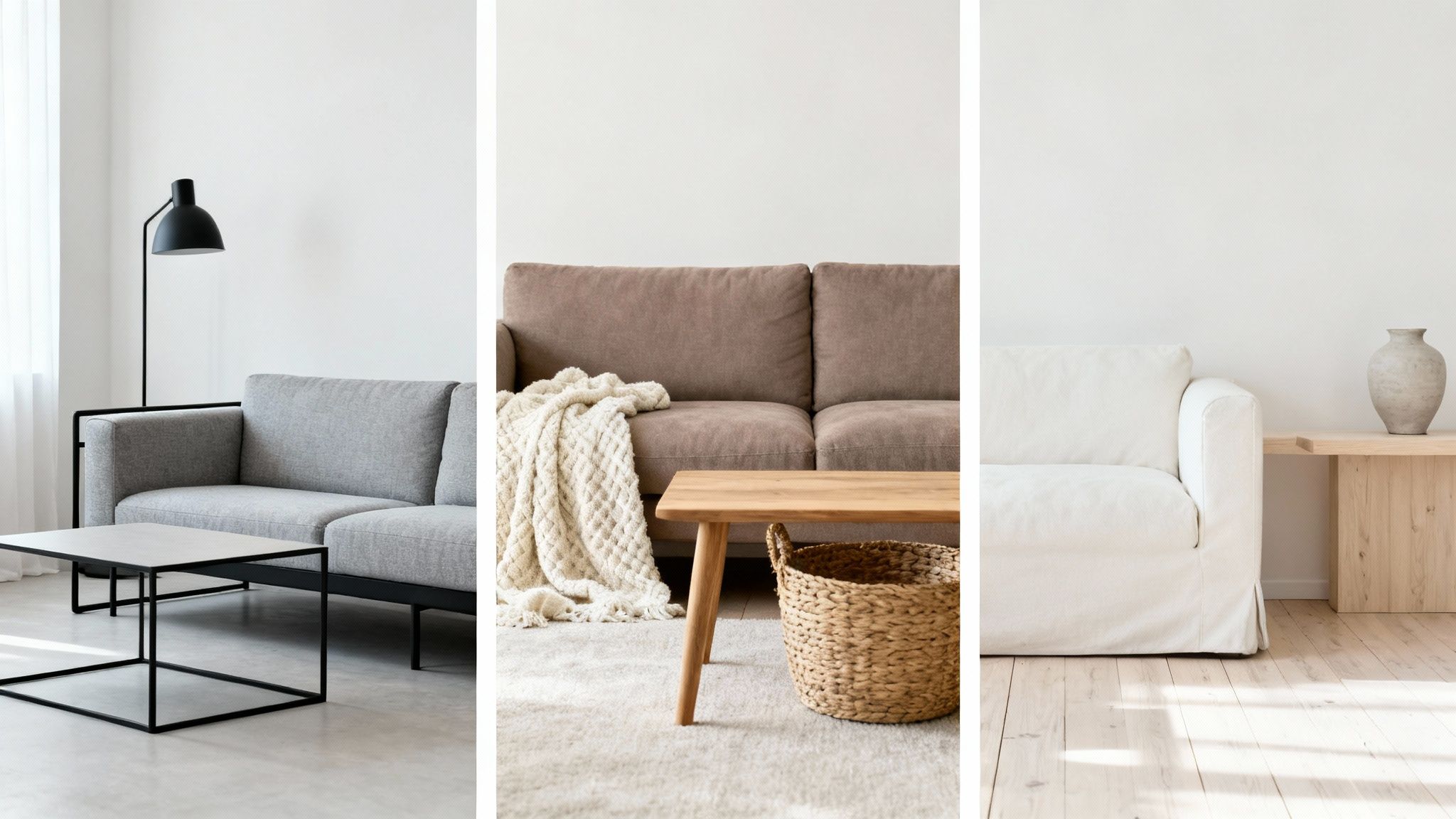
The Modern Minimalist Palette
Modern minimalism is all about clean lines, uncluttered surfaces, and letting the architecture of a room speak for itself. The neutral palette for this style is crisp, sophisticated, and very intentional. It’s less about bright colours and more about using contrast to create interest, resulting in a space that feels both serene and powerfully simple.
A minimalist approach isn't about having less; it's about making sure every item in the room has a purpose and a place. The colour palette supports this by creating a quiet backdrop where form and texture can take centre stage.
- Core Colours: This look often leans on cooler neutrals. Think of a crisp, pure white as your foundation, paired with different shades of grey, from a pale silver to a deep, dramatic charcoal.
- Styling Tips: Ground the space with sharp black accents through metal-framed furniture, light fittings, or simple picture frames. The key is balancing soft textures, like a comfy sofa, with hard surfaces like glass or metal. Keep accessories to a minimum, choosing a few high-impact pieces over lots of small ones.
The Cosy Contemporary Palette
If you want a living room that feels like a warm hug, this is the style for you. It’s a beautiful blend of modern design with rustic comfort, creating a space that’s inviting and deeply personal. The palette is earthy and grounded, focusing on warm neutrals that feel organic and real.
This style shares a few threads with more rustic designs. If that’s your thing, you can find more inspiration in our guide to cottage interior decorating.
Here’s a quick breakdown to help you compare these popular neutral styles and see what makes each one tick.
Neutral Palette Styling Guide
Creating a beautiful neutral living room really comes down to choosing a style that feels like you and then committing to its core ideas. By picking a palette that channels a specific look—whether it’s the airy simplicity of Scandi design or the warm embrace of contemporary comfort—you can build a space that feels not just stylish, but genuinely and authentically yours.
Common Questions About Neutral Living Rooms
Even the most carefully planned scheme can hit a snag. When it comes to decorating with neutral colours for a living room, a few questions pop up time and time again.
Here are our practical answers to the most common dilemmas, helping you solve those lingering problems and nail the final details.
How Do I Stop My Neutral Room From Feeling Boring?
This is the number one fear, but luckily, the fix is simple: texture, texture, texture. A room layered with different materials will always feel rich and interesting, even without a single pop of bright colour.
- Mix soft and hard finishes. Think a plush boucle sofa against a smooth marble coffee table.
- Layer up your textiles. Combine different weaves like a chunky wool throw, slubby linen cushions, and a low-pile rug.
- Bring the outside in. Wood, rattan, stone, and a few well-placed plants add instant warmth and organic texture that stops everything from feeling too flat.
By focusing on a variety of tactile surfaces, you create visual depth that draws the eye in. The space feels dynamic and inviting, not one-dimensional.
What Is the Best White Paint for a Living Room?
Ah, the million-dollar question. The truth is, the "best" white is entirely dependent on your room’s natural light and the mood you’re trying to create. There’s no magic, one-size-fits-all tin of white paint out there, which is why testing is absolutely non-negotiable.
To narrow it down, start with your light:
- For north-facing rooms: Steer clear of cool, blue-toned whites, which can look almost clinical in the cool light. Instead, opt for whites with a creamy or soft yellow undertone to inject a bit of warmth.
- For south-facing rooms: You’ve won the lottery here – you can use almost any white. A crisp, true white will feel bright and airy, while a cooler white can beautifully balance out that intense golden light.
The golden rule? Always see how a white paint interacts with your specific light. Never, ever choose one based on how it looks online or in the shop. Get those large tester patches on your walls.
How Do I Pair Neutral Walls with Wood Furniture?
Getting neutrals to play nicely with wood is all about harmonising their undertones. Every wood has its own subtle base colour—oak can be quite yellow, cherry has reddish notes, and walnut is a deep, cool brown. The trick is to look at your wood’s primary undertone and choose a wall colour that complements it.
A good rule of thumb is to create a gentle contrast. For instance, if you have warm, golden oak floors, a cool grey on the walls can feel jarring and out of place. A warmer greige or a soft, creamy white, however, would feel much more cohesive and intentional.
The goal is to make the wall colour and wood tones feel like they belong to the same family, even if they aren't the same shade.