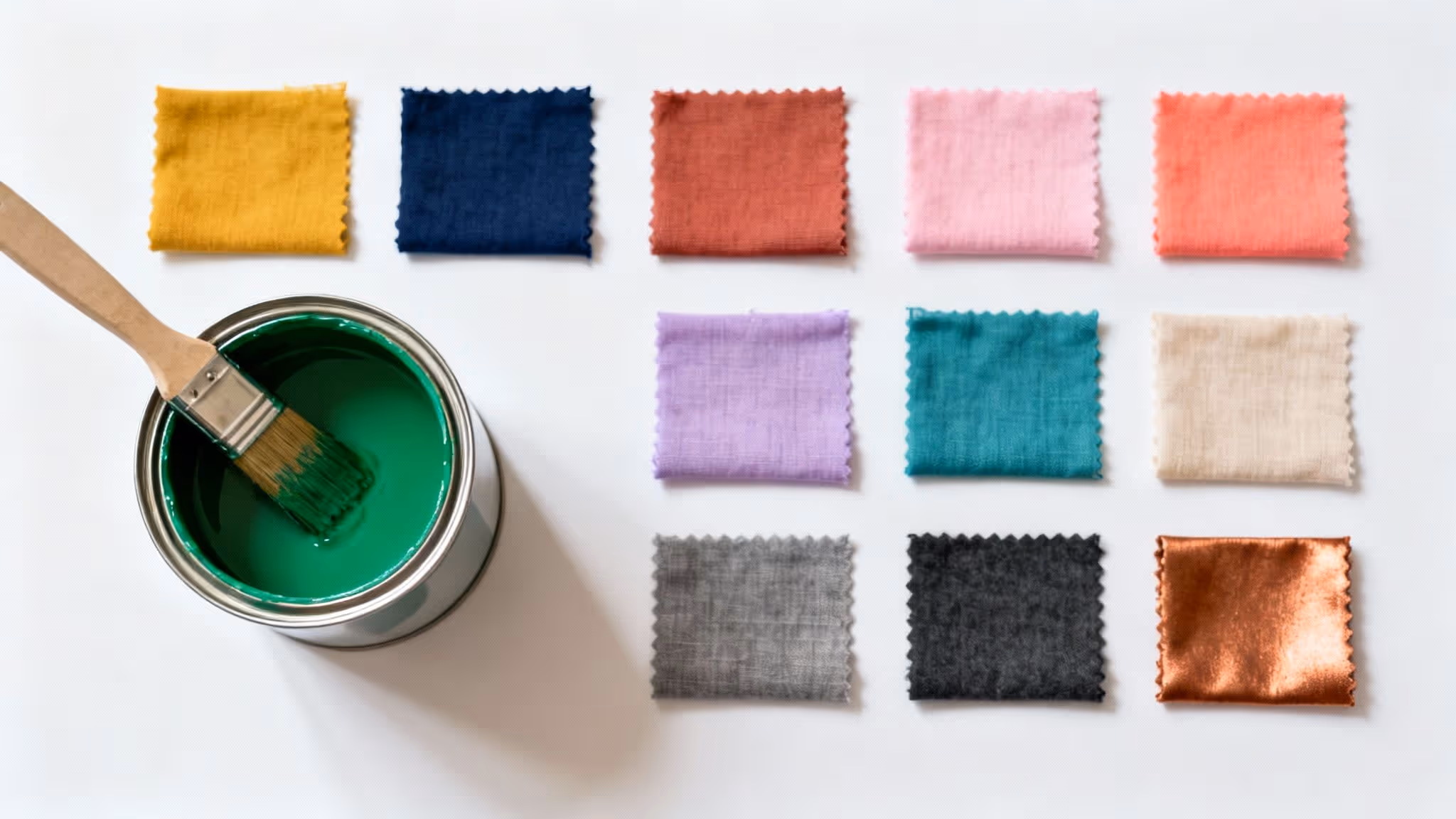
Green is the cornerstone of tranquil and vibrant living spaces, echoing the serenity of nature in our homes and gardens. From deep, moody forest green to the gentle, calming tones of sage and mint, its versatility is unmatched. Yet, the secret to unlocking its full potential often lies in finding the perfect companion colours to create a cohesive and sophisticated palette. Many homeowners hesitate, unsure of which pairings will enhance their space rather than overwhelm it. This is precisely where understanding the right combinations becomes crucial for successful interior design and garden planning.
This guide moves beyond the basics to explore a curated selection of stunning colours that match with green, offering fresh perspectives and practical styling tips. We will delve into specific pairings, demonstrating how to use them effectively to achieve your desired aesthetic. Whether you are aiming to create a bold, dramatic statement in your living room or a serene, natural oasis in your garden, these expert-backed combinations will provide the inspiration you need. Prepare to elevate your design from ordinary to extraordinary, proving that green is more than just a colour; it is a foundation for beautiful, intentional living.
1. Green & White
The pairing of green and white is a timeless classic that creates a fresh, clean, and revitalising aesthetic. This combination is one of the most versatile and popular colours that match with green, offering a crisp contrast that allows the verdant tones to take centre stage. It evokes a sense of nature, purity, and simplicity, making it a reliable choice for creating spaces that feel both airy and grounded. Its strength lies in its ability to be either bold and modern or soft and traditional, depending on the specific shades and textures used.
Why This Combination Works
White acts as a perfect neutral backdrop, amplifying the vibrancy of any green shade it’s paired with, from a deep forest green to a zesty lime. This pairing is frequently seen in wellness centres and healthcare facilities to promote a feeling of calm and cleanliness. It’s also a hallmark of minimalist Scandinavian design, where the focus is on light, space, and natural elements.
Practical Styling Tips
To master this look, consider using white as the dominant colour to maintain a bright, open feel, and introduce green through accent pieces.
- Vary Your Shades: Layer different greens, such as a sage green sofa against an olive green cushion, to create depth and prevent the scheme from feeling flat.
- Introduce Texture: Combine a green velvet armchair with a white linen throw or a glossy white table next to a potted plant to add tactile interest.
- Choose the Right White: Use a crisp, cool white for a sharp, contemporary look. For a softer, more inviting atmosphere, opt for a warmer off-white or cream.
This classic pairing is particularly effective in living spaces. For more inspiration on using this duo, explore these stunning green living room ideas for your home.
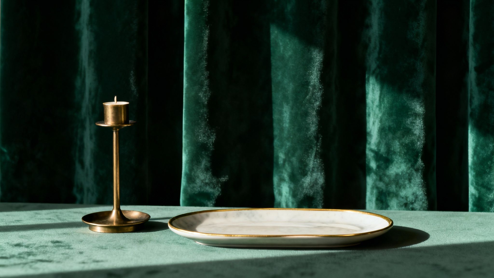
2. Green & Navy Blue
The combination of green and navy blue creates a deeply sophisticated and composed atmosphere. This pairing brings together the calming, natural essence of green with the depth and stability of navy, resulting in a look that feels both luxurious and grounded. It is one of the most elegant colours that match with green, conveying trust, growth, and a quiet confidence. This duo is perfect for crafting spaces that are refined and professional, making it a popular choice in formal settings, from corporate interiors to distinguished home offices.
Why This Combination Works
Navy blue provides a strong, authoritative base that allows the organic qualities of green to stand out without overpowering a room. The pairing strikes a perfect balance between cool and warm tones, creating a scheme that feels classic and enduring. This sense of reliability is why it is often used by financial institutions and luxury brands to communicate dependability and high quality. It feels both modern and traditional, adapting easily to various design styles.
Practical Styling Tips
To achieve this polished look, use navy as the foundational colour and introduce green as a compelling accent to create a rich, layered interior.
- Establish a Ratio: A 70-30 split often works best, with navy dominating walls or large furniture pieces and green appearing in textiles, artwork, or decor.
- Add Metallic Accents: Introduce touches of gold, brass, or silver through light fixtures, frames, or decorative objects to enhance the luxurious feel of the palette.
- Incorporate Texture: Combine a navy linen sofa with emerald green velvet cushions or a dark wool rug to add tactile depth and prevent the scheme from feeling too formal.
This powerful combination is exceptionally well-suited for creating a moody and inviting lounge. To explore more sophisticated palettes, discover these expert-approved colours for a living room that can transform your space.
3. Green & Warm Gray
The combination of green and warm gray offers a modern, sophisticated pairing that feels both organic and chic. This understated duo blends the natural vitality of green with the grounding neutrality of warm gray, creating a balanced and contemporary aesthetic. It is an excellent choice for crafting spaces that are calm and collected yet possess a subtle warmth and character. This pairing is particularly effective in designs that aim for a minimalist yet inviting atmosphere, striking a perfect balance between cool serenity and comfortable elegance.
Why This Combination Works
Warm gray, with its subtle beige or brown undertones, provides a soft, welcoming alternative to cooler grays, which can sometimes feel stark. When paired with green, it creates a gentle contrast that highlights the green without overwhelming it. This sophisticated palette is often seen in architectural design and contemporary office spaces, where it promotes a sense of focus and calm. It’s also a staple in modern Scandinavian-inspired interiors, which prioritise a connection to nature through a muted, earthy colour scheme.
Practical Styling Tips
To achieve this refined look, aim for balance by allowing both colours to have their moment without competing for attention.
- Choose the Right Gray: Opt for warm grays with distinct beige undertones (often called 'greige') to prevent the space from feeling too cool or industrial.
- Layer Tints and Tones: Use various shades of both green and warm gray to add depth. For example, pair a deep olive green feature wall with light greige furniture and charcoal grey accents.
- Introduce Natural Wood: Elements of oak, walnut, or birch complement this pairing beautifully, enhancing its organic and earthy feel.
This combination provides a versatile foundation for any room. For further guidance on selecting the perfect shades for your space, explore these expert tips on how to choose paint colours for your home.
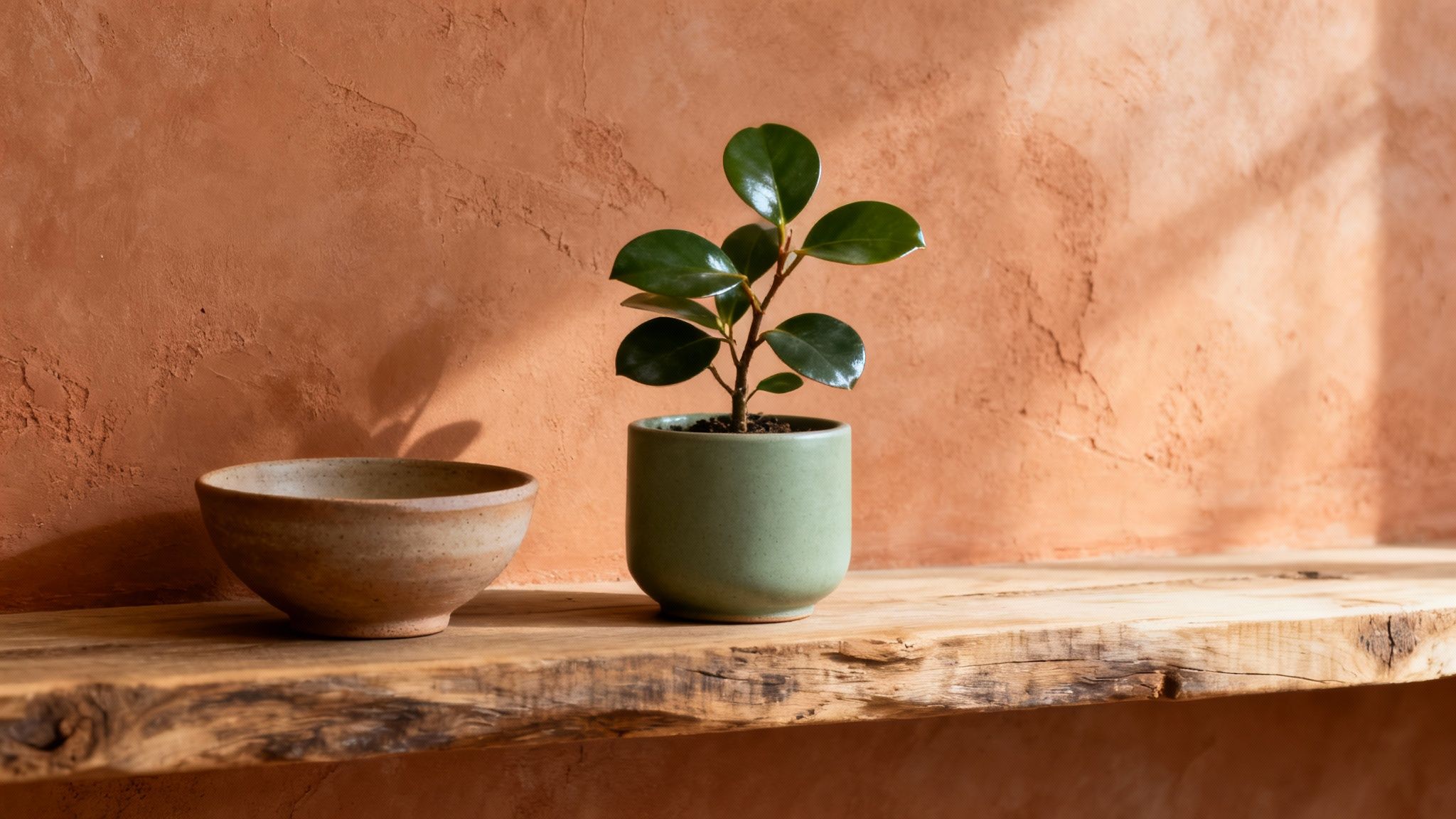
4. Green & Cream/Beige
Pairing green with cream or beige creates a soothing, organic, and incredibly sophisticated aesthetic. This combination channels an earthy warmth, evoking a sense of calm, sustainability, and closeness to nature. Unlike the crispness of pure white, cream and beige offer a softer, more inviting backdrop that allows various shades of green to feel grounded and natural. It’s a versatile palette that works beautifully in rustic, traditional, and even minimalist modern designs, promoting a feeling of comfortable elegance.
Why This Combination Works
The warm undertones in cream and beige perfectly complement the natural essence of green, making this pairing one of the most harmonious colours that match with green for creating a tranquil atmosphere. This duo is frequently used by eco-conscious brands and in wellness spaces to communicate a connection to the natural world. It creates a gentle contrast that is easy on the eyes, making it ideal for creating relaxing sanctuaries like bedrooms and living rooms where comfort is key.
Practical Styling Tips
To achieve a balanced and layered look, use cream or beige as your base colour to establish a warm, welcoming foundation.
- Incorporate Natural Textures: Enhance the organic feel by introducing materials like jute, rattan, light-toned wood, and unbleached linen. A beige sisal rug or cream bouclé armchair can add immense textural depth.
- Layer Green Tones: Mix different greens, such as a muted olive with a soft sage, to add complexity. This prevents the colour scheme from appearing one-dimensional.
- Add Natural Accents: Complete the look with elements like stone coasters, terracotta pots, or wooden furniture to reinforce the earthy, nature-inspired theme.
5. Green & Gold/Brass
The union of green and gold or brass is a truly luxurious pairing, creating an aesthetic that exudes opulence and sophistication. This combination elevates the natural, grounding quality of green with the warm, reflective richness of metallics. It communicates a sense of high-end style and prosperity while maintaining a connection to nature and growth, making it an excellent choice for creating a space that feels both glamorous and inviting. This duo is frequently seen in luxury hotel lobbies, high-end restaurants, and premium product branding.
Why This Combination Works
Gold and brass add a touch of warmth and light that beautifully complements the cool, earthy tones of green. This pairing works so well because it balances the organic with the ornate. Deeper shades like emerald or forest green create a dramatic, moody backdrop for gleaming gold accents, while lighter greens like mint or sage produce a softer, more subtle art deco feel. It's one of the most effective colour combinations for adding instant glamour.
Practical Styling Tips
The key to mastering this look is to use metallics as an accent rather than a dominant colour to avoid an overwhelming effect.
- Accessorise with Metallics: Introduce gold or brass through smaller elements like picture frames, light fixtures, cabinet handles, or mirror frames.
- Balance with Finishes: Pair a shimmering gold tap with a matte-finish green tile backsplash to create a sophisticated contrast in textures.
- Embrace Deep Greens: For a truly decadent look, use a deep emerald or forest green on walls or a feature piece of furniture, then layer in your brass accessories.
This combination is perfect for creating a warm and refined atmosphere. For more tips on making your space feel inviting, explore these cosy home ideas to enhance your décor.
6. Green & Terracotta/Rust
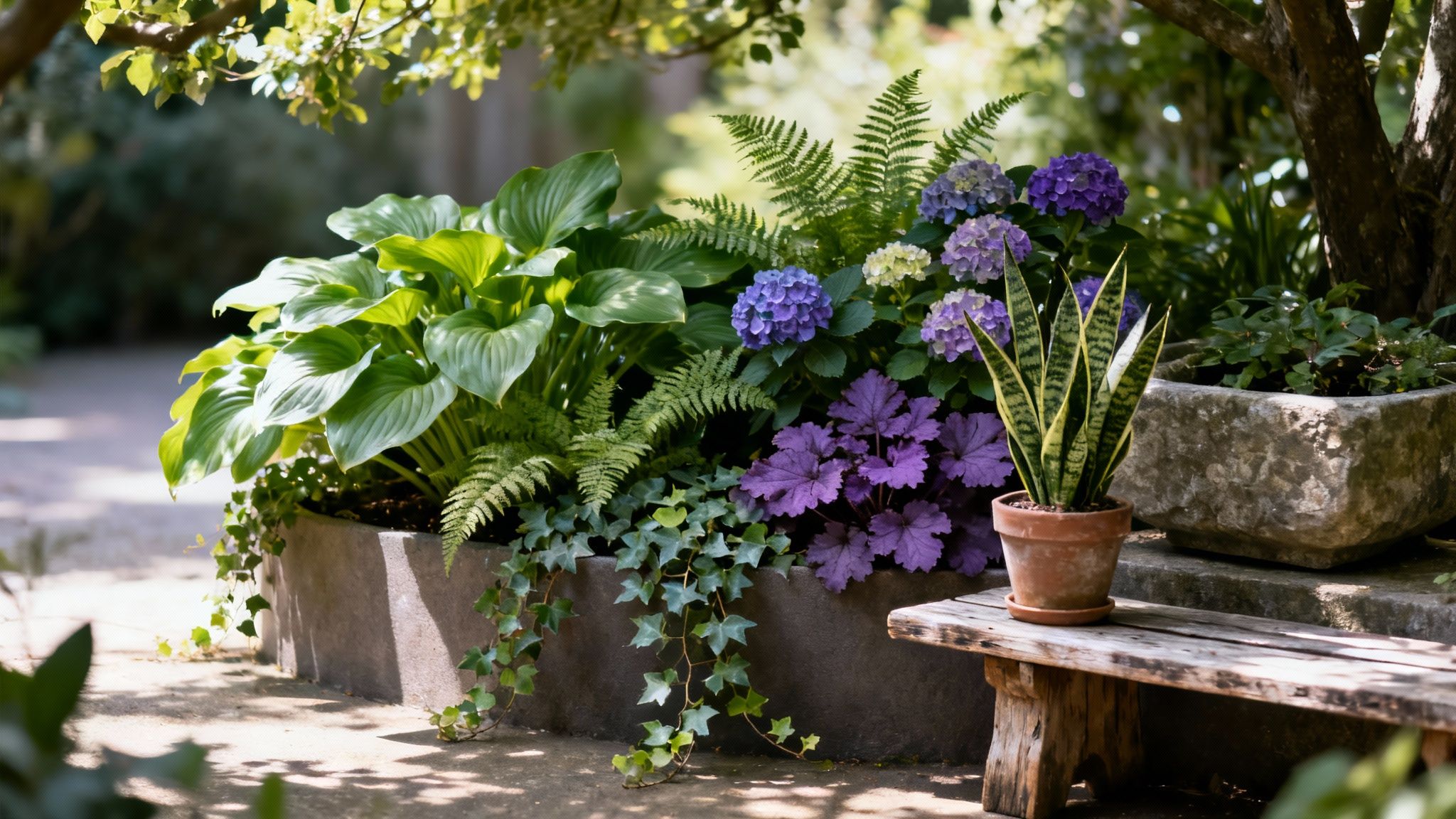
The combination of green and terracotta or rust offers an earthy, grounding palette that feels deeply connected to nature. This pairing evokes images of sun-baked earth, lush foliage, and artisanal clay, creating a warm, organic, and bohemian aesthetic. As one of the most natural colours that match with green, terracotta brings a comforting warmth that beautifully complements the cool, fresh tones of green. Its strength lies in its ability to create a space that feels both rustic and sophisticated, inviting and rich with character.
Why This Combination Works
Terracotta and rust are warm, earth-toned colours that sit opposite green on the colour wheel, creating a complementary relationship that is visually stimulating yet balanced. This pairing is foundational in Mediterranean and Southwestern design styles, celebrating natural materials and a connection to the landscape. It’s also popular in plant nurseries and eco-tourism branding to create an authentic, grounded feel that speaks to sustainability and nature.
Practical Styling Tips
To achieve this organic look, focus on raw materials and a balanced distribution of colour to create an immersive, welcoming atmosphere.
- Balance the Colours: For a harmonious feel, consider a near 50-50 split. A deep green feature wall, for example, can be beautifully balanced with terracotta-hued soft furnishings like cushions, rugs, or throws.
- Incorporate Natural Textures: Enhance the earthy vibe by introducing materials like unglazed clay pots, raw wood furniture, jute rugs, and linen fabrics. These textures add depth and tactile interest.
- Embrace Matte Finishes: Opt for matte or chalky finishes on walls and decor. A matte terracotta paint or limewash will provide a more authentic, artisanal feel than a high-gloss alternative.
7. Green & Blush Pink
The pairing of green and blush pink is a modern, playful combination that creates a soft yet sophisticated atmosphere. This duo expertly balances the natural, earthy quality of green with the gentle, feminine touch of delicate pink tones. The result is a contemporary and approachable aesthetic that feels both on-trend and enduring. It's a popular choice in fashion and branding, particularly with millennial-focused retail spaces, as it feels fresh, inviting, and effortlessly chic.

Why This Combination Works
Blush pink provides a warm, subtle counterpoint to the coolness of many greens, particularly muted shades like sage or olive. This pairing creates a harmonious contrast that is visually pleasing without being overwhelming, evoking feelings of calm, romance, and well-being. Its success lies in its ability to soften a room, making it feel more personal and welcoming, which is why it’s often seen in beauty startups and influencer branding to convey approachability and style.
Practical Styling Tips
To achieve a polished look with this pairing, aim for balance and sophistication, allowing the colours to complement each other rather than compete.
- Choose Muted Shades: Opt for a soft sage or moss green paired with a dusky, millennial pink. This keeps the look refined and prevents it from appearing overly sweet.
- Embrace Minimalism: A minimalist approach works best. Use one colour as the base and the other for accents to maintain a clean, uncluttered feel.
- Add Metallic Accents: Introduce brass, copper, or gold elements through light fittings, frames, or decorative objects to add a touch of glamour and sophistication.
This colour scheme is wonderfully versatile for creating a serene yet stylish space. For more ideas on integrating such palettes, explore these inspiring living room colour ideas for your home.
8. Green & Charcoal Black
Pairing green with charcoal black creates a striking, contemporary look that exudes sophistication and drama. This high-contrast combination is bold and impactful, merging the organic, vibrant energy of green with the grounding, serious nature of deep charcoal. It’s a modern and elegant choice that works exceptionally well in spaces designed to make a statement, offering a powerful aesthetic that feels both luxurious and balanced. The depth of charcoal allows any shade of green, from emerald to mint, to pop with intensity.
Why This Combination Works
Charcoal black provides a strong, neutral anchor that enhances the richness and saturation of green without overwhelming it. This pairing is often seen in high-end branding and contemporary fashion, where it conveys a sense of modern luxury and confidence. In interior design, it can be used to create a moody, atmospheric space or a sharp, graphic look, depending on the balance and application of the two colours.
Practical Styling Tips
To use this dramatic duo effectively, focus on balance to prevent the space from feeling too heavy or dark. It’s one of the most powerful colour combinations that match with green for a modern aesthetic.
- Introduce a Softening Element: Use crisp white or light grey accents in trims, ceilings, or textiles to break up the intensity and add a breath of fresh air.
- Play with Green Saturation: Combine a muted sage green wall with bold charcoal furniture, or use a vibrant lime green accessory to add a playful jolt of colour against a dark backdrop.
- Incorporate Natural Textures: Introduce elements like wood, leather, or woven fabrics to add warmth and tactile interest, preventing the scheme from feeling cold or one-dimensional.
9. Green & Deep Purple/Plum
The pairing of green with deep purple or plum creates a rich, sophisticated, and unexpectedly harmonious aesthetic. This bold combination exudes a sense of luxury, creativity, and modern drama, moving beyond more traditional palettes. It combines the natural, grounding quality of green with the regal and mysterious tones of deep purple, resulting in a look that feels both opulent and artistic. The duo is perfect for crafting spaces and designs that aim to be memorable and impactful.
Why This Combination Works
On the colour wheel, green and purple are neighbours to blue, creating a cool-toned analogue harmony that is visually pleasing yet dynamic. This pairing is often seen in high-end branding and luxury fashion, where it conveys quality and exclusivity. The depth of plum allows the vibrancy of greens like emerald or forest to stand out, creating a layered and visually interesting environment that feels curated and intentional.
Practical Styling Tips
This powerful duo works best when used deliberately to create a specific mood. For those looking for colours that match with green in a more daring way, this is an excellent choice.
- Balance the Drama: For a bold statement, use green and plum in a near-equal split, such as plum-coloured seating against a dark green feature wall.
- Add Metallic Accents: Introduce touches of gold, brass, or copper through light fixtures, frames, or decorative objects to enhance the luxurious feel.
- Create Breathing Room: Incorporate a neutral like soft grey or creamy white in floors, ceilings, or larger furniture pieces to prevent the deep colours from overwhelming the space.
- Use in Key Elements: If painting entire walls feels too much, use this combination in accent pieces like artwork, cushions, rugs, or a standout armchair.
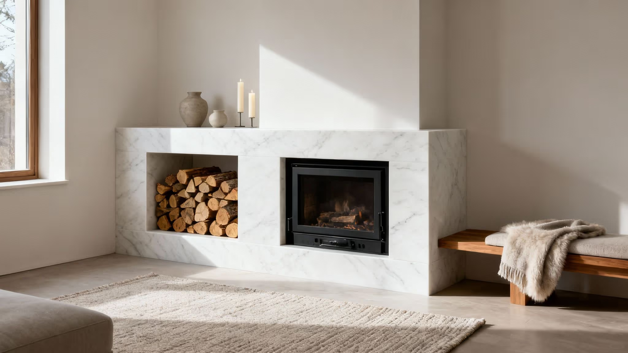
10. Green & Cream with Natural Wood
The trio of green, cream, and natural wood creates a holistic and deeply organic aesthetic. More than just a simple colour pairing, this combination crafts an entire atmosphere of warmth, sustainability, and connection to the natural world. It moves beyond a two-colour scheme to build a complete palette that feels sophisticated and grounded. This approach is favoured in luxury wellness centres, high-end hospitality, and sustainable design projects for its ability to create serene, restorative environments that feel both elegant and earthed.
Why This Combination Works
This combination works because it mirrors the palettes found directly in nature. Cream provides a softer, warmer alternative to stark white, acting as a neutral base that enhances the richness of both the green and the wood tones. The wood introduces texture, depth, and a timeless quality that green and cream alone cannot achieve. Together, they form a balanced, harmonious scheme that is calming to the senses, making it an excellent choice among colours that match with green for creating relaxing sanctuaries.
Practical Styling Tips
To achieve a cohesive look, focus on balance and layering the different natural elements throughout your space.
- Vary Your Wood Tones: Don't limit yourself to one type of wood. Mix light woods like oak or ash with darker tones like walnut to add richness and visual interest.
- Layer Greens: Use cream as your main background on walls and introduce green through various fabrics and accents. Think olive green linen curtains, a sage velvet sofa, and an abundance of houseplants.
- Incorporate Natural Textures: Enhance the organic feel by adding other natural materials. Elements like stone, clay pottery, jute rugs, or woollen throws will complement the wood and soft colours beautifully.
Top 10 Color Matches for Green
Bringing Your Green Vision to Life
As we've journeyed through the spectrum of possibilities, it's clear that green is far more than just a single colour; it's a versatile foundation for countless design narratives. From the crisp, classic elegance of green and white to the moody sophistication of charcoal and deep plum, the key to unlocking its potential lies in understanding the power of a well-chosen palette. This exploration has armed you with a diverse toolkit of colours that match with green, moving beyond theory into practical, actionable strategies for your home and garden.
The most crucial takeaway is that the 'right' combination is deeply personal. It's about how a colour pairing makes you feel and the atmosphere it cultivates in your daily life. Whether you seek a tranquil retreat or a vibrant hub for socialising, the principles we've discussed provide a reliable starting point for your creative experiments.
Your Next Steps to a Greener Space
Feeling inspired? The best way to move forward is to take one or two of your favourite combinations and put them to the test. Don't be afraid to start small and build confidence.
- Gather Samples: Before committing to a full room makeover, collect fabric swatches, paint sample pots, and material textures. See how they interact with the unique light in your space throughout the day.
- Introduce Accent Pieces: Not ready for a full-scale renovation? Introduce a new colour pairing through cushions, throws, artwork, or a statement vase. This is a low-commitment way to see how you feel about a new palette.
- Focus on a Single Zone: Select a small area, like a reading nook or a patio corner, to try out a new scheme. A focused project can deliver a significant impact without overwhelming your time or budget.
Mastering these colour combinations is more than just a decorative exercise; it’s about crafting an environment that truly supports and reflects your lifestyle. A well-designed space can enhance your mood, boost your creativity, and provide a genuine sense of sanctuary from the outside world.
Ultimately, the true beauty of green lies in its inherent connection to nature and its remarkable ability to adapt. Let these pairings be the springboard for your imagination. Embrace the process of experimentation, trust your instincts, and allow the dynamic character of green to infuse your home and garden with renewed energy and style. The perfect green-inspired haven is not just a possibility; it's waiting for you to bring it to life.