The dining room is more than just a place to eat; it's the heart of entertaining, family gatherings, and quiet weeknight dinners. The colours on your walls set the entire mood, influencing conversation and even appetite. Choosing the right dining room colours can feel daunting, but it’s the most impactful way to transform the space from merely functional to truly inviting. A well-chosen palette can make a small room feel grand, a large room feel intimate, or a dark room feel bright and airy. It is the foundational element that dictates every other design choice, from furniture and lighting, to tableware and art.
This guide is curated for discerning home enthusiasts who appreciate inspired design and actionable advice. We have gathered 10 distinct and versatile colour schemes, complete with specific paint ideas, practical styling tips, and key considerations for lighting and room size. Whether you crave a dramatic, jewel-toned sanctuary for sophisticated dinner parties or a calming, botanical haven for relaxed family meals, you will find a palette here to spark your creativity. Let's explore the colours that will redefine your home's central gathering space and help you create a dining room you will love for years to come.
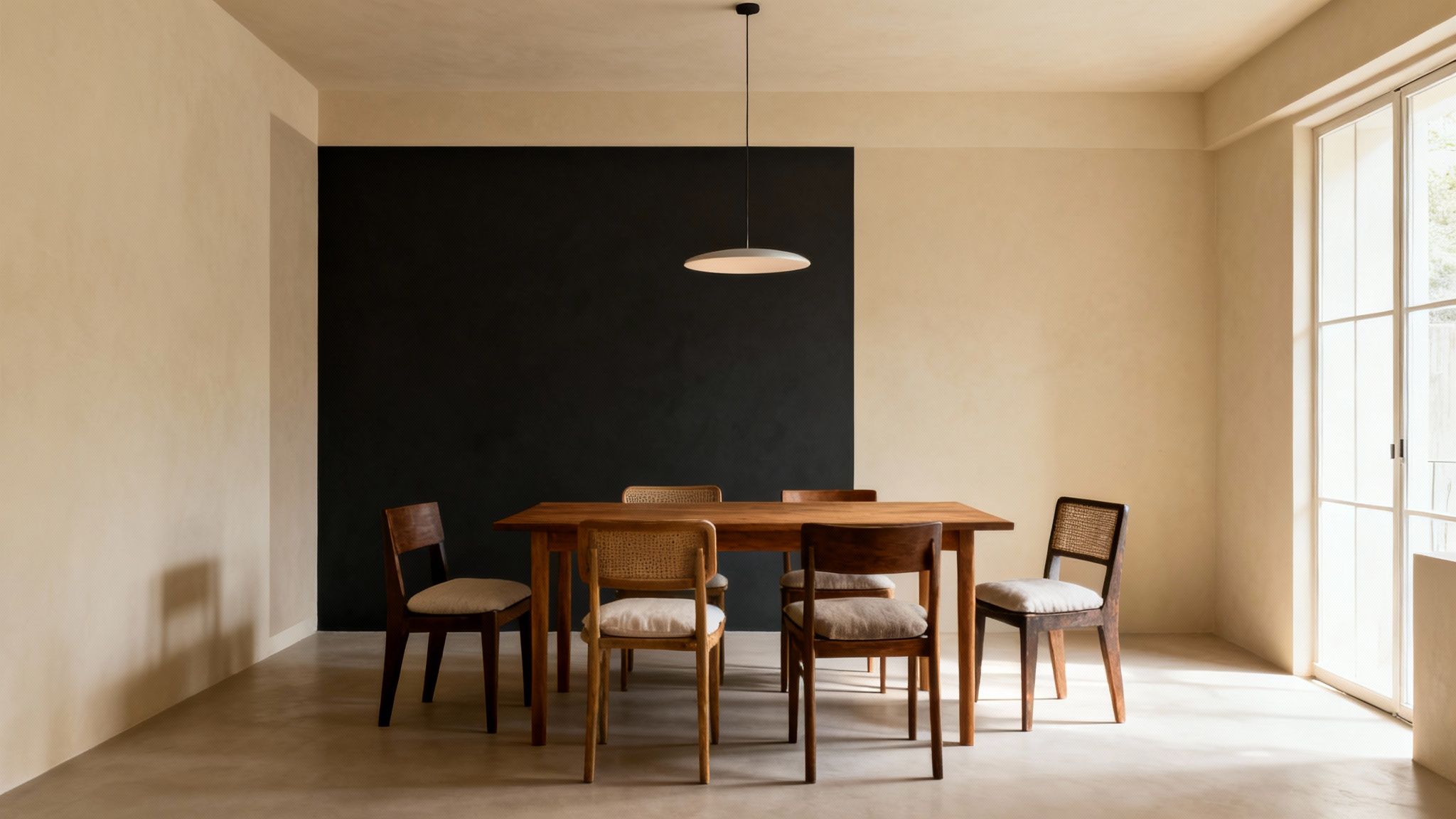
1. Warm Neutral with Accent Wall
Combining a warm, neutral base with a single, dramatic accent wall is a sophisticated strategy for adding depth and personality to your dining space. This approach allows you to introduce bold dining room colours without overwhelming the room, creating a focal point that maintains an inviting and elegant atmosphere. It's a timeless choice, perfect for creating a backdrop that feels both contemporary and classic.
This method works by using soft, calming colours like cream, taupe, or soft grey on three walls to make the room feel open and bright. The fourth wall, typically the one behind the main dining table or a sideboard, is then painted in a deeper, contrasting shade. This draws the eye, anchors the furniture, and adds a layer of curated style.
Why It Works
An accent wall provides the perfect balance between subtlety and impact. It creates visual interest and can help define a specific zone within an open-plan living area. This technique is especially effective in dining rooms as it can make the space feel more intentional and formal, ideal for hosting guests. For a deeper understanding of how to balance tones, you can explore our guide on how to choose paint colours.
How to Implement This Colour Scheme
- Colour Pairing: Create a high-impact look by pairing Farrow & Ball's 'Wimborne White' on the main walls with a dramatic 'Railings' charcoal accent. For a warmer, earthier feel, try combining a soft taupe with a deep terracotta or rust accent wall.
- Placement is Key: Always choose the wall you want to be the centre of attention for your accent. The wall behind the dining table is the most common and effective choice.
- Tie It Together: Weave your chosen accent colour into the room's décor. Use it for placemats, napkins, a vase, or a piece of art to create a cohesive, professionally designed look.
- Consider the Finish: Opt for a durable paint finish like a wipeable matt or eggshell for the accent wall, as it will likely be in a high-traffic area.
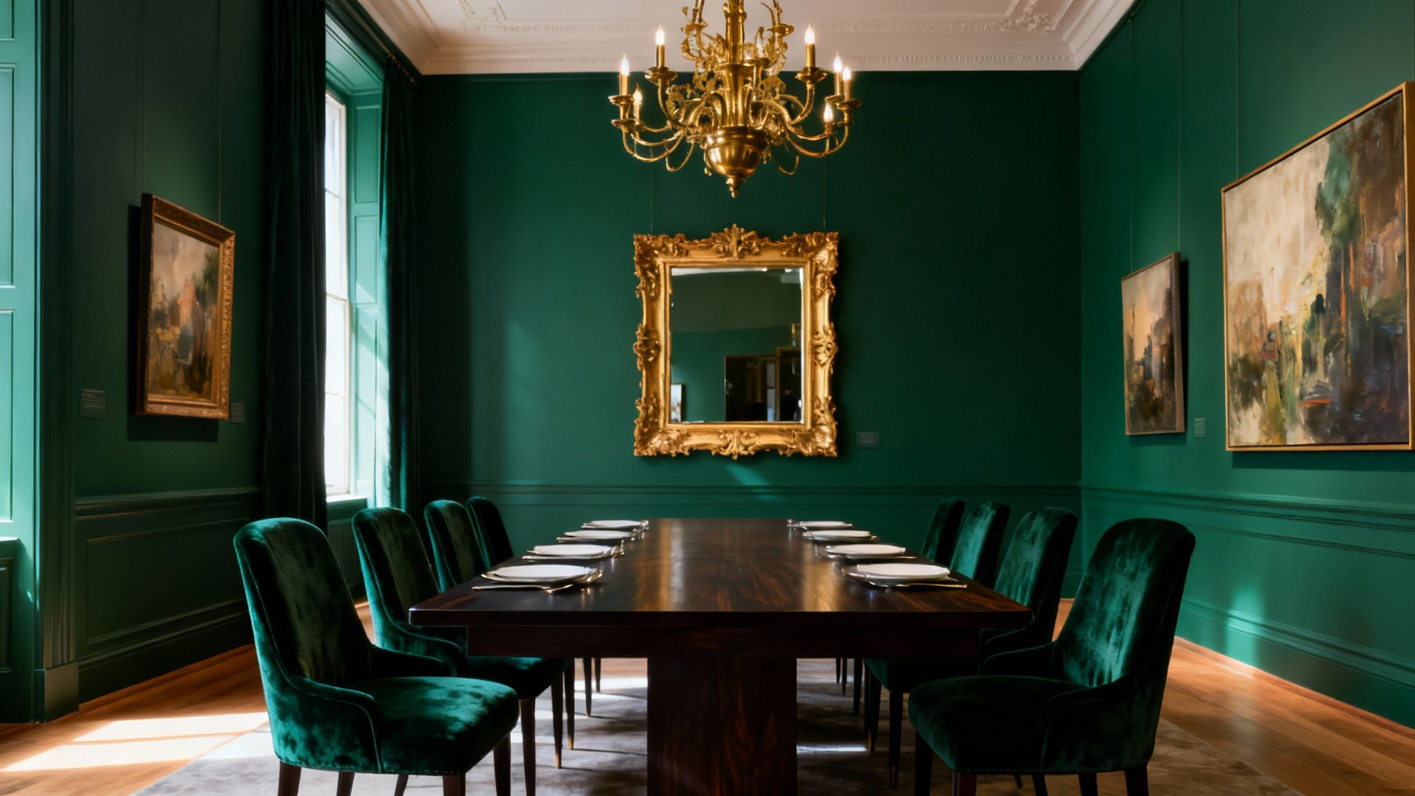
2. Deep Jewel Tones (Emerald, Sapphire, Amethyst)
Embracing deep, saturated jewel tones is a bold move that transforms a dining room into a luxurious and intimate sanctuary. Rich colours like emerald green, sapphire blue, and deep amethyst, inspired by precious gems, create an atmosphere of opulence and drama. This approach is perfect for those wanting to make a statement, establishing a sophisticated space ideal for memorable dinner parties and formal gatherings.
These dining room colours wrap the space in a cosy yet glamorous feel, making it feel distinct and purposeful. The intensity of the shades adds depth and character, turning the room into a jewel box that encourages lingering conversations. Paired with the right lighting and accents, jewel tones deliver an unapologetically elegant and high-end aesthetic.
Why It Works
Jewel tones convey a sense of history and luxury, instantly elevating the perceived value of a space. They work exceptionally well in dining rooms because these areas are often used in the evening, where the deep colours create a moody and inviting ambience under artificial light. This scheme is particularly effective for homeowners who love to entertain and want their dining area to feel like a special destination within their home.
How to Implement This Colour Scheme
- Lush Palettes: For a classic, decadent look, use a deep emerald like Graham & Brown's 'Adeline' on all walls. Pair it with a statement brass chandelier and mirrors with gold frames to reflect light and add glamour.
- Balance with Light: Prevent the room from feeling too dark by using crisp white on the ceiling and trim. Incorporate lighter-coloured furniture, such as a pale wood table or cream upholstered chairs, to provide a beautiful contrast.
- Layer with Metallics: Metallic accents are essential for this look. Weave in gold, brass, or copper through light fixtures, cutlery, and decorative objects to enhance the luxurious feel and bounce light around the room.
- Invest in Lighting: Sufficient lighting is non-negotiable. A dimmer switch is crucial, allowing you to create a bright setting for dining or a softer, atmospheric glow for after-dinner drinks.
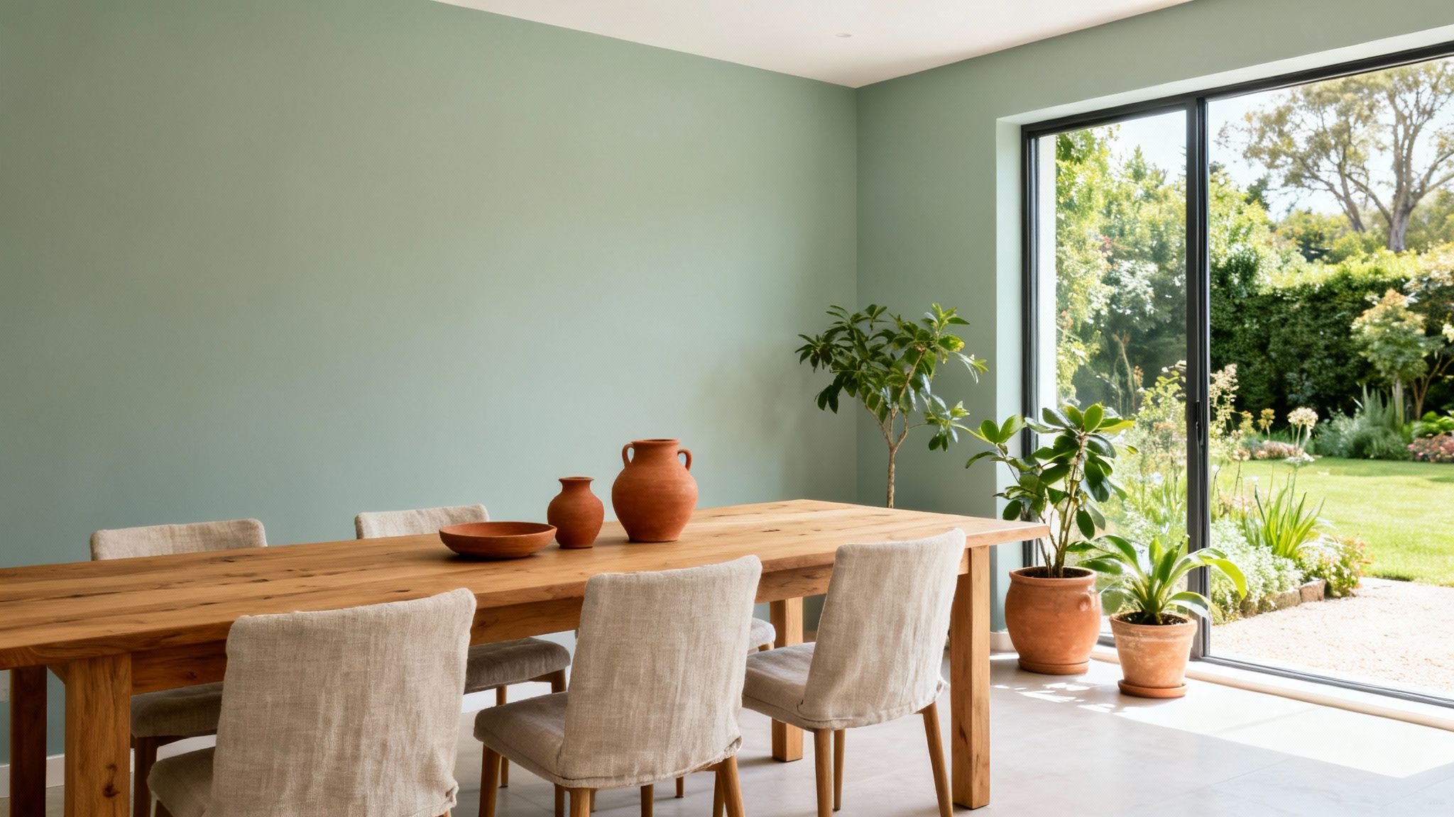
3. Soft Sage and Botanical Green
Muted, nature-inspired green tones create a calming and welcoming dining environment, connecting your interior spaces to the garden. Soft sage and botanical greens are versatile, contemporary dining room colours that foster a peaceful atmosphere, making them perfect for quiet family dinners and multi-generational gatherings. This palette evokes a sense of tranquility and effortless elegance.
These greens work by borrowing from the natural world to make a room feel grounded and serene. Colours like celadon, pistachio, or sage act as sophisticated neutrals, providing a soothing backdrop that doesn't overwhelm. They pair beautifully with natural textures, enhancing the connection to the outdoors and creating a space that feels both refreshing and timeless.
Why It Works
This colour scheme is inherently calming, which is ideal for a space meant for conversation and relaxation. It's a fresh alternative to traditional neutrals that adds a subtle hint of colour while maintaining a bright, airy feel. The connection to nature is known to promote well-being, turning your dining room into a restorative retreat. For more ideas on using these shades throughout your home, explore our guide to green living room ideas.
How to Implement This Colour Scheme
- Colour Pairing: For a soft, heritage feel, pair Farrow & Ball's 'Cromarty' with 'Wimborne White' woodwork. For a slightly richer look, try 'Pigeon' on the walls with natural wood furniture and terracotta accents.
- Embrace Natural Materials: Enhance the botanical connection by incorporating natural elements. Think wooden tables, linen chairs, rattan light fixtures, and ceramic tableware.
- Incorporate Greenery: Reinforce the theme by adding real plants or high-quality botanical artwork. A simple vase of eucalyptus or a collection of potted herbs can bring the scheme to life.
- Choose the Right Finish: A soft, chalky matt finish enhances the natural, earthy quality of these greens, giving walls a modern yet authentic texture.
4. Classic Navy Blue with White Trim
Pairing deep navy blue walls with crisp white trim is a timeless and powerful strategy for creating a dining room that exudes sophistication and formality. This classic combination evokes a sense of heritage and structure, making it perfect for hosting memorable dinner parties and formal gatherings. It is one of the most enduring dining room colours for those seeking a look that is both dramatic and dependably elegant.
The concept works by creating a sharp, high-contrast look that highlights the architectural details of a room. The deep navy provides a rich, enveloping backdrop, while the brilliant white on skirting boards, coving, and window frames offers a clean, structured outline. This contrast makes the space feel deliberate, organised, and refined.
Why It Works
This colour scheme lends an instant air of gravitas and classic style to a dining space. The dark walls create an intimate, cosy atmosphere, encouraging guests to linger, while the white elements prevent the room from feeling too heavy or enclosed. It’s a versatile look, popularised by classic American and British country house design, that feels both grand and inviting. For more ideas on using cool tones, you can find inspiration in our guide to blue and grey living room ideas.
How to Implement This Colour Scheme
- Choose the Right Navy: For a traditional feel, select a deep, true navy like Farrow & Ball's 'Hague Blue'. For a slightly softer, more modern interpretation, consider a navy with grey undertones.
- Emphasise with White: Use a brilliant, pure white for trim to achieve the sharpest contrast. A durable satin or eggshell finish will keep the woodwork looking crisp and is easy to clean.
- Warm It Up: Prevent the scheme from feeling cold by introducing warm metallics. Brass or gold light fixtures, candlesticks, and cutlery will beautifully complement the deep blue.
- Balance with Wood: Warm-toned wood furniture, such as a mahogany or oak dining table, provides a necessary natural element that balances the cool tones of the walls.
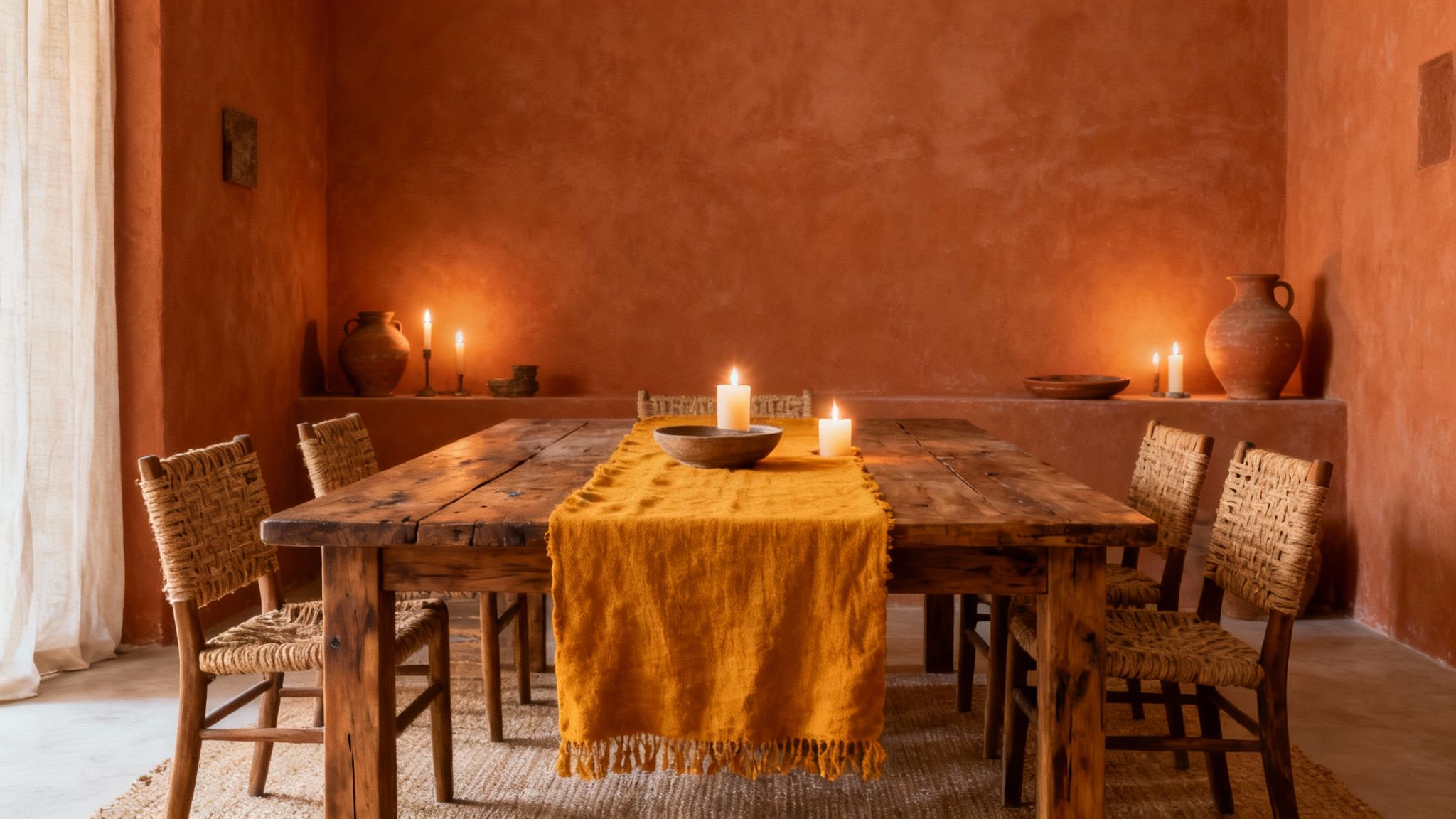
5. Warm Terracotta and Ochre
Drawing inspiration from Mediterranean landscapes and rustic interiors, a palette of warm terracotta and ochre creates a dining space that is both convivial and deeply inviting. These earthy dining room colours envelop the room in a gentle warmth, fostering a sense of hospitality and encouraging long, leisurely conversations around the table. This choice is perfect for those aiming for a bohemian, artisanal, or globally-inspired dining atmosphere.
These rich, clay-based tones work by grounding the space and adding a layer of organic texture and character. Colours like burnt orange, deep rust, and golden ochre mimic the sun-baked earth, making a room feel cosy and connected to nature. This palette transforms a simple dining area into an intimate and welcoming sanctuary.
Why It Works
Warm terracotta and ochre shades are inherently comforting and make people feel relaxed and at ease. This makes them exceptionally well-suited for a dining room, where the goal is to create a sociable and pleasant environment for sharing meals. The colours also have a timeless quality, rooted in historical and artisanal design traditions, giving the space a feeling of authenticity and curated style.
How to Implement This Colour Scheme
- Colour Pairing: For an authentic Mediterranean feel, try Farrow & Ball's 'Red Earth' on the walls, complemented by natural wood and cream-coloured trim. For a sunnier look, pair a golden ochre like Little Greene's 'Yellow-Pink' with off-white accents.
- Embrace Texture: Enhance the artisanal appearance by using textural paint finishes. Limewash or plaster effects will add depth and a handcrafted quality to the walls.
- Layer Natural Materials: This colour scheme thrives when paired with natural materials. Incorporate rustic wood furniture, woven textiles, and clay or ceramic pottery to build an authentic, layered look.
- Warm Metallic Accents: Integrate warm metals like copper, brass, or bronze through light fixtures, cutlery, or decorative objects. These accents will reflect light beautifully and amplify the room's inherent warmth.
6. Soft Grey with Metallic Accents
Creating a contemporary and sophisticated atmosphere, soft grey provides a versatile neutral canvas that is beautifully enhanced by metallic finishes. This pairing of muted grey with the lustre of gold, brass, or chrome introduces a sense of modern elegance, crafting a dining room that feels both luxurious and welcoming. It's an ideal choice for those who appreciate understated yet impactful design.
This scheme works by using soft grey as a calming, sophisticated base, allowing metallic elements to truly shine. The grey walls prevent the space from feeling cold or clinical, while accents in gold, silver, or copper add warmth, light, and a touch of glamour. The result is a balanced and polished aesthetic that elevates the dining experience.
Why It Works
A soft grey backdrop is timeless and allows for immense flexibility in styling. The addition of metallic accents injects personality and prevents the neutral palette from appearing flat. This combination of dining room colours is particularly effective at reflecting light, making the space feel brighter and more dynamic, perfect for both intimate dinners and larger gatherings.
How to Implement This Colour Scheme
- Select Your Grey: Test grey paint samples in your room's specific lighting. A warm grey like Farrow & Ball’s ‘Elephant’s Breath’ pairs beautifully with brushed gold, while a cooler tone like ‘Cornforth White’ is stunning against polished chrome.
- Coordinate Metals: Stick to two or three metallic finishes for a cohesive look. For example, pair a brass chandelier with matching cabinet handles and picture frames.
- Balance with Texture: Introduce warmth by incorporating natural materials. A wooden dining table, linen curtains, or a wool rug will prevent the scheme from feeling too sterile.
- Add Personality: Use artwork and textiles to introduce pops of colour and personality, ensuring the space feels unique and inviting. Quality accessories will retain their lustre and impact over time.
7. Burgundy and Deep Wine Tones
Embracing burgundy and deep wine tones transforms a dining room into a space of refined elegance and intimate sophistication. These deeply saturated reds evoke a sense of luxury and tradition, perfect for creating a formal, restaurant-quality experience at home. This choice of dining room colours is bold and atmospheric, ideal for memorable dinners and special occasions.
The concept works by enveloping the room in a rich, warm hue that feels both comforting and dramatic. Shades like claret, merlot, and burgundy create a cocooning effect, making the space feel more intimate and encouraging guests to linger. When paired with opulent materials and considered lighting, these colours establish an unapologetically lavish and inviting atmosphere.
Why It Works
Deep wine tones are inherently associated with luxury, fine dining, and heritage aesthetics. This colour palette elevates the act of dining, making every meal feel like a significant event. It is particularly effective in dedicated dining rooms, where the goal is to create a distinct mood separate from the rest of the home, offering a sophisticated backdrop for entertaining.
How to Implement This Colour Scheme
- Colour Pairing: Commit to a rich, enveloping feel with a shade like Little Greene's 'Etruscan Red' on all walls. Balance this depth with a crisp white like 'Slaked Lime' on the ceiling and trim to prevent the space from feeling too heavy.
- Lighting is Crucial: These dark colours absorb light, so a well-planned lighting scheme is essential. Install a statement chandelier and wall sconces on dimmer switches to control the ambience from bright and formal to low and intimate.
- Luxurious Textures: Pair these powerful walls with rich materials. Velvet-upholstered chairs, a dark mahogany dining table, and silk or heavyweight linen curtains will complete the opulent look.
- Metallic Accents: Weave in gold or brass accents through light fixtures, mirror frames, and cutlery. These warm metals catch the light beautifully against the deep red background, adding a final layer of glamour.
8. Black Accent Walls with Light Contrasts
Using a black accent wall with light contrasts is a daring and sophisticated design choice that brings a contemporary, gallery-inspired feel to a dining room. This strategy uses the dramatic power of black to create a striking focal point, while light-coloured walls, trim, and furnishings provide balance, preventing the space from feeling too dark or enclosed. It’s an ideal scheme for those wanting to make a confident style statement.
This high-contrast approach works by grounding the room with a deep, dramatic anchor. A single black wall, or even black-painted panelling, draws the eye and makes lighter elements in the room pop. This interplay of light and dark adds architectural definition and an undeniable sense of modern luxury, turning the dining area into a curated, design-forward space.
Why It Works
A black accent wall introduces instant drama and depth, making it an excellent choice for a room dedicated to hosting and entertaining. The contrast with lighter tones, such as crisp white or warm wood, creates a dynamic visual tension that feels both bold and refined. This is one of the most effective dining room colours for highlighting artwork, metallic fixtures, and sculptural furniture.
How to Implement This Colour Scheme
- Strategic Placement: Use black on a single feature wall, such as the one behind a sideboard or the head of the table, to create impact without overwhelming the room.
- Balance with Light: Pair your black accent with off-white, soft grey, or cream on the remaining walls. Furnish with a light-coloured dining table or chairs to create a stark, stylish contrast.
- Introduce Texture: Soften the boldness of black with natural materials. A light wood table, linen curtains, a jute rug, or leather chairs will add warmth and texture to the space.
- Choose the Right Finish: The paint finish is crucial. A matte or eggshell finish will absorb light and create a velvety, sophisticated look, while a satin finish offers more durability. You can explore the difference between eggshell and satin to decide what's best for your space.
9. Warm Cream and Champagne with Subtle Patterns
For an atmosphere of understated elegance and timeless sophistication, a monochromatic scheme of warm cream and champagne is unparalleled. This approach focuses on layering soft, light-filled tones to create a serene and inviting dining space. Visual interest is introduced not through bold colour, but through subtle patterns and textures, adding depth while maintaining a refined aesthetic.
This classic combination works by using shades like ivory, champagne, and warm cream to build a cohesive and airy backdrop. The magic lies in the details: a delicate damask wallpaper, a textured wallcovering, or a botanical print can elevate the room from simple to stately. It’s an ideal choice for those who appreciate quiet luxury and want a dining room that feels both formal enough for special occasions and welcoming for family gatherings.
Why It Works
This colour palette creates a bright, expansive feel, making it perfect for both large and small dining rooms. The use of subtle patterns adds a layer of curated detail without overwhelming the senses, allowing architectural features and fine furniture to stand out. Popularised by traditional British country house aesthetics, this look evokes a sense of heritage and enduring style that will not date.
How to Implement This Colour Scheme
- Layer Tones and Textures: Combine a base wall colour like Little Greene’s ‘First Light’ with a feature wall in a subtly patterned wallpaper, such as a Sanderson damask print. Layer textures through linen curtains, a wool rug, and upholstered dining chairs.
- Choose Complementary Patterns: Select patterns that align with your home’s architectural style. A classic damask or stripe suits a traditional home, while a soft geometric or botanical print can work in a more contemporary setting.
- Lighting is Crucial: Ensure the room has ample lighting, both natural and artificial. Warm cream tones can appear yellowish in poor light, so a statement chandelier with warm-toned bulbs is essential to bring out their luminosity.
- Accessorise Thoughtfully: Add depth with curated accessories. Gilt-framed mirrors, antique silver, and high-quality table linens will enhance the scheme’s luxurious feel.
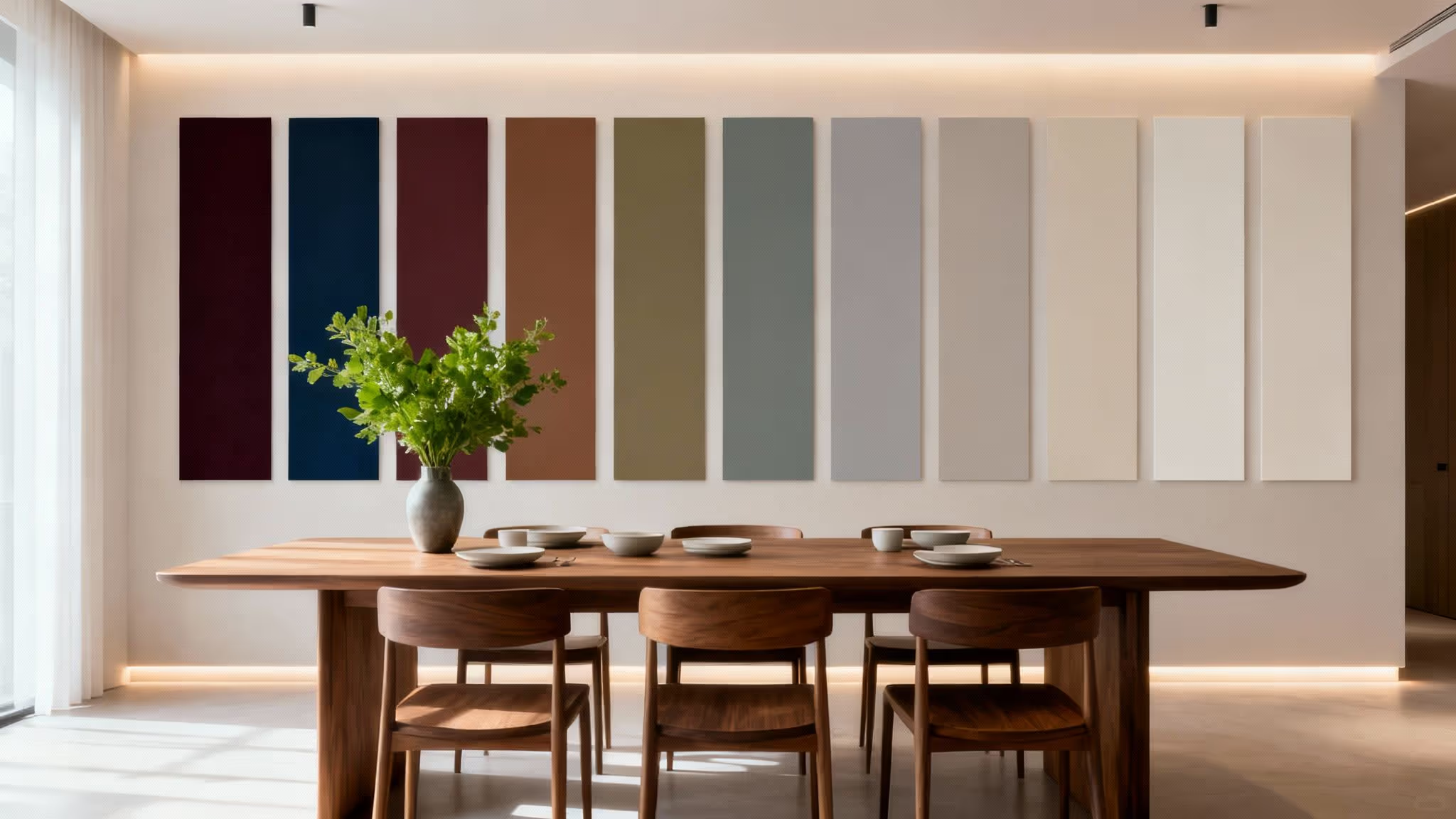
10. Dual-Tone or Colour-Blocking Dining Rooms
Colour-blocking is a contemporary design approach that divides walls, either horizontally or with geometric shapes, into two complementary colours. This modern technique adds architectural interest and artistic flair to a dining room, creating a sophisticated and balanced look. It appeals to those seeking a design-forward style, with options ranging from bold contrasts to subtle, tone-on-tone effects.
This method works by using two distinct shades to create visual separation and depth. A common application is painting the lower portion of the wall in a darker colour and the upper portion in a lighter one, which can make the ceiling feel higher. The division can be a crisp line, or it can be defined by a physical element like a dado rail for a more traditional touch.
Why It Works
Dual-tone walls introduce a dynamic and bespoke feel without committing to a full wall of a single bold colour. This technique can manipulate the perception of a room's proportions, making a space feel wider, taller, or more intimate depending on the placement of the dividing line. It’s an excellent way to showcase unique dining room colours in a structured, intentional manner. For more creative wall treatments, explore our guide to painting walls with innovative ideas.
How to Implement This Colour Scheme
- Proportion is Key: A classic approach is to divide the wall at dado rail height, about one-third of the way up from the floor. For a more modern look, consider a half-and-half split or an asymmetrical geometric design.
- Harmonious Pairing: Combine a rich lower wall in terracotta with a soft cream above for warmth. For a moodier, elegant space, pair a deep navy blue lower section with a soft grey upper.
- Define the Line: Ensure your dividing line is perfectly crisp for a professional finish. Use high-quality painter's tape and a spirit level. Alternatively, install a thin wooden batten or dado rail to create a clean, physical separation.
- Coordinate Furnishings: Balance your design by coordinating your furniture and décor with both colours. For instance, dining chairs could match the lower wall colour, while artwork pulls from the upper shade.
10 Dining Room Colour Schemes Comparison
Bring Your Vision to Life with Confidence
Choosing the right dining room colours is about so much more than just painting walls; it’s about crafting an atmosphere that reflects your personality and sets the stage for memorable moments. Throughout this guide, we've journeyed through ten distinct palettes, each offering a unique pathway to transform your space. From the earthy embrace of terracotta to the sophisticated drama of deep jewel tones, you now have a comprehensive toolkit to make an informed and inspired decision.
Remember the core principles we explored: warm neutrals create a versatile foundation, while bold choices like a black accent wall or rich burgundy can infuse a room with personality and depth. The soft, botanical feel of sage green connects your home to nature, just as classic navy blue offers a timeless elegance. The key is to see these ideas not as rigid rules, but as creative springboards.
Your Actionable Next Steps
To move from inspiration to implementation, follow this simple roadmap:
- Shortlist Your Favourites: Review the ten colour schemes and select the two or three that resonate most with your personal style and existing home décor. Consider the mood you wish to cultivate: is it energising and social, or calm and intimate?
- Gather Samples: Never commit to a colour based on a screen alone. Obtain sample pots or large paint swatches of your top choices. Observe them on different walls and at various times of the day to see how natural and artificial light alter their appearance.
- Evaluate Your Space: Revisit the advice on room size and lighting. A gorgeous, deep sapphire might feel magnificent in a large, bright room but could overwhelm a smaller, darker space without strategic lighting and metallic accents to lift it.
- Plan Your Full Palette: Your chosen wall colour is just one element. Think about how it will pair with your furniture, flooring, textiles, and trim. This holistic approach ensures a cohesive and professionally curated result.
Ultimately, the most successful dining room colours are the ones that bring you joy. This is your opportunity to be bold, experiment, and create a space that is a true extension of yourself. Trust your intuition, use the practical guidance provided, and embark on your decorating journey with the confidence that you are equipped to create a beautiful, functional, and inviting dining room where memories will be made for years to come.