Here’s the thing about white paint: there isn't one perfect shade. The secret is finding the right one for your room, a white that works with its unique light and quirks. It’s the difference between a crisp, cool white like Benjamin Moore’s Chantilly Lace and a soft, warm white like Farrow & Ball’s Wimborne White.
And that choice? It’s what takes a space from just okay to absolutely brilliant.
Why Choosing the Right White Paint Is So Important
We’ve all been there. Staring at a wall of white paint swatches, feeling completely overwhelmed because they all look… well, white. Yet every designer, blogger, and interiors-obsessed friend insists that getting it right is crucial.
They’re not wrong. The perfect white paint does so much more than just cover a wall; it completely transforms a room.
A well-chosen white can make a space feel brighter, bigger, and infinitely more stylish. It’s the ultimate canvas, making your furniture, artwork, and even the architectural details sing. But the wrong white? It can do the exact opposite, leaving a room feeling sterile, cold, or with an odd, unwanted tint of yellow or grey.
The Foundation of Good Design
Think of white paint as the foundation of your home’s design. Get it right, and everything else you layer on top just works. Its enduring popularity isn’t a fleeting trend; it’s a design staple. In fact, architectural coatings have long dominated the UK paints market, capturing a massive 68.25% share back in 2021. This is driven by residential projects where white reigns supreme, especially for creating those airy, light-filled spaces we all crave in our homes.
White is never just white. It’s the most complex colour because it’s influenced by everything around it—the light, the flooring, even the view from your window. Getting it right is the first step to a beautiful room.
Navigating the Nuances of White
Consider this your definitive guide to decoding the subtle world of white paint. We're here to demystify the concepts you need to understand to choose with confidence, helping you learn how to choose paint colours like a pro.
We’ll break it all down into simple, practical steps:
- Understanding Undertones: We'll show you how to spot the hidden cool, warm, or neutral hues in every tin of white.
- Assessing Light: Learn how natural sunlight and artificial bulbs can dramatically change how a paint colour looks on your wall.
- Coordinating Finishes: Get the lowdown on matching your wall, ceiling, and trim sheens for a polished, professional finish.
By the end of this, you'll have the know-how to pick a timeless white that feels just right for your home and your style. No more guesswork, just a creative win.
Understanding the Secret Language of White Paint Undertones
If there’s one secret to choosing the right white paint, it’s this: undertones. Think of it as the paint’s true personality—the subtle hint of colour hiding just beneath the surface that only reveals itself when you get it home. Don't be fooled by a name like 'White Dove'; it doesn't mean it's a pure, brilliant white.
It’s a bit like holding two different sheets of paper up to the light. Suddenly, one looks slightly creamier, and the other feels surprisingly crisp and grey. That hidden hue is the undertone, and learning to spot it is your best defence against common decorating mishaps, like a living room that feels accidentally clinical or a kitchen that looks faintly yellow.
The Three Families of White
Every white paint you’ll ever encounter belongs to one of three main families, each defined by its underlying colour. Getting your head around these categories is the key to creating the exact mood you’re after. Let’s break them down.
1. Cool Whites
Cool whites have undertones of blue, grey, or sometimes even a whisper of green. These are the shades that create a crisp, clean, and modern feeling. They’re brilliant at making spaces feel larger and more airy because they reflect light, giving everything a sharp, bright edge.
Just be mindful of your lighting. In a north-facing room that already gets cool, blueish light, a cool white can start to feel a bit sterile or even icy. Popular examples include Farrow & Ball's Blackened or Little Greene's Shirting.
2. Warm Whites
Warm whites are where you’ll find those yellow, beige, or reddish undertones. These are the colours that create a cosy, inviting atmosphere—perfect for rooms where you want to kick back and relax, like a living room or bedroom.
Instead of reflecting light, these whites tend to absorb it, making a space feel softer and more intimate. A classic example is Farrow & Ball's Wimborne White, which has a gentle yellow undertone that feels both timeless and welcoming. Exploring different neutral colours for your living room can give you even more ideas for building a warm palette.
3. True or Neutral Whites
Often called 'true' whites, these colours have very minimal or perfectly balanced undertones. They’re the most versatile of the bunch, offering a clean, gallery-like backdrop that doesn’t lean too heavily in either a warm or cool direction.
A neutral white is a fantastic choice if you want your artwork, furniture, and textiles to do all the talking. Dulux's Pure Brilliant White is a classic go-to, though it's worth remembering that even the most neutral whites can be subtly influenced by the colours and light around them.
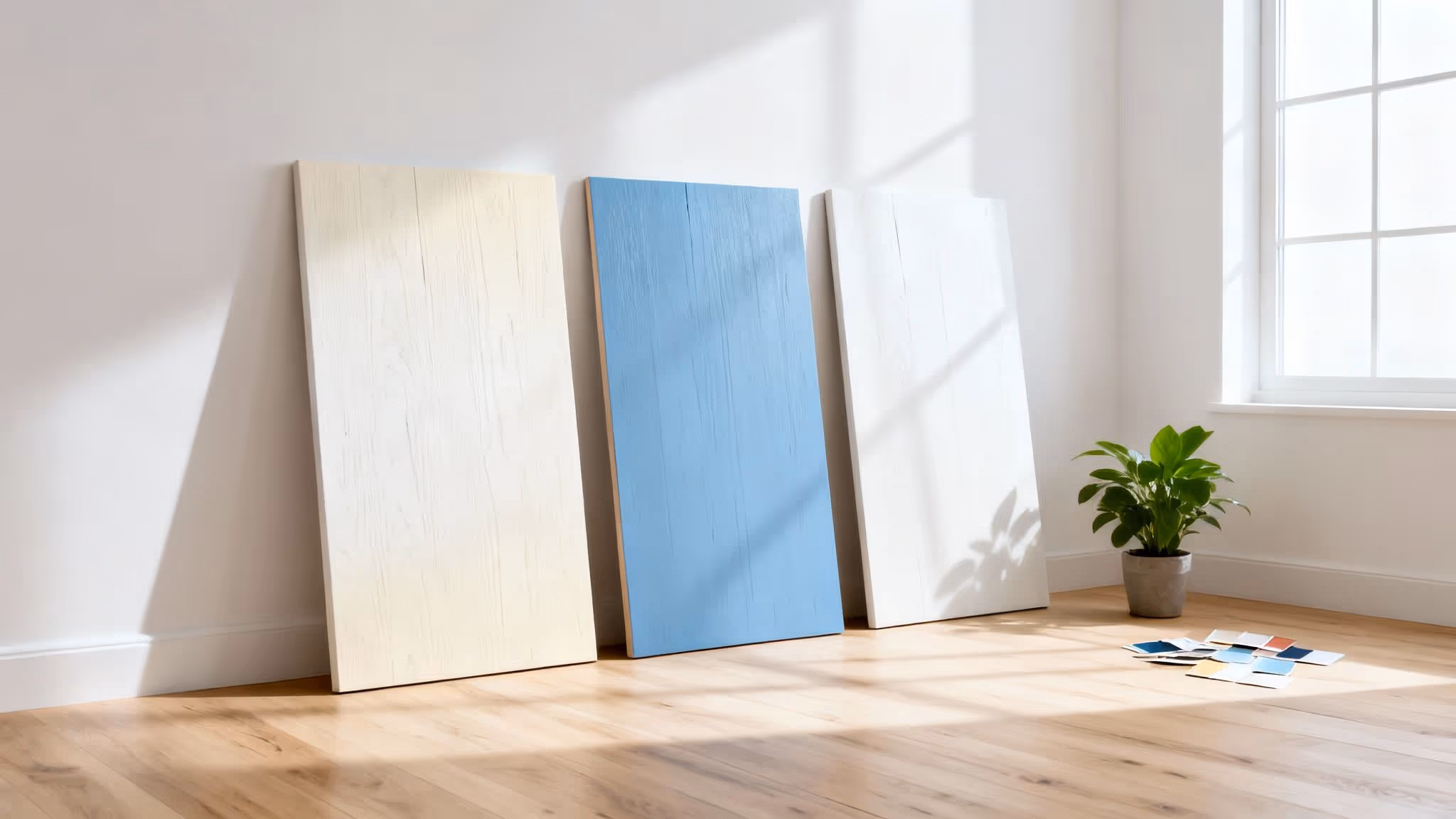
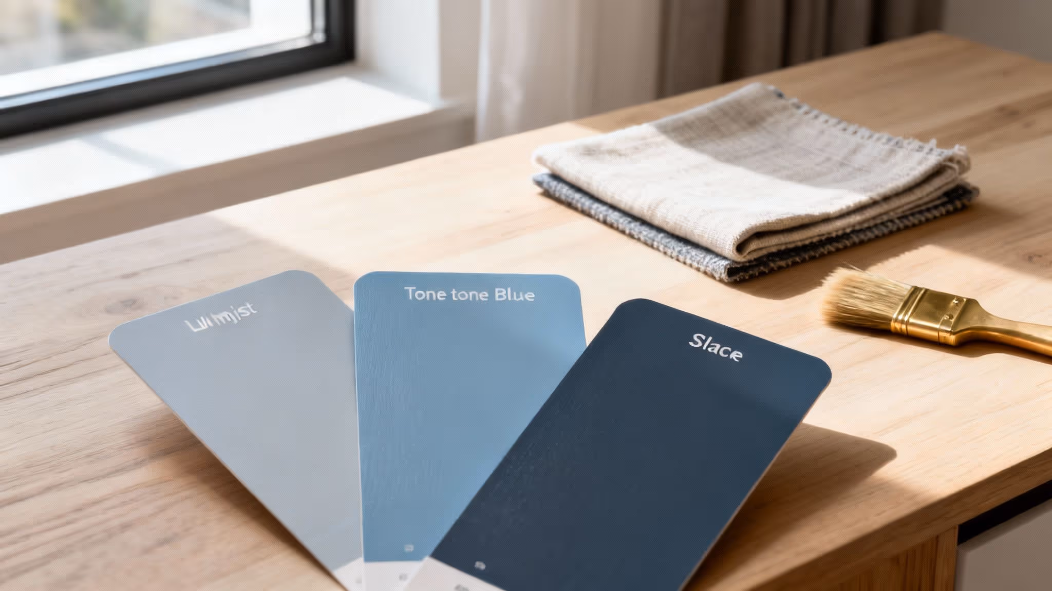
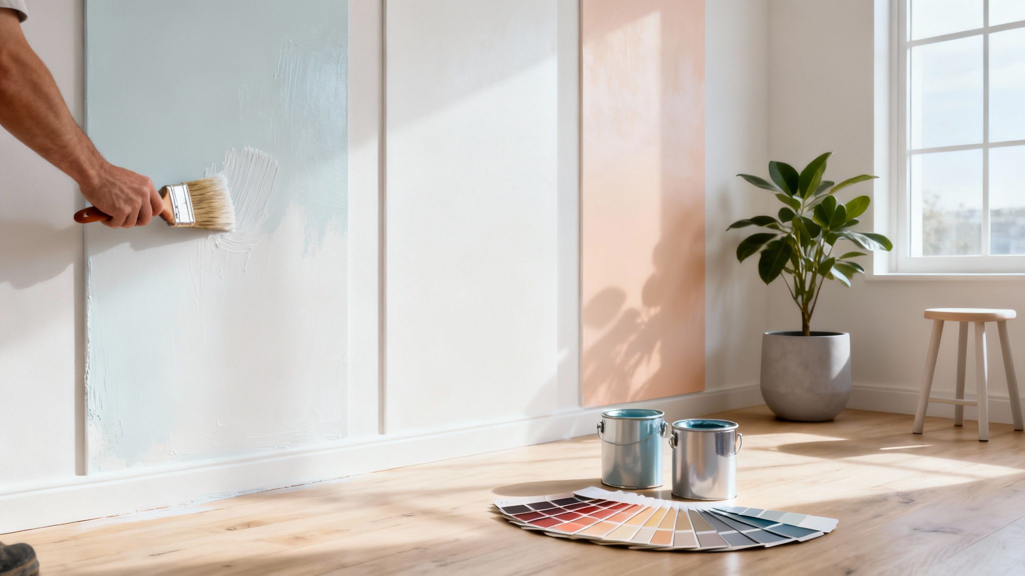
The secret to white paint is that one shade can make another look completely different. A cool white next to a warm white will make the warm one appear creamier, while the cool one will look even crisper. This is why testing is non-negotiable.
A Quick Guide to White Paint Undertones
Use this reference to quickly identify a white paint's undertone and understand the atmosphere it will help create in your space.
Once you start seeing these subtle differences, you'll be able to choose a white that works with your space, not against it.
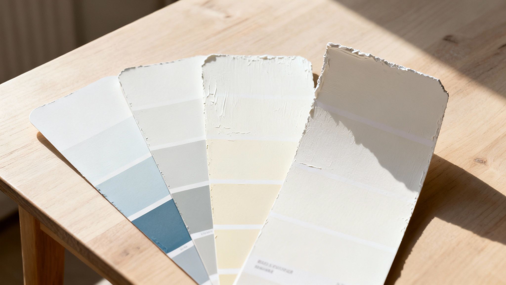
How to Spot Undertones Like a Pro
Trying to identify undertones on a tiny paint chip under the harsh lighting of a DIY shop is nearly impossible. So, don’t even try.
The best trick is to compare your potential white against a sheet of plain white printer paper. Hold the paint swatch right next to the paper, and the hidden hues will pop. The swatch will instantly look greyer, creamier, or perfectly balanced in comparison. Simple.
Another pro tip? Look at the darkest colour on the same paint strip. That deep shade often reveals the true colour family of the entire strip, giving you a massive clue about the undertone you’re dealing with. This little step can save you from choosing a white that clashes with your home’s existing finishes and gets you one step closer to the perfect shade.
How Natural and Artificial Light Transforms White Paint
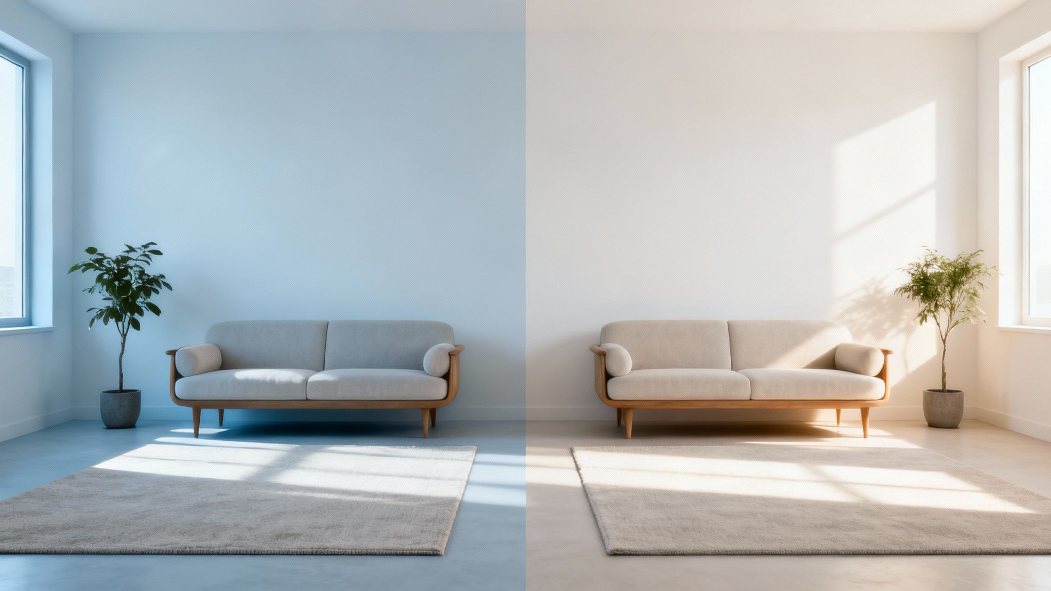
We’ve all been there. You’ve painstakingly chosen the best white paint colour from a tiny swatch, only to slap it on all four walls and realise it looks completely different. It’s a classic case of painter’s remorse, and the culprit is almost always the same: light.
Light is the final, transformative ingredient that dictates how your chosen white will actually feel in your home. It’s a dynamic force, revealing undertones and shifting the mood from sunrise to sunset.
A seemingly perfect neutral white can suddenly look cool and grey on a cloudy morning, or surprisingly creamy under the warm glow of evening lamps. Getting your head around this interplay is the secret to picking a white you’ll love at any time of day.
The Impact of Natural Light Direction
The direction your room faces is the single biggest player when it comes to natural light. Each orientation has its own distinct personality, and it will bring out a different side of your white paint.
- North-Facing Rooms: These rooms get a cool, indirect light for most of the day. This blue-ish light can make cool whites feel a bit sterile or icy. The trick here is to lean into a warmer white with a subtle yellow or pink undertone to create a balanced, cosy feel.
- South-Facing Rooms: The holy grail of natural light. Blessed with bright, warm sunshine all day long, these rooms are the most versatile. You can get away with both cool and warm whites, but a word of warning: a very warm white might look intensely yellow in the midday sun.
- East-Facing Rooms: You get that lovely, bright, warm light in the morning which becomes cooler and shadowier as the day wears on. A white that looks beautiful at breakfast might feel a bit flat by teatime. Look for a white with enough warmth to hold its own as the light changes.
- West-Facing Rooms: These are the opposite, feeling cooler in the morning and then getting bathed in a warm, almost orange glow in the late afternoon. A neutral or slightly cool white can stop the evening sun from making the walls look too fiery.
If your room really struggles for light, our guide on how to brighten a dark room has a few more clever tricks up its sleeve.
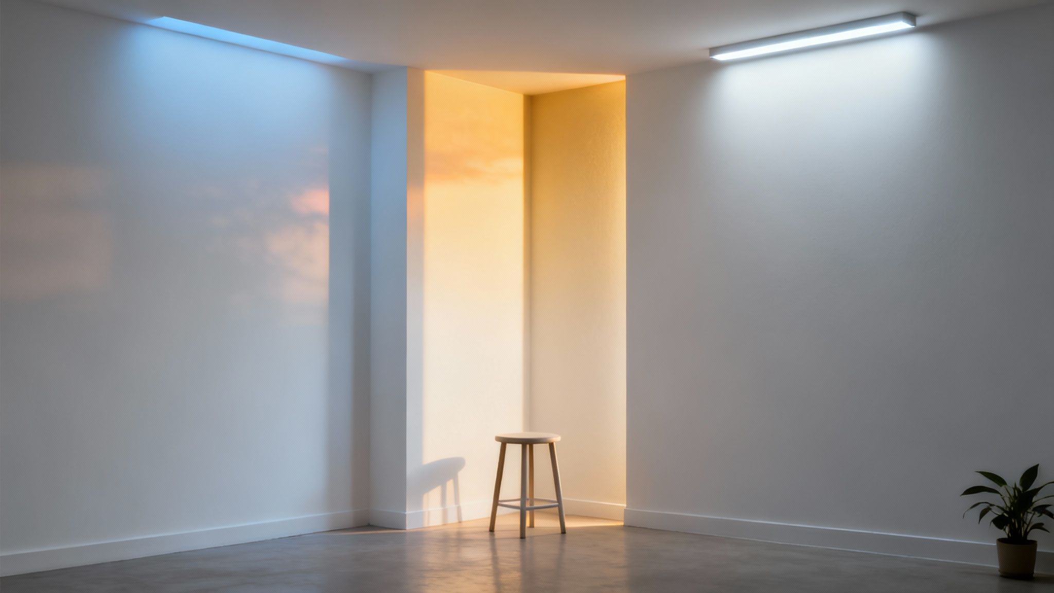
How Artificial Lighting Changes Everything
Once the sun goes down, your artificial lighting takes over, bringing a whole new set of rules to the game. The type of light bulb you use can completely change how your white paint looks after dark.
One crucial factor is something called Light Reflectance Value (LRV). The best white paints often have an LRV over 90, meaning they bounce back most of the light that hits them. This makes them brilliant at amplifying both natural and artificial light, making any space feel brighter.
This high reflectivity is why top-tier paints deliver such great opacity and longevity. The very best whites can achieve a light reflectance of 98-99%, which is a massive help in the UK for maximising the glow on grey days and keeping interiors feeling bright.
Choosing Bulbs to Complement Your White Paint
The colour temperature of your light bulbs, measured in Kelvins (K), is key. It will either flatter your paint's undertones or fight against them.
- Warm White Bulbs (2700K - 3000K): These give off a yellow, cosy glow, much like old-school incandescent bulbs. They’ll amplify the creaminess in a warm white and soften the crispness of a cool white.
- Cool White Bulbs (3500K - 4100K): These produce a brighter, more neutral light. They’re great for making cool whites look sharp and clean, but they can make warm whites look a bit dull or muddy.
- Daylight Bulbs (5000K - 6500K): These emit a blue-toned light that mimics natural daylight. They’ll highlight any blue or grey undertones in your paint and can feel quite stark in living areas, but they often work well in functional spaces like utility rooms.
By thinking about both the sunlight your room gets and the light bulbs you use, you can choose the best white paint colour that looks consistently beautiful, day and night.
Choosing the Perfect Finish for Walls, Ceilings and Trim
So, you’ve picked your perfect white. That’s a huge step, but the journey doesn’t stop there. Now comes the paint’s finish—or sheen—and it’s the detail that dictates not just how the colour looks, but how it lives in your home.
Think of it like choosing the fabric for a suit; the same colour looks completely different in matte linen versus a shiny silk.
Choosing the right finish is all about balancing aesthetics with practicality. It changes how light bounces around a room, how well the surface stands up to scuffs and sticky fingers, and ultimately, how pulled-together the final design feels. A clever mix of sheens is what gives a room that polished, professionally designed look.
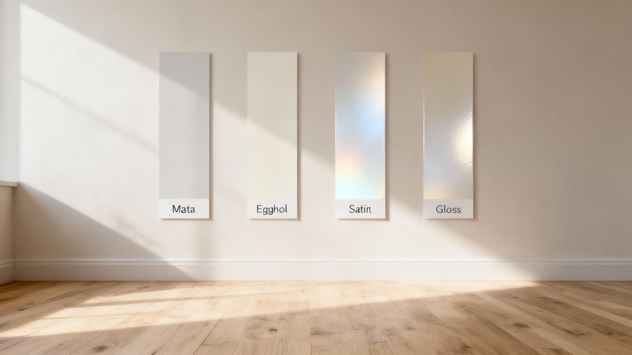
Decoding the Spectrum of Paint Sheens
First things first, you need to get to grips with the different finishes on offer. Each one has its own personality, making it a better fit for some jobs than others. A simple rule of thumb: as the sheen level goes up, so do the durability and the shine.
It's also worth noting the shift towards more eco-friendly options in the UK. Water-based paints, for instance, claimed a huge 44.14% market share back in 2023. These modern formulas are a brilliant choice if you're hunting for the best white paint colour, as they give a flawless finish that won’t yellow over time, no matter the sheen. You can dive deeper into the market stats over on Grandview Research.
From Flat Matte to Subtle Satin
Let's break down the most common finishes you'll be choosing between for your walls and ceilings.
Matte (or Flat): This finish has almost no shine at all, giving it a soft, velvety look. Because it doesn’t reflect light, it’s fantastic at hiding any little imperfections like bumps or hairline cracks. This makes it perfect for older properties or low-traffic areas like living rooms and adult bedrooms. The trade-off? It’s the least durable and can be a pain to clean.
Eggshell: A small step up from matte, eggshell has a very subtle sheen, a bit like the surface of, well, an egg. It’s a bit more durable and easier to wipe clean, making it a hugely popular all-rounder for most walls, including hallways and kids' bedrooms.
Satin: With a soft, gentle glow, a satin finish is more durable still. It bounces a little more light around the room and can handle a good wipe-down, making it a smart choice for busier spaces. The difference can be subtle, but this guide on the distinction between eggshell and satin can help you nail the right choice.
A great designer trick is to use the same white paint colour throughout a room but in different finishes. Try a matte finish on the walls and a satin finish on the trim—it creates a subtle, cohesive definition that just looks expensive.
High-Shine Finishes for Trim and High-Moisture Areas
For the bits of your home that take a real beating, a higher sheen is your best friend.
Semi-Gloss and GlossThese finishes are the tough guys of the paint world—highly reflective, hard-wearing, and a dream to clean. Their robust nature makes them the go-to choice for:
- Trim and Architraves: The shine highlights these architectural details beautifully.
- Doors: They stand up to constant handling, scuffs, and knocks.
- Kitchens and Bathrooms: Their moisture-resistance is a must-have in steamy spaces.
- Cabinetry: They provide a wipeable, durable surface that lasts.
The only catch is that their shine will magnify every single flaw underneath. Prep is everything here. Any bumps, dents, or wonky brush marks will be put on full display, so you need a perfectly smooth surface to get that flawless, high-end look.
Our Top White Paint Colour Picks for Every Room
Right, you’ve got the theory down. Now for the fun bit: putting it all into practice and actually choosing a paint. To make life easier, we’ve pulled together our favourite, tried-and-tested whites from brands we love, like Farrow & Ball, Little Greene, and Dulux.
Think of this as your cheat sheet for getting white paint right, every time. We’ve handpicked each shade for its character and how it performs in a real home, so you can finally skip the guesswork.
The Welcoming Living Room: Soft Whites
Living rooms are all about comfort, so they need a white that feels warm and inviting. The last thing you want is a stark, cold space. Soft whites with subtle warm undertones are perfect here, creating a backdrop that feels both sophisticated and genuinely cosy.
A go-to for us is Farrow & Ball's Wimborne White. It’s a gorgeous, gentle white with just a whisper of yellow in it, which gives it a timeless warmth. The best part? It’s ridiculously versatile and looks just as good in a modern flat as it does in a period home, without ever feeling too creamy.
Another brilliant choice is Little Greene's Slaked Lime. This one has a lovely, soft, chalky finish that feels pure and warm. It’s a classic for a reason – it just makes a room feel gentle and welcoming, which is exactly what you want in a space made for relaxing. For a bit more inspiration, check out our guide to creating beautiful living room neutral colour palettes.
The Clean and Bright Kitchen: Crisp Whites
The kitchen is the heart of the home, so it needs a white that feels fresh, clean, and up to the job. The goal is a colour that bounces light around, making the whole space feel airy, while also looking great against your cabinets and worktops.
Benjamin Moore’s White Dove is a designer favourite, and it’s easy to see why. It’s a soft white with the slightest hint of grey, which stops it from feeling clinical while still looking crisp. That little touch of warmth means it plays nicely with all sorts of materials, from natural wood to cool marble.
If you’re after a crisper, more modern vibe, have a look at Dulux’s Timeless. It’s a delicate cream-white that gives a clean, classic feel. It’s a reliable workhorse that brightens up a kitchen without the harshness of a brilliant white, offering a simple, elegant finish.
"When choosing a white for a functional space like a kitchen, always think about how it looks next to your fixed elements. A white that’s beautiful on a swatch can suddenly look all wrong against the undertones in your worktop or floor tiles. Always, always test your samples in the room, right next to those surfaces."
The Serene Bedroom: Warm Whites
Your bedroom should be your sanctuary – a calm, restful escape from the world. Warm whites are fantastic for creating this kind of atmosphere, as their soft undertones feel soothing and intimate.
Farrow & Ball’s School House White is an absolute winner here. It’s a soft off-white that has an understated, timeless feel to it. It’s gentler than a pure white but doesn't lean too yellow, creating a tranquil and calming space that’s just perfect for sleep.
For something a touch warmer, try Little Greene’s Silent White. This paint has been cleverly balanced with different pigments to make it a true neutral. It’s designed to adapt to the light, creating a peaceful, harmonious backdrop that instantly makes you want to unwind.
The Bright and Durable Bathroom: Clean Whites
Bathrooms need a white that’s not just bright but also practical. It needs to stand up to moisture, of course, but you also want a colour that makes what’s often a small room feel bigger and a bit more spa-like. A clean, crisp white is usually your best bet.
Benjamin Moore’s Chantilly Lace is one of the cleanest, brightest whites out there, with almost no visible undertone. It’s like a gallery white, giving you a pristine, brilliant finish that reflects light like a dream and makes any bathroom feel sparkling and spacious.
Another great, hard-wearing option is Dulux’s Diamond Eggshell in Pure Brilliant White. This paint is made for high-traffic, high-moisture areas, so it’s extra durable and washable. The crisp colour opens up the space, while the tough finish can handle all the steam and humidity a bathroom throws at it.
To help you visualise these choices, here's a quick summary of our top picks.
Curated White Paint Selections for Your Home
A summary of our top recommended white paint colours, organised by room to help you achieve the perfect look and feel.
Hopefully, seeing these laid out by room makes it easier to narrow down the perfect white for your project. Remember to always test a sample on your own walls first
Common Mistakes to Avoid When Choosing White Paint
Choosing the right white paint can feel like a surprisingly high-stakes decision. We’ve all been there. But painter's remorse is easy to avoid once you know the common traps people fall into. After you’ve thought about undertones, light, and finishes, this final checklist will help you sidestep the pitfalls for a choice you’ll love.
One of the biggest mistakes? Judging a colour from a tiny swatch in the hardware shop. The fluorescent lighting in those places is famously awful and nothing like the light in your home. A colour that looks like a perfectly neutral white under those harsh bulbs can suddenly reveal a shocking pink or green undertone the moment it’s on your own walls.
Forgetting About Existing Elements
Another classic misstep is ignoring the undertones already present in your home’s fixed elements. Your flooring, kitchen worktops, sofa, and even that big piece of art all have their own colour leanings. A cool, crisp white can make warm oak flooring look jarringly orange, while a creamy, warm white might look a bit dingy next to a modern, cool grey sofa.
The goal is harmony, not a fight. Before you commit, always hold your large painted sample board right up against these key features. This simple step ensures your new white works with what you already own, rather than clashing against it.
This little check prevents you from accidentally highlighting unwanted tones, creating a space that feels cohesive and intentional. It’s all about making your new paint feel like it was always part of the story.
Using the Wrong Paint Finish
Finally, choosing an impractical finish for the space is a mistake that can cause headaches down the line. While a chalky, flat matte finish looks beautiful and is brilliant for hiding imperfections on a living room wall, using it in a bathroom or kitchen is a recipe for disaster.
Here’s a quick reminder of what not to do:
- Don't use matte paint in high-moisture areas: It’s porous, a nightmare to clean, and can lead to stains and mildew.
- Don't use high-gloss on imperfect walls: The shine acts like a spotlight, highlighting every single bump, crack, and flaw.
- Don't use a low-durability finish in hallways: Scuffs and marks from daily life will quickly ruin the look.
By steering clear of these common errors—testing large samples in your own light, considering your existing undertones, and picking a practical finish—you can choose your perfect white with total confidence and get a flawless, professional result that will stand the test of time.
Last-Minute White Paint Queries, Answered
Even after you've swatched and studied, a few niggling questions always seem to pop up just as you’re about to commit. We get it. To help you make that final decision with total confidence, here are the answers to the questions we hear the most.
Think of this as the final checklist before you get the perfect white on your walls.
What’s the Best White for Natural Wood Trim?
This is a big one, especially if you have beautiful original features like oak skirting or pine doors. The trick is to complement the wood’s undertones, not clash with them.
If your wood has warm, yellow, or orange tones, a warm white is your best friend. Anything with a creamy or soft beige undertone will feel harmonious and intentional. A stark, cool white, on the other hand, can make that beautiful warm wood look almost aggressively orange.
For cooler-toned woods, like ash or some of the more modern grey-stained finishes, you can get away with a neutral or even a slightly cool white. The golden rule? Always hold a big paint sample right up against the trim in your room to see how they really get on.
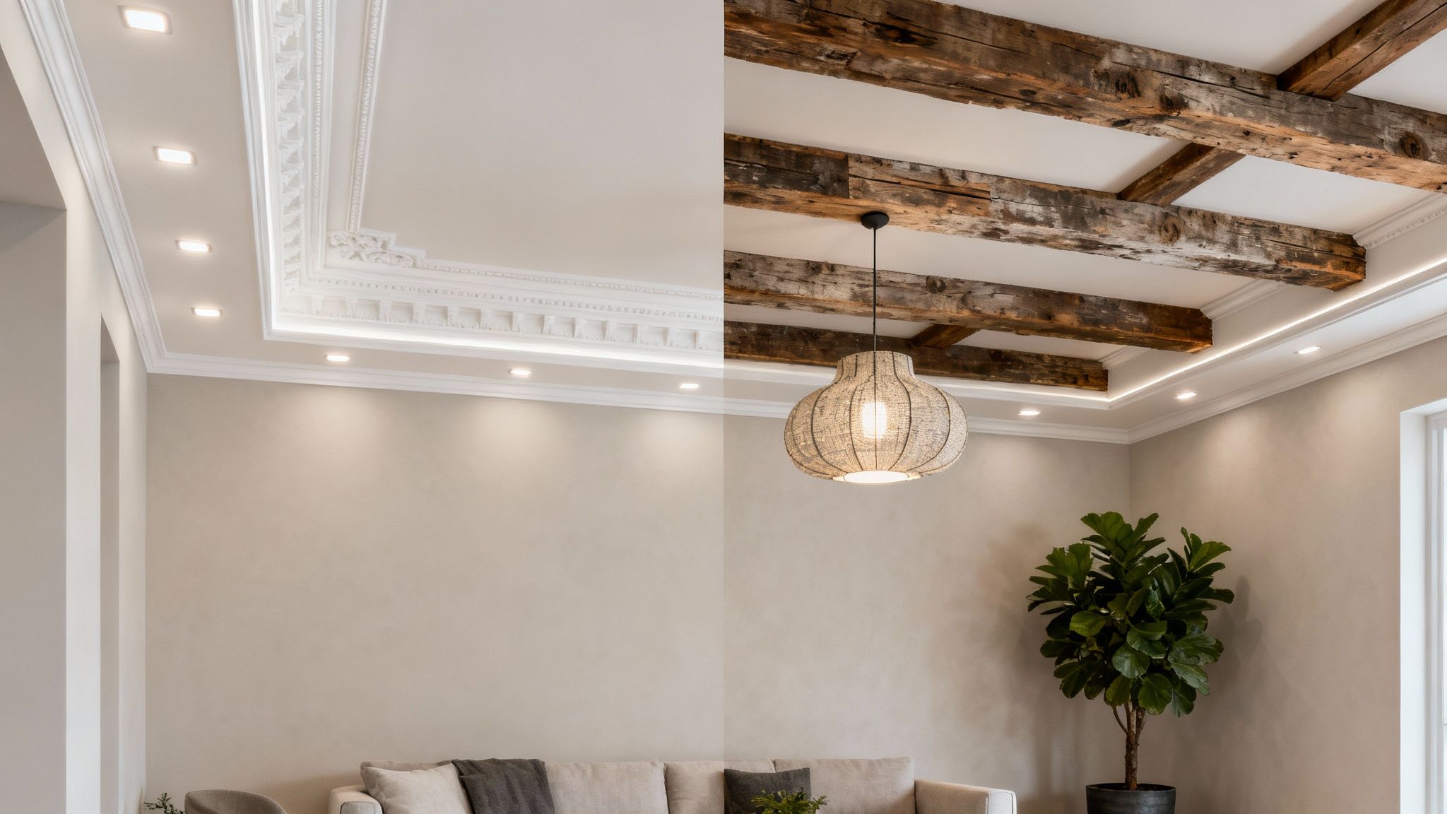
Should My Ceiling and Trim be the Same White as the Walls?
Ah, the classic trim-and-ceiling dilemma. There’s no single right answer here – it all depends on the vibe you’re going for.
For a seamless, modern feel: Painting the walls, ceiling, and trim in the exact same white is a seriously chic move. It blurs the edges of the room, making it feel bigger, calmer, and more cohesive. To add just a touch of definition without breaking the flow, play with different paint finishes – try a matte for the walls, satin for the trim, and a classic flat for the ceiling.
For a more traditional, defined look: Use a crisper, brighter white for the trim and ceiling. This creates a clean frame around your wall colour, making it pop. A go-to designer trick is to use a soft, warm white on the walls, then a clean, neutral white like Benjamin Moore's Chantilly Lace for all the woodwork.
How Do I Stop an All-White Room from Feeling Cold and Clinical?
An all-white room can sometimes tip over into feeling a bit sterile, but warming it up is easier than you think. It's all about layering. Think of your white walls as the perfect, quiet backdrop for texture, character, and life.
First, bring in a mix of materials to add depth. Things like:
- A chunky wool throw draped over the sofa
- Linen or velvet cushions
- A deep-pile rug that feels great underfoot
- Natural touches like wood, rattan, or jute baskets
Never underestimate the power of good lighting. A simple switch to warm-toned light bulbs (look for around 2700K) in your lamps will cast a soft, inviting glow that instantly dials up the cosy factor. It’s a small change that makes a huge difference in the evenings.
Finally, add personality. Houseplants, a gallery wall of your favourite prints, a stack of books – these are the things that turn a white box into a warm, inviting home.