It's time to move on from predictable beiges and stark greys. There’s a new go-to in town, and it’s called blue grey paint. This isn't just one single colour; it's a whole mood. Think of a shade that feels calm and cool one moment, then warm and enveloping the next. It’s the kind of colour that shifts with the light, making a room feel interesting and complete all at once.
Why Blue Grey Paint Is the Perfect Modern Neutral
Let's be honest, choosing the right paint colour can feel like a huge commitment. But this is where blue grey really shines. It offers a beautiful balance that somehow makes the decision easier, bridging that gap between cool and warm tones that can be so tricky to get right. Unlike some neutrals that fall a bit flat, blue grey has an inherent depth that adds a quiet layer of elegance to any room.
It’s no wonder it’s become such a favourite. The UK paints and coatings market is worth around £4.0 billion, which shows just how much we love to invest in our homes. And with residential projects accounting for 85.37% of architectural coatings, the demand for versatile, liveable colours like blue grey is only growing. You can check out more on UK paint market trends to see how tastes are changing.
The New Go-To Colour
The real magic of blue grey paint is its chameleon-like quality. It's complex enough to hold its own, but subtle enough that it won't fight with your furniture or art. It simply works, creating a stylish, cohesive backdrop that lets the rest of your home breathe.
A great neutral should be a canvas, not a compromise. Blue grey paint gets this just right, providing a backdrop that feels both contemporary and timeless, allowing your personal style to take centre stage.
Here’s why it has become such a design staple:
- Emotional Versatility: It can create a serene, tranquil vibe in a bedroom or a focused, calm atmosphere in a home office. It just adapts to the mood you want to create.
- Design Flexibility: This colour plays well with everything. It looks just as good next to rustic wood and warm leather as it does with sleek metals and soft linens.
- Timeless Appeal: It manages to feel current without being trendy, which means your walls will look stylish for years to come. No beige regret here.
If you're still exploring the world of neutrals for your main living areas, take a look at our complete guide to selecting neutral colours for a living room. It’s packed with tips to help you understand how different shades can completely transform your space.
Decoding the Hidden Undertones in Blue Grey Paint
We’ve all been there. You find a blue grey paint sample, fall in love with it in the shop, only to get it home and find it looks completely wrong on your wall. What happened? The culprit is almost always its hidden undertone.
Think of undertones as the secret ingredients in a recipe; they’re not the main flavour, but they absolutely define the final taste. It’s the same with blue grey paint. A subtle hint of green, violet, or even a different grey is mixed in to create the final shade, and this underlying colour is what makes a room feel serene and earthy or cool and crisp. Getting your head around these undertones is the single biggest step to choosing a paint you’ll love for years.
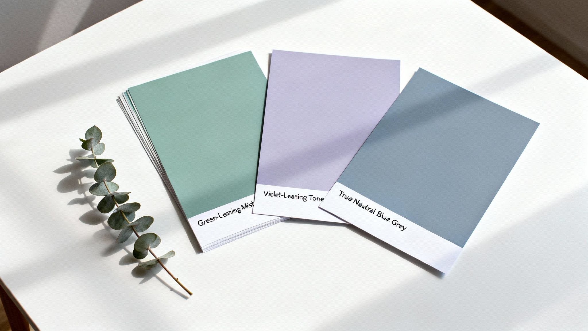
The Green Undertone: Earthy and Grounded
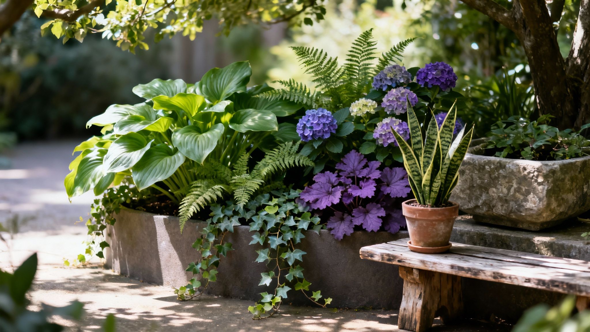
When a blue grey paint has a green undertone, it leans towards the teal or aqua end of the spectrum. These shades feel instantly grounded, natural, and calming. Imagine the colour of a misty coastline or the soft hue of eucalyptus leaves; that’s the feeling a green-based blue grey brings into a space.
These colours are also incredibly versatile. They pair beautifully with natural materials like warm woods, rattan, and linen, creating a look that feels both relaxed and put-together. Thanks to their connection to nature, they work especially well in rooms that get plenty of natural light, like living rooms or garden-facing kitchens.
A blue grey with a green undertone connects a room to the outdoors. It’s a fantastic choice for creating a tranquil, restorative space that feels like a breath of fresh air.
This type of blue grey is quite forgiving, too. That hint of green stops it from feeling too cold or sterile—a common pitfall with bluer shades, especially in north-facing rooms. Instead, it provides a soft, welcoming backdrop that has a lovely depth and complexity.
The Violet Undertone: Soft and Atmospheric
On the other side of the colour wheel, you'll find blue grey paints with a violet or purple undertone. These shades have a touch of red mixed in, which gives them a subtle warmth and a more atmospheric, moody quality. Think of the colour of a stormy sky at dusk or the soft shade of distant lavender fields.
These colours often read as more sophisticated and elegant. The hint of violet can make a room feel cosy and enveloping, making them an excellent choice for bedrooms, dining rooms, or any space where you want to create a sense of intimacy and calm.
Here’s what makes violet-based blue greys so appealing:
- Creates Depth: The slight warmth from the violet adds a layer of complexity that can make a room feel richer and more luxurious.
- Pairs Well with Metals: These shades look stunning alongside metallic finishes like brushed brass, gold, or bronze, which really bring out their warm notes.
- Adapts Beautifully: In warm light, the violet becomes more apparent, creating a cosy ambiance. In cooler light, the blue and grey take over for a more muted and serene look.
If you’re aiming for a space that feels both restful and refined, exploring blue greys with a whisper of violet is a great place to start. For a deeper dive into the fundamentals of colour selection, our guide on how to choose paint colours has practical advice for any project.
The True Grey Undertone: Crisp and Modern
Finally, there are the blue greys that have a more neutral, or 'true grey,' undertone. These are perhaps the most classic interpretation of the colour—they have just enough blue to stop them feeling like a standard charcoal or slate, but not so much that they lean heavily into green or violet.
The effect is often crisp, clean, and decidedly modern. These shades are perfect for creating a sharp, architectural look; think of a minimalist Scandi-inspired interior or a sleek, contemporary office. They provide a sophisticated neutral canvas that doesn’t compete with other design elements.
Because they’re so balanced, these colours are workhorses that can be used in almost any room. They offer a more interesting alternative to pure grey while maintaining that feeling of cool neutrality. Paired with a brilliant white trim and a few black accents, a true blue grey creates a timeless and seriously impactful look.
How Light Transforms Your Blue Grey Walls
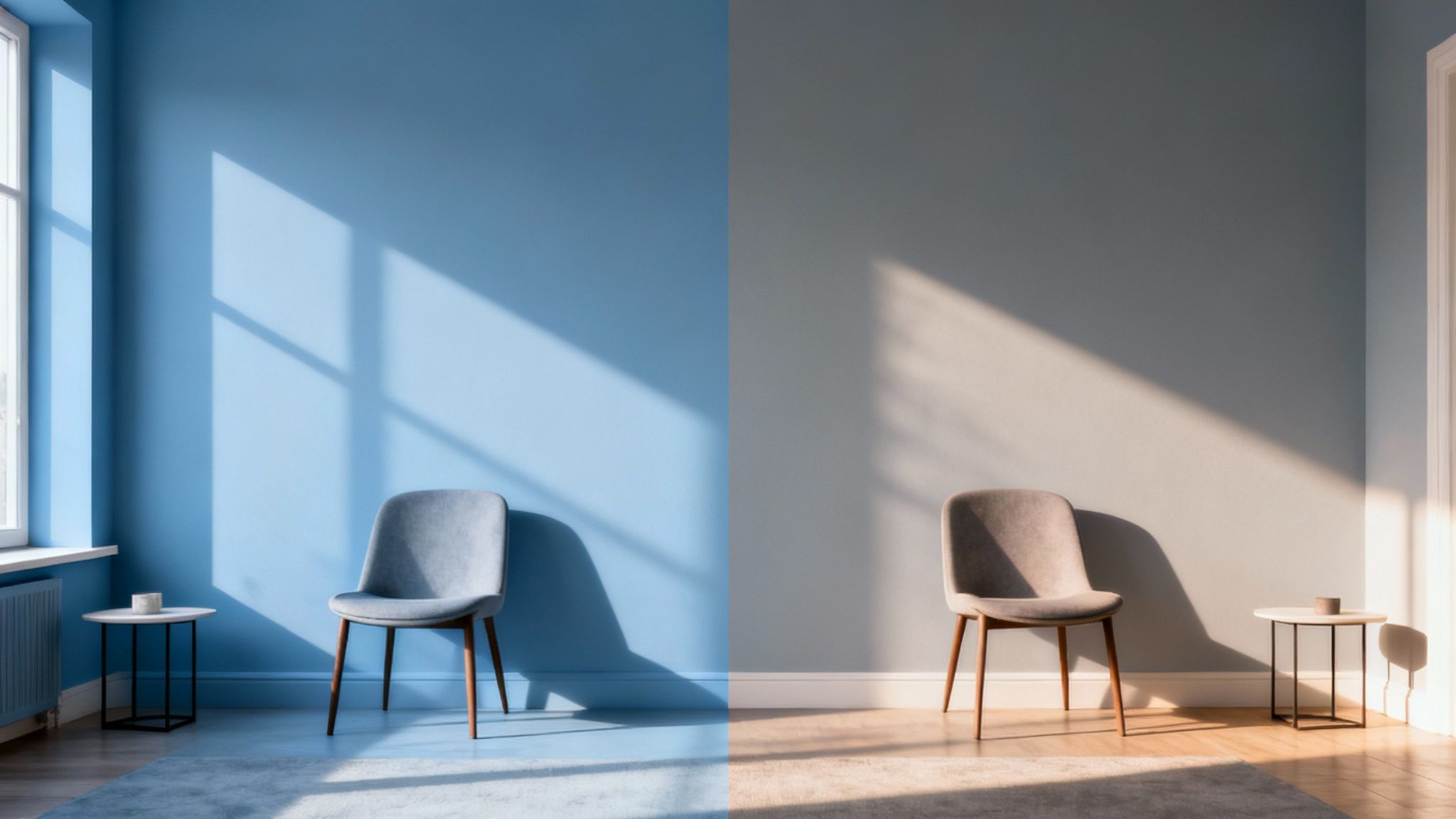
Ever painted a swatch on your wall, fallen in love with it, then painted the whole room only to find it looks completely different? You’re not imagining things.
The biggest player in how your blue grey paint will look is light – both the sunshine pouring through the window and the lamps you switch on at night. This chameleon-like neutral is famous for its shifting personality, and figuring out your light is the secret to getting it right.
A single tin of blue grey paint can look crisp and cool in one room, yet soft and almost warm in another. That’s not a flaw; it’s a feature. Once you get the hang of it, you can choose a shade that perfectly plays up your room's unique lighting, turning a potential headache into your best design trick.
The Power of Natural Light Direction
The direction your windows face completely changes the quality of daylight in a room, which in turn flips the script on your blue grey walls. Each direction brings its own vibe to the colour.
A room with north-facing windows gets cool, indirect light all day. This light naturally has a blueish tint, so it’ll pull out and amplify the blue undertones in your paint. This can create a wonderfully crisp and sophisticated look, but be warned: it can also make a cooler blue grey feel a bit chilly if you don't balance it with warm textures and furnishings.
Meanwhile, south-facing rooms are flooded with bright, warm light for most of the day. This golden-hued light will soften the blue notes and bring the cosier grey undertones forward. It makes the space feel bright and inviting, and even a cooler blue grey will look much softer here.
Light isn't just about brightness; it's about colour temperature. North-facing light is cool and blue, while south-facing light is warm and yellow. Your blue grey paint will reflect and react to this temperature, fundamentally changing its appearance.
Rooms with east-facing windows get a bright, clear light in the morning which turns cooler and moodier as the day wears on. On the flip side, west-facing rooms have softer light in the morning before being bathed in a warm, dramatic glow in the late afternoon. This is when your blue grey walls will look incredibly rich and welcoming.
How Artificial Lighting Changes The Game
Your work isn't done when the sun goes down. The type of light bulbs you use will have a massive say in how your blue grey walls look after dark, and picking the right ones is key to nailing that evening atmosphere.
Artificial light is measured in Kelvins (K), which is just a fancy way of saying it has a colour temperature. Getting your head around this is the key.
- Warm White Bulbs (2700K - 3000K): These give off a yellowish, cosy glow, a bit like old-school incandescent bulbs. They’re perfect for balancing out a cooler blue grey in a north-facing room, adding warmth and stopping the colour from feeling too stark.
- Cool White Bulbs (3100K - 4500K): Emitting a brighter, bluer light, these bulbs will enhance the cool, modern edge of your paint. They work brilliantly in kitchens and bathrooms where you want a crisp, clean feeling.
- Daylight Bulbs (5000K - 6500K): These mimic natural daylight and show the most accurate version of your paint colour. They're great for home offices or utility areas where seeing colours clearly is important.
Here’s a quick breakdown of how the same paint can look so different depending on the light source.
Ultimately, choosing the right paint and lighting is crucial, especially if you're dealing with a particularly dark space. For more tips on that, check out our guide on how to brighten a dark room.
But the only real way to know for sure? Test, test, test. Get large sample patches on your walls and watch how they change from your morning coffee to your evening glass of wine.
Styling Blue Grey Paint in Every Room of Your Home
Right, you’ve got a handle on undertones and how light plays its tricks. Now for the fun part: bringing blue grey paint to life around the house. The real beauty of this colour is its incredible adaptability; it can feel completely different from one room to the next. Think serene bedroom retreat, or a sharp, focused home office – blue grey is the perfect starting point for pretty much any style you can dream up.
Let’s move on from the theory and get into some real inspiration. Here’s a room-by-room guide to show you how to get the most out of blue grey paint, with practical styling ideas to help you pull together a space that feels thoughtful, cohesive, and completely you.
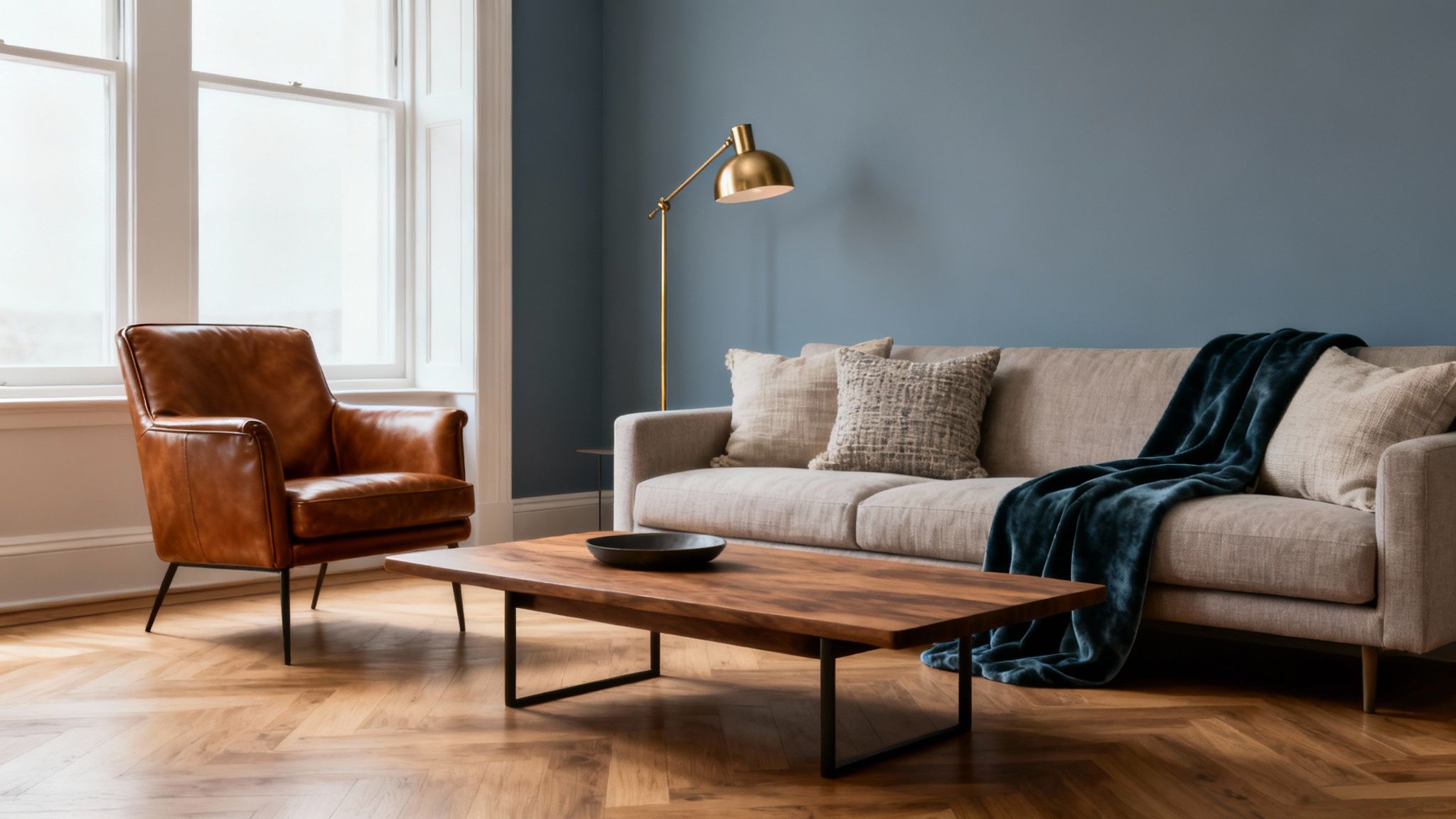
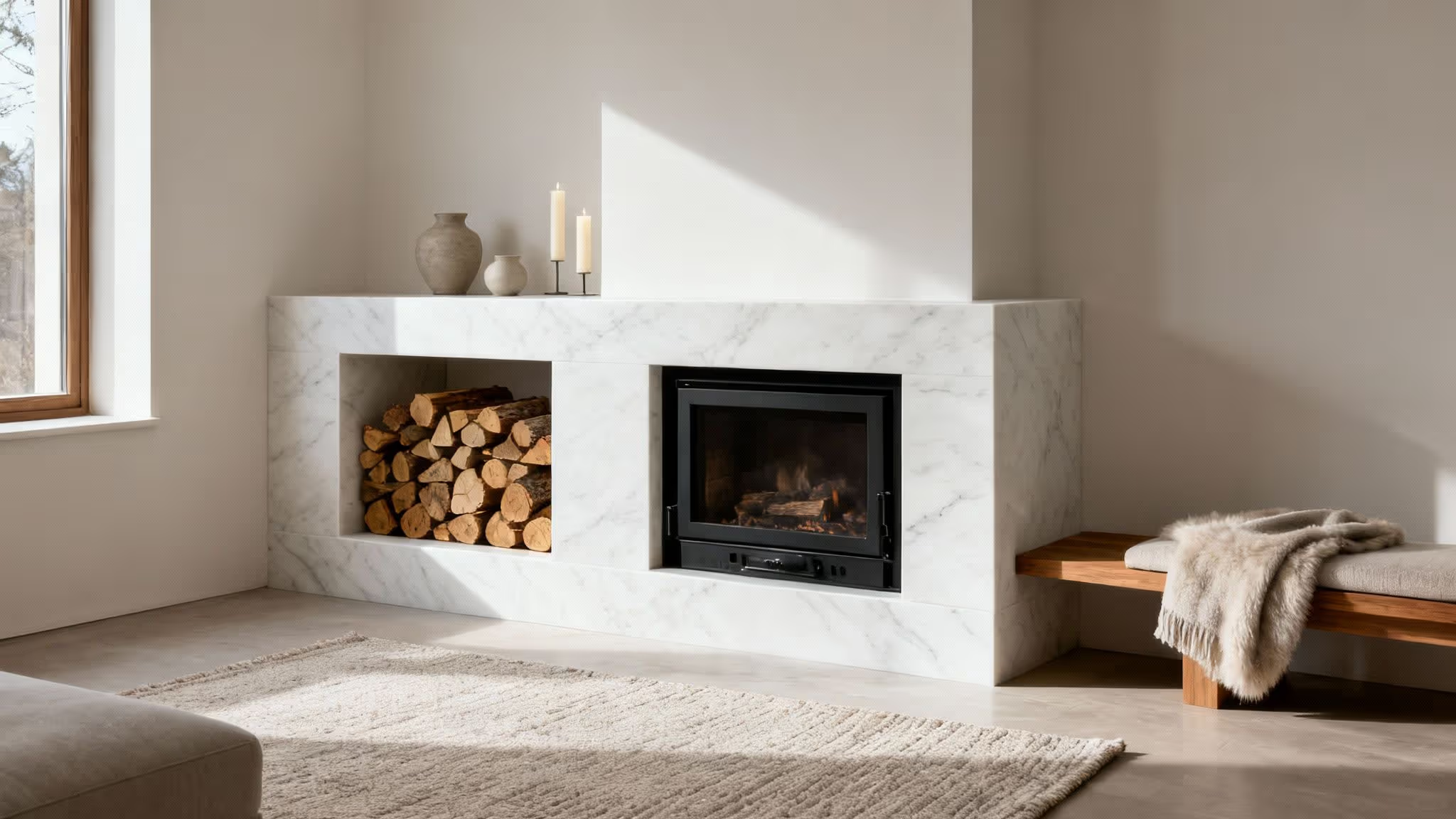
The Living Room: A Sophisticated Welcome
The living room is where you welcome friends and slump after a long day, so it needs to feel both inviting and pulled-together. A mid-to-deep blue grey with a subtle green undertone creates a wonderfully enveloping vibe, especially on a feature wall behind the sofa or fireplace. It’s a trick that adds depth without making the whole room feel dark.
To finish the look, it’s all about layering textures and materials that play nicely with the cool walls. The key is to bring in warm, natural elements to create a bit of contrast and balance.
Here are a few ideas to get you started:
- Warm Woods: Think about pieces in oak, walnut, or teak. A wooden coffee table, a sideboard, or even just picture frames will add that essential organic warmth.
- Rich Leathers: A classic cognac or tan leather armchair is a perfect partner for the moodiness of a deeper blue grey. It just feels right.
- Metallic Accents: Brushed brass or soft gold light fittings, mirrors, and other bits and bobs will really pop against the cool backdrop, adding a touch of understated glamour.
If you’re after more ideas for creating a harmonious social space, dive into our detailed guide on blue and grey living room ideas.
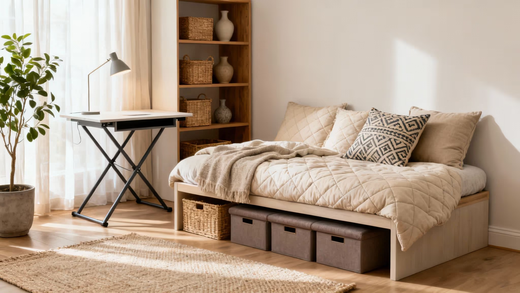
The Bedroom: A Tranquil Sanctuary
In the bedroom, the goal is nearly always calm. A soft, muted blue grey paint with just a hint of a violet undertone is your best friend here. These shades are incredibly gentle and promote a sense of peace, making them ideal for a room dedicated to rest.
For a seamless, cocooning effect, try painting all four walls in a light blue grey. It creates a soft canvas you can build on with textiles and lighting.
For a truly serene bedroom, pair a soft blue grey with layers of natural fabrics. The combination of the gentle wall colour and tactile materials creates a space that feels like a quiet escape from the world.
To really lean into that tranquil feeling, focus on soft textures and a simple colour palette.
- Lush Textiles: Layer the bed with plush velvet cushions, a chunky knit throw, and crisp linen bedding in shades of off-white, charcoal, or even a soft blush pink.
- Soft Lighting: Pop some warm-toned bulbs in your bedside lamps. Fabric shades will cast a gentle, flattering glow that’s perfect for winding down in the evenings.
- Minimalist Decor: Keep clutter to a minimum. A few well-chosen pieces of art and some fresh greenery are all you really need.
The Home Office: A Hub of Focus
A productive home office needs a colour that helps you concentrate without feeling sterile. A mid-tone blue grey with a true grey undertone strikes that perfect balance. It’s calming enough to minimise distractions but has enough personality to keep the space from feeling bland.
This kind of blue grey provides a professional, modern backdrop that works with all sorts of office furniture, from sleek white desks to industrial metal shelves. It just helps you think clearly. This shift towards cooler, more thoughtful colours isn't just happening in our homes, either. While grey still tops the charts for new cars, blue has made a strong comeback, accounting for 14.95% of new registrations. It suggests a wider trend towards calming colours in all areas of design, as recent findings on the UK's favourite car colours show.
The Bathroom: An Airy and Clean Escape
In smaller spaces like bathrooms, a light and airy blue grey can work wonders. Choosing a shade with more blue than grey will bounce light around beautifully, helping the room feel larger and more open. Plus, it just feels clean and fresh, which is exactly what you want in a bathroom.
It's a brilliant alternative to stark white, which can sometimes feel a bit clinical. A pale blue grey adds a touch of personality while keeping everything bright.
To make the most of it, pair it with the right finishes:
- Crisp White: Use a brilliant white on the trim, ceiling, and any sanitaryware to create a sharp, clean contrast that looks fantastic.
- Polished Chrome: Chrome or polished nickel taps and fixtures will complement the cool tones of the paint perfectly.
- Natural Light: If you have a window, keep the covering simple to let as much natural light flood in as possible. A bit of frosted film gives you privacy without sacrificing the light.
Creating Perfect Palettes with Blue Grey Paint
Choosing a blue grey paint is a brilliant first step, but the real magic happens when you pair it with the right companions. A thoughtfully chosen palette can turn a simple wall colour into the anchor of a cohesive, professional-looking room. It’s the difference between just painting a wall and actually designing a space.
The right palette doesn’t just match your walls; it sets the entire mood. By carefully selecting accent colours, textiles, and finishes, you can make your blue grey feel more dynamic, more calming, or more sophisticated. It’s about building a complete visual story where every element works together, instead of just defaulting to plain white trim.
The Monochromatic Approach
For an elegant and layered look, you don’t even need to introduce new colours. A monochromatic palette uses various shades, tones, and tints of the same colour family to create subtle depth. With blue grey, this means pairing your main wall colour with both darker and lighter versions across the room.
Imagine walls in a mid-tone blue grey, the trim in a soft, almost-white version, and maybe a feature wall or a cosy alcove in a deep, stormy shade. This technique creates a serene, seamless feeling that is both modern and timeless. It’s also a fantastic designer trick to make a space feel larger and more unified.
Creating Contrast with Complementary Colours
If you’re after a more dynamic and energetic space, it’s time to play with complementary colours. Pairing cool blue grey with warm tones creates a beautiful visual tension that feels both grounded and interesting. Think about introducing shades that sit opposite blue on the colour wheel.
These warm pairings are perfect for injecting personality and stopping a room from feeling too cold or one-note.
- Ochre and Mustard: These earthy yellows bring a vibrant, stylish contrast that feels contemporary and inviting. They work brilliantly for cushions, a statement piece of art, or a striking armchair.
- Terracotta and Burnt Orange: These rich, clay-like tones add an organic warmth and a touch of rustic charm. They’re ideal for plant pots, textiles, or a feature rug that anchors the room.
- Cognac Leather: The classic combination of a deep tan leather sofa against a blue grey wall is timeless for a reason. It adds instant warmth, texture, and sophistication to any living space.
It turns out our love for sophisticated greys extends beyond our homes. For seven years straight, grey has been the UK's favourite new car colour, holding an impressive 27.8% market share. This just shows how much we’re drawn to these versatile neutrals, a trend you can explore in more detail through recent findings on UK car colour preferences.
The Critical Role of Paint Finish
Finally, never underestimate the power of paint finish. It plays a huge role in the final look and feel of your palette, as the same blue grey can appear dramatically different depending on its sheen. How it reflects—or absorbs—light is key.
The finish of your paint is just as important as the colour itself. A matte finish will give you a soft, velvety look that hides imperfections, while a satin finish will add a subtle glow that enhances the colour's complexity.
Consider these common options:
- Flat or Matte: This finish has no sheen at all. It absorbs light, creating a soft, almost chalky appearance. It’s excellent for creating a calming, modern atmosphere and is very forgiving on less-than-perfect walls.
- Eggshell or Satin: With a slight lustre, these finishes are more durable and easier to wipe clean than matte. The subtle sheen reflects a small amount of light, which can help bring out the beautiful nuances in your blue grey paint.
For more inspiration on building a complete look, our article on choosing the right colours for a living room offers plenty of extra guidance.
Your Guide to Flawless Sampling and Application
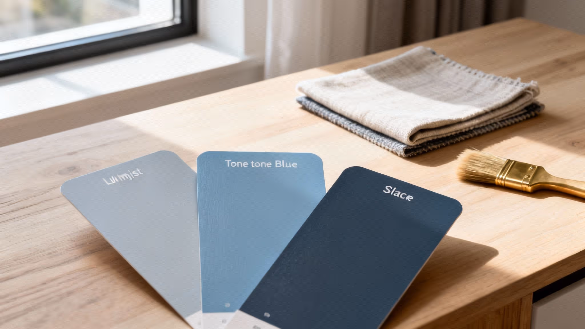
Right, you’ve navigated the tricky world of undertones, considered your lighting, and now you have a shortlist of promising blue grey shades. This next bit is the most crucial step of all: sampling. It’s what separates a decent paint job from a truly stunning one, and it’s the only way to be completely sure before you commit.
Here’s the biggest mistake we see people make: painting little squares directly onto the wall. It seems logical, but the colour you’re painting over will completely throw off your perception of the new shade. You need to test it like a pro.
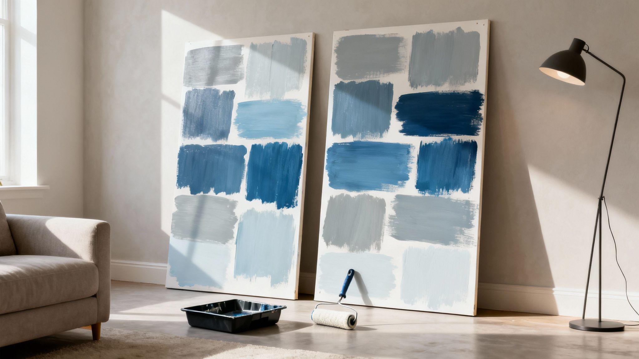
The Art of the Sample Board
The secret weapon of any interior designer is a large, movable sample board. Grab a couple of A2-sized pieces of white card or even some leftover lining paper. Apply at least two coats of your chosen paint, but here’s the key: leave a crisp white border around the edge. This little trick helps your eyes see the colour in isolation, giving you a much truer reading.
Once they’re dry, these boards are your best friend. Move them around. Watch how that blue grey shifts as the day goes on.
A sample board is like a portable snapshot of your future wall. It lets you see how the colour really behaves next to your sofa, your flooring, and your curtains – in bright morning sun and under the warm glow of an evening lamp.
This simple process takes all the guesswork out of it. You can prop the board up in a gloomy corner, stick it next to a bright window, and slide it behind your furniture. It gives you a proper feel for how the colour will live in your home, long before you’ve cracked open a full tin of paint.
Essential Application Tips for a Perfect Finish
So, you’ve found the one. Now, getting that perfect, professional-looking finish is all down to good prep and the right kit. Trust us, rushing this stage is a recipe for regret.
Follow these simple steps, and you’ll do your beautiful new colour justice.
- Prep Your Walls: Give the walls a good clean with a sugar soap solution to get rid of any dust or grease. Fill any little cracks or holes with filler, and once it’s dry, sand it back so it’s completely smooth.
- Use a Primer: This is non-negotiable if you’re painting over a dark or very bold colour. A good primer creates a neutral base, ensuring the true shade of your blue grey comes through beautifully. It also helps the paint stick better, making for a much more durable finish.
- Choose the Right Roller: For most interior walls, a medium-pile microfibre roller is your best bet. It holds a decent amount of paint and gives you a lovely, smooth finish without leaving annoying bits of fluff behind.
- Cut In Carefully: Using a 2-inch angled brush, paint a clean line around all the edges – where the walls meet the ceiling, skirting boards, and window frames. This is called “cutting in,” and it creates a neat border for you to roll up to.
- Apply Two Thin Coats: Load up your roller and apply the paint in a big ‘W’ shape, then go back and fill in the gaps without lifting it from the wall. Let that first coat dry completely (check the tin for timings!) before going in with the second. This is how you get that rich, flawless colour depth.
Common Questions About Using Blue Grey Paint
Even when you think you’ve got it all figured out, a few last-minute questions always seem to pop up. It’s completely normal, especially with a colour as complex as blue grey. Here are the answers to the dilemmas we see most often, designed to give you that final boost of confidence.
Think of this as your quick-fire round to nail those finishing touches.
What Is the Best White Paint for Trim with Blue Grey Walls?
Getting the trim right is a game-changer. For almost any blue grey wall, the safest bet is a clean, crisp, neutral white. You want something that will pop against the walls without fighting for attention.
Steer clear of whites with obvious yellow or creamy undertones. Next to a cool blue grey, these can look a bit grubby or dated. Instead, go for a pure, bright white that acts like a sharp, architectural frame for your gorgeous new wall colour.
How Can I Stop My Blue Grey Paint from Looking Like Baby Blue?
Ah, the dreaded "nursery blue" fear. It’s a real one, especially in rooms with lots of cool, natural light. This usually happens when a simple blue grey meets a north-facing window, where the light dials up the blue and washes out all the subtle grey notes.
Luckily, there are two easy ways to dodge this:
- Pick a more complex shade: Look for a blue grey with a stronger grey base or even a hint of a green undertone. These sophisticated shades have enough depth to hold their own, even in the coolest light.
- Test, test, and test again: This is non-negotiable. Get a large sample board and move it around the room at different times of the day. See how the colour shifts and changes in your home’s unique light before you even think about buying a full tin.
The biggest mistake we see? People choosing a colour from a tiny swatch under the harsh fluorescent lights of a shop. A blue grey only shows its true personality in your home, which makes proper sampling the most important step of all.
Can Blue Grey Paint Feel Warm and Cosy?
Absolutely! While it’s famous for being cool and calm, the right blue grey can feel like a warm hug. It all comes down to the specific shade you choose and how you style it.
To dial up the cosiness, find a blue grey with a warmer, almost beige-like base or even a touch of a violet undertone. These shades have an inherent softness that feels really enveloping. Then, layer in warmth with your decor: think natural wood furniture, a well-worn leather armchair, and plenty of soft textiles. The final trick? Use warm-toned light bulbs (around 2700K) to cast a lovely, welcoming glow in the evenings.