Choosing a white paint should be easy, right? Just pick one and go. But anyone who’s stood staring at a wall of swatches, trying to tell the difference between twenty shades of ‘off-white’, knows it’s far more complicated.
The truth is, even the most popular choices, like Benjamin Moore's White Dove or Farrow & Ball's Pointing, are packed with subtle undertones. The perfect white is rarely a pure white; it’s about finding the right one that makes your unique space sing.
Why Choosing a White Paint Is Surprisingly Difficult
What seems like the simplest decorating decision is actually one of the most impactful. Staring at a dozen near-identical paint chips can feel completely overwhelming, but there’s a good reason for it: there is no single ‘best’ white. The goal is to find the right white for your home, your light, and your style.
Think of this as your roadmap. We're going to demystify the hidden world of undertones, look at how dramatically daylight can change a colour, and see why the right finish can make or break your whole scheme. We'll turn a daunting task into a creative one.
The Popularity of White in UK Homes
There’s a reason white remains a firm favourite. In the UK, residential projects dominate the paint market, making up a huge 85.37% of its value. It just goes to show how much homeowners rely on a fresh coat of paint to transform their spaces, and time and again, it's a shade of white they turn to.
This guide will give you the confidence to pick a shade that doesn’t just cover the walls but truly enhances your home. We'll get into everything from undertones to lighting, but for a quick overview first, check out our general guide on how to choose paint colours.
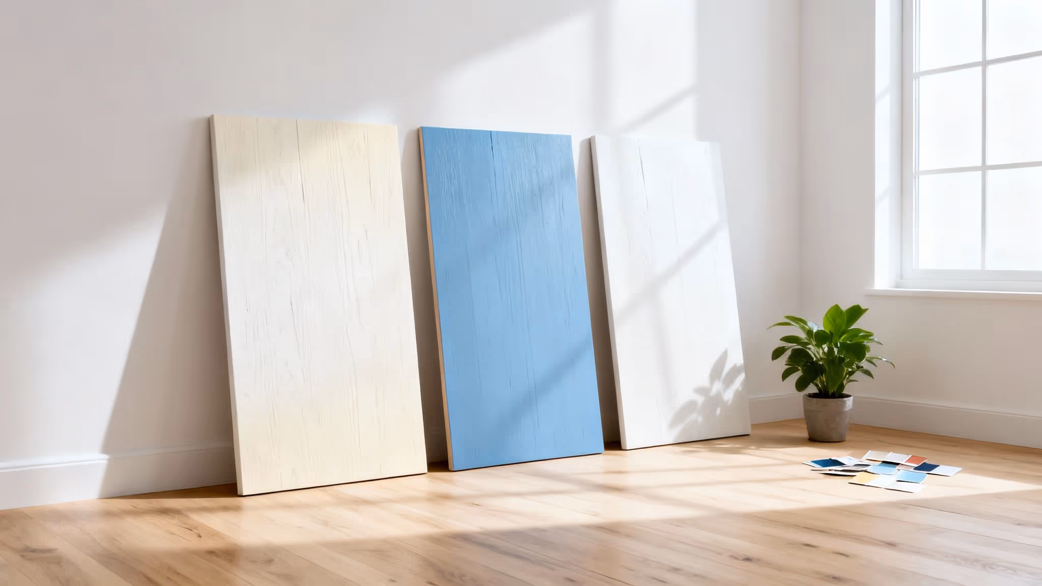
A common mistake is painting a small swatch directly onto an existing wall. The old colour will always influence how you see the new one, giving you a completely inaccurate impression. Always, always use large sample boards to see the true colour.
By the end of this, you’ll be ready to choose a white that creates the bright, inviting, and perfectly curated home you've been picturing.
Decoding the Hidden Undertones in White Paint
Here’s the secret to finding the perfect white paint: it’s almost never about finding a “pure” white. The magic is in the hidden undertones—those subtle hints of other colours that give each white its unique personality.
Think of it this way: a true, brilliant white is a completely blank canvas. But a white with an undertone? That’s a canvas with a built-in atmosphere. This is exactly why one white can feel cosy and another sterile, even in the very same room. Once you learn to spot these nearly-invisible differences, you can pick a paint that perfectly matches the feeling you want to create.
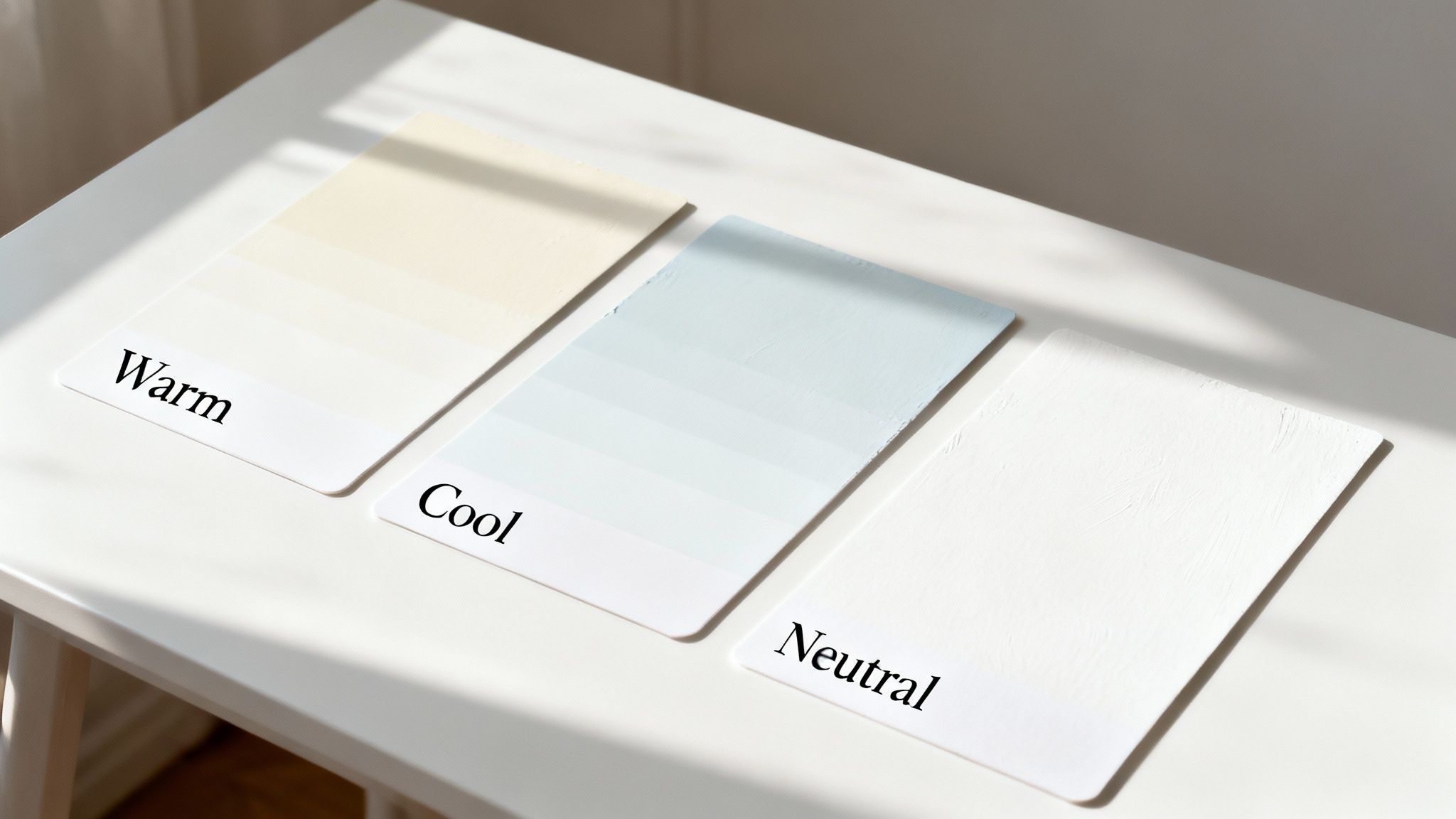
Warm Whites for an Inviting Glow
Warm whites are laced with hints of yellow, cream, or even a soft peach. These undertones give them a gentle, sun-kissed quality that feels instantly welcoming, wrapping the space in a soft glow. They’re brilliant at making a room feel comfortable and intimate.
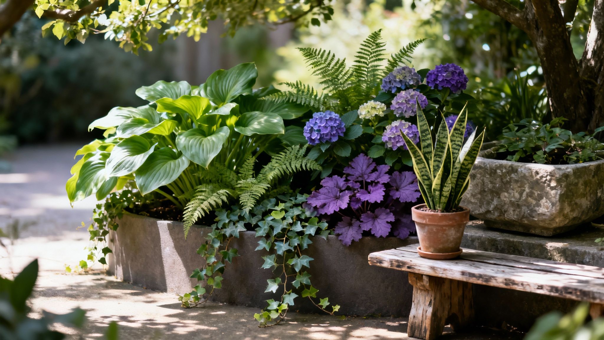
This makes them a go-to choice for living rooms and bedrooms—anywhere you want to encourage relaxation. Warm whites also beautifully complement natural materials like wood and stone, enhancing their inherent warmth. For more on this, check out our guide on choosing neutral colours for your living room.
- Creates a feeling of: Comfort, cosiness, and intimacy.
- Best paired with: Earthy tones, natural wood finishes, and warm metallics like brass or copper.
- Ideal for: Rooms where you want to create a snug, inviting atmosphere that feels like a permanent hug.
These welcoming shades are a huge reason why waterborne coatings, which often feature these popular whites, are so dominant. In fact, these coatings accounted for 44.14% of the UK paints and coatings market revenue in 2023. Their fast-drying nature and low VOCs make them a top choice everywhere, with acrylic whites holding a 56.99% share of the architectural coatings market.
Cool Whites for a Crisp and Modern Feel
On the other side of the spectrum are cool whites. These shades have subtle undertones of blue, grey, or even a hint of violet, giving them a crisp, clean quality that can make a space feel larger and more open.
Cool whites are perfect for creating a serene, minimalist, or contemporary look. They work exceptionally well in kitchens and bathrooms where you want a feeling of cleanliness, and they provide a sharp, gallery-like backdrop that makes bold art and vibrant decor truly pop.
When you use a cool white, it will amplify other cool tones in the room, like blues, greens, and greys. It creates a very clean, deliberate, and sophisticated look.
Think of these whites as the equivalent of a crisp, clear morning. They reflect light beautifully, which can help brighten up rooms that don’t get a lot of natural sun.
Neutral Whites: The Ultimate Blank Canvas
Finally, we have the neutral or ‘pure’ whites. These are the chameleons of the paint world, with the least amount of discernible undertone. They don't lean noticeably warm or cool, making them incredibly versatile.
This versatility is their greatest strength. A neutral white is a clean slate that works with any design style, from ultra-modern to traditional country. It provides a bright, clarifying backdrop that doesn’t compete with your furniture, artwork, or architectural details.
- When to use them: When you want your decor, textiles, and art to be the star of the show.
- Their effect: They create a sense of spaciousness and clarity, making them ideal for small rooms or spaces you want to feel uncluttered.
- A designer's trick: Use a pure white on both walls and trim but in different sheens (e.g., matte on walls, satin on trim). This creates subtle texture and dimension without introducing another colour.
To make it even simpler, here's a quick breakdown of how to choose the right undertone for your space.
Quick Guide to White Paint Undertones
By figuring out which of these three families a white paint belongs to, you can narrow down your choices and find a shade that will perfectly support your overall design vision.
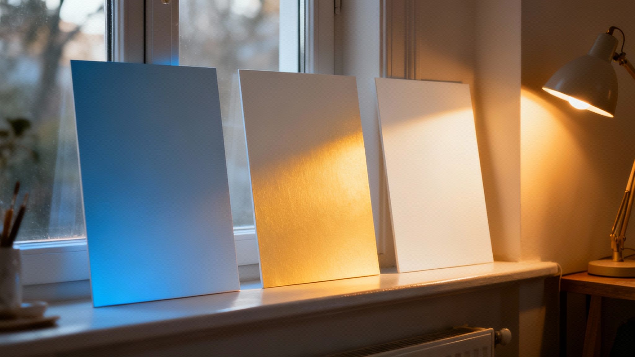
How Light Completely Changes Your White Walls
Think of white paint as a chameleon. The colour you see on the tin is almost never the exact shade you get on your walls, because its final look is pretty much decided by the light in your home. Getting this relationship right is the secret to choosing a white that feels just right.
Both the sun streaming through your windows and the lamps you switch on at night have a massive impact, turning subtle undertones into the main event. A white that looks perfectly creamy and soft in one room can suddenly look stark and yellow in another, all because of the light. This is exactly why testing a paint sample in your actual space isn't just a good idea—it's non-negotiable.
The Influence of Natural Light
The direction your room faces is the single biggest decider in how daylight will play with your white paint. Each orientation—north, south, east, or west—gets a different quality of light that shifts throughout the day, and it will pull out different undertones from your chosen white.
North-Facing Rooms: These rooms get cool, indirect light for most of the day. This blue-ish light can wash colours out, making warm whites look more neutral and cool whites feel a bit sterile or even slightly blue. To balance it out, pick a white with a clear warm undertone (think creamy or soft yellow) to add a bit of warmth and stop the space feeling chilly.
South-Facing Rooms: Ah, the dream. Blessed with bright, warm light all day, these rooms are much more forgiving. The golden glow will make a creamy white look absolutely beautiful, but be careful—a very warm white could tip over into looking too yellow. A neutral or even a cool-toned white can feel perfectly crisp and balanced in this lovely light.
East-Facing Rooms: You’ll get bright, warm light in the morning, which turns cooler and more shadowed in the afternoon. A versatile white with soft, subtle undertones works beautifully here. It will adapt as the light changes without looking too stark in the morning or too grey in the evening.
West-Facing Rooms: The light here is softer in the morning and then becomes intensely warm and golden in the late afternoon. A warm white can look absolutely stunning in that evening glow, but a crisp, neutral white might be better to balance out the intensity of the afternoon sun.
Mastering Artificial Lighting
Your walls don't go to sleep when the sun goes down, and neither should your perfect white paint. The light bulbs you use play a huge part in the evening vibe, and the secret weapon here is understanding the Kelvin scale, which measures the colour temperature of light.
Bulbs with a lower Kelvin temperature (around 2700K) give off a warm, yellowish glow, much like an old-school incandescent bulb. This kind of light will dial up the warm undertones in your white paint, creating a really cosy, inviting atmosphere at night.
On the other hand, bulbs with a higher Kelvin temperature (around 4000K-5000K) produce a cool, crisp, blue-toned light that’s closer to daylight. While it’s great for task lighting in a kitchen or office, it can make warm whites look a bit muddy and cool whites feel overly clinical.
For most living spaces, a bulb somewhere in the 2700K to 3000K range is your sweet spot. It casts a comfortable, flattering light that works with most white paints without messing with their intended colour.
If you're struggling with a room that always feels a bit gloomy, learning how to work with light is key. For more tips, have a read of our detailed advice on how to brighten a dark room. By pairing the right white paint with the right lightbulb, you can make sure your walls look just as good at night as they do during the day.
Selecting the Perfect Paint Sheen and Finish
So, you’ve picked the perfect white. A huge step, but the job’s not quite done. Now for the decision that dictates how your walls feel, how they wear, and crucially, how they handle real life: the paint finish, or sheen.
Think of sheen as the texture of your paint. It’s all about how it plays with light, which can completely change the personality of your chosen white. The same colour can look chalky and soft in a flat finish or crisp and bright in a semi-gloss, proving this choice is just as important as getting the undertones right.
It’s a balancing act between looks and life. A gorgeous, velvety finish might be what you’re dreaming of, but can it handle the sticky fingerprints in a busy hallway? Let’s break down the options so your beautiful white walls are ready for anything.
From Velvety Matte to Subtle Glow
Paint finishes run the gamut from zero shine to an almost mirror-like gleam. Each one has its own strengths and is a better fit for different corners of your home.
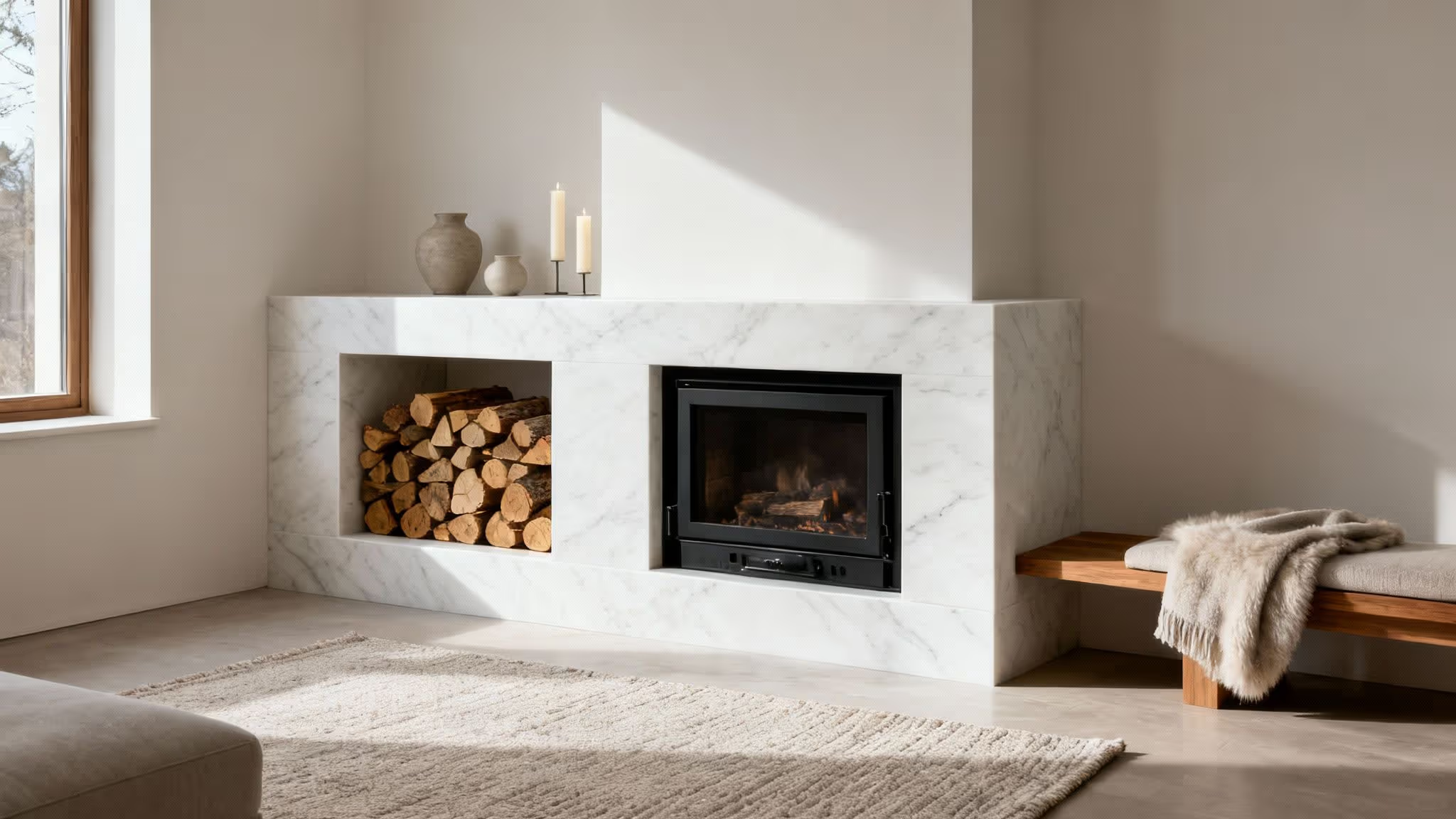
A matte or flat finish has virtually no reflection. This gives it a soft, chalky quality that’s brilliant at hiding lumps, bumps, and less-than-perfect plaster. Because it doesn’t bounce light around, the pure colour really sings, creating a rich, deep look. The trade-off? Matte finishes are the least durable and a pain to clean, making them best for low-traffic spots like ceilings or adult bedrooms.
Next up are eggshell and satin. These are the workhorses of the paint world, and for good reason. They offer a gentle, low-lustre glow that reflects a little light without being properly shiny. That subtle sheen makes them much more durable and wipeable than matte, which is why you see them everywhere from living rooms to hallways and dining rooms. If you're weighing up these two popular choices, exploring the key differences between eggshell and satin can help you lock in the right one for your space.
High-Shine Finishes for Durability and Detail
When you need paint that can take a beating or want to make architectural details sing, it’s time to embrace the shine. Semi-gloss and gloss finishes are the toughest of the lot, built to resist moisture, scuffs, and frequent wipe-downs.
A classic designer trick is to use the same white on the walls and trim but in different sheens. Think eggshell on the walls and a crisp semi-gloss on the skirting boards and door frames. It creates a subtle, sophisticated contrast that adds depth without complicating the colour palette.
These shinier finishes are perfect for:
- Trim and Mouldings: A semi-gloss finish makes woodwork pop, giving your walls a sharp, clean outline.
- Doors: High-traffic doors need a durable, easy-to-clean sheen to look their best.
- Kitchens and Bathrooms: Their moisture-resistant nature makes them a no-brainer for areas prone to splashes and steam.
In the UK, the demand for these practical, hard-wearing finishes is massive. Architectural coatings have long dominated the market, accounting for a huge 68.25% share back in 2021. In cities like London, durable, light-reflecting whites are a must for making compact spaces feel bigger. And with more of us working from home, people are refreshing their spaces 20-30% more often, looking for versatile whites that are both beautiful and bulletproof. According to TechSci Research's UK paint market trends, choosing the right sheen isn't just a style choice; it’s about future-proofing your home.
Our Curated Picks for the Best White Paint Colours
Alright, we’ve covered the theory—the undertones, the light, the finishes. Now for the fun part. Let's put all that knowledge to work and talk about actual paint choices for the most important rooms in your home.
Because let’s be honest, every room has a different job to do, and the right white can make all the difference. We’ll focus on the type of white that works best in each space to give you a solid starting point. To make things even easier, we’ve pulled together some mini-palettes with accent colours for furniture and decor to get you inspired.
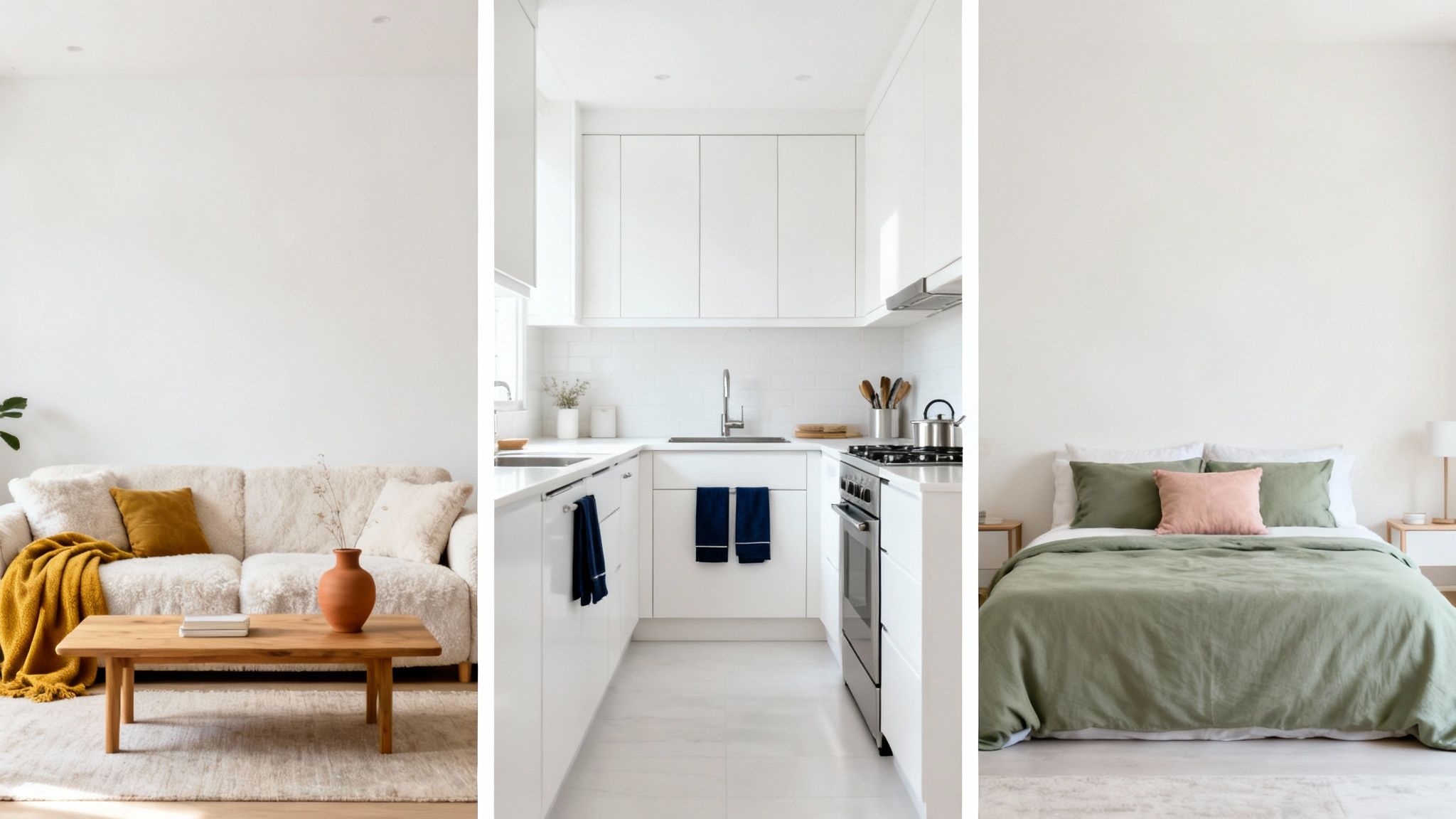
For the Living Room: Welcoming Soft Whites
The living room is the heart of the home, isn't it? It’s where you relax, chat, and connect. The best white for this space is one that feels versatile and welcoming—a soft, inviting backdrop that doesn't shout for attention. A warm off-white with creamy or gentle beige undertones is almost always the perfect choice.
These shades create a cosy, enveloping feel that works beautifully any time of day. They’re brilliant with natural materials like wood and linen, making those organic textures really sing. Think of shades like Benjamin Moore's White Dove or Farrow & Ball's Pointing, both loved for their warm, gentle glow.
A soft white in a living room is incredibly forgiving. It adapts beautifully to changing light, feeling bright and airy during the day and warm and intimate under lamplight in the evening.
To pull the whole look together, pair your soft white walls with a thoughtful palette.
- Furniture: A deep navy blue or charcoal grey sofa grounds the space beautifully.
- Textiles: Bring in cushions and throws in sage green, dusty rose, and warm terracotta.
- Accents: Add a touch of elegance with warm metallics like brushed brass for lamps and picture frames.
For the Kitchen: Crisp, Clean Whites
Kitchens are busy, functional spaces that just feel right when they’re clean, fresh, and bright. This makes them the perfect place for a neutral or cool-toned white. A pure, gallery-style white can make a kitchen feel spacious and hygienic, while one with a subtle grey or blue undertone adds a crisp, modern edge.
A clean white acts as a brilliant canvas, making other design elements—like your cabinetry, worktops, and splashback—the real stars. Consider shades like Sherwin-Williams' Pure White or Benjamin Moore's Decorator's White, which are popular for their bright, no-fuss character.
You can add personality and stop things from feeling too clinical by layering in colour and texture through accessories. Finding fresh painting walls ideas can spark inspiration for a feature wall, colourful cabinetry, or just smaller details that make a big impact.
- Cabinetry: Try a contrasting island in a deep forest green or a classic slate grey.
- Worktops: Pair with warm butcher block or elegant marble with subtle veining.
- Accents: Weave in natural textures through rattan bar stools, ceramic pots with fresh herbs, and sleek chrome or matte black hardware.
For the Bedroom: Serene Off-Whites
A bedroom should be your sanctuary—a calm, restful retreat from the noise of the outside world. For this, you want a white that whispers serenity. Look for soft off-whites with gentle, muted undertones. A white with a hint of grey, taupe, or even a touch of pink creates a tranquil and sophisticated vibe.
These more complex whites have a quiet depth that stops them from feeling stark or cold. They have a soft, cocooning effect that's perfect for encouraging rest. Shades like Farrow & Ball's Ammonite or Sherwin-Williams' Oyster White are excellent examples of whites that feel both soothing and chic.
By carefully choosing your accent colours, you can create a layered, hotel-like feel that’s pure bliss to wake up in.
- Bedding: Go for luxurious layers of natural linen in shades of oatmeal, muted blue, or soft greige.
- Furniture: A dark wood or upholstered headboard adds contrast and a strong focal point.
- Accents: Use soft lighting from bedside lamps with fabric shades and add warmth with a plush wool rug and velvet cushions.
The Pro Secret to Choosing with Confidence
Let’s be honest, we’ve all been tempted to do it. You get a few sample pots, paint little squares directly onto the wall, and squint. But here’s the rub: this is a recipe for beige regret. Your current wall colour will always skew your perception, making that perfect off-white look dingy, yellow, or just… wrong.
The Power of the Sample Board
To really see a colour for what it is, you need to get your old paint out of the picture. The method designers swear by is surprisingly simple: paint large sample boards instead. Just grab a few pieces of A4-sized card or thin board and give each one two proper coats of your chosen paint sample.
It’s a complete game-changer. Once they’re dry, these boards become portable snapshots of your potential new walls. You can move them around the room, seeing exactly how that white behaves as the light changes. It’s the only way to be sure the colour you fell for in the shop is the one you’ll still love when it’s all over your walls.
Using a large, movable sample lets you see the paint in its purest form. You can hold it up against your sofa, see how it sits with your kitchen cabinets, or check it next to your flooring—all without your old wall colour whispering sweet nothings in your ear.
Your Observational Checklist
With your sample boards ready, it's time to play detective. For the next 24-48 hours, move them around the room and pay attention. This is where you confirm you’ve found the one.
Here’s what you should be looking for:
- Morning vs. Evening: How does the colour shift from the bright, cool light of morning to the warm, golden glow of late afternoon?
- Direct Sun vs. Shadow: Pop one board in the sunniest spot and another in the darkest corner. Does it hold its own, or does it wash out or turn gloomy?
- Under Artificial Light: Don’t forget to check the samples at night with all your lamps on. Does that lovely warm white suddenly turn a bit too yellow?
- Against Fixed Elements: This is the big one. How does the white look next to the things you can’t easily change, like your worktops, flooring, window frames, and that big statement sofa?
This methodical approach takes all the drama out of the decision. You’re not just hoping it will look good; you’re making sure it will harmonise with every part of your room, at every time of day. The result? A perfect white you can be absolutely confident in.
A Few Final White Paint Questions
Even after you've narrowed down your undertones and considered your lighting, a few lingering questions always seem to pop up just before you commit. Getting these last details right is what separates a good paint job from a great one. Let’s tackle the common ones to give you that final boost of confidence.
From the practicalities of covering up that old, dark feature wall to the classic dilemma of what to do with your trim and ceilings, we've got you covered.
What’s the Best White Paint for Covering Dark Colours?
So, you’re finally saying goodbye to that moody navy or deep forest green wall? The secret weapon here isn't actually the white paint itself – it's all in the prep. Don't skip the primer. A quality primer is non-negotiable.
Here’s a pro tip: ask your paint shop to tint your primer grey. It sounds counterintuitive, but a grey base neutralises the dark colour underneath far better than a white primer ever could. This little trick means you'll need fewer coats of your beautiful new white, saving you time and money.
After priming, look for a white paint with high opacity, sometimes called 'hiding power'. Most good brands will advertise paints specifically for their excellent coverage. A crisp, neutral white or one with a slightly cool undertone usually provides the most solid finish, as some of the creamier, warmer whites can have pigments that are just a touch more translucent.
Should My Ceiling and Trim Be the Same White as My Walls?
Ah, the great trim debate. There’s no single right answer here, but there are three brilliant approaches, each creating a different feel.
Painting the walls, ceiling, and trim all in the same white gives you a seamless, contemporary look. It’s a trick designers use to make a room feel bigger, calmer, and more cohesive. Simple, but oh-so-sophisticated.
The classic approach is to use a brighter, crisper white for the trim and ceiling. This creates a subtle, clean contrast that beautifully frames your wall colour, giving the space a polished, more traditional feel.
And for a foolproof middle ground? Use the exact same white shade on walls and trim but in different finishes. Think eggshell on the walls and a durable satin on the trim. This creates a lovely, subtle texture and depth without introducing another colour.
How Do I Choose a White Paint That Won’t Look Yellow?
Nobody wants that accidental buttery-cream look when they were aiming for a serene white. To avoid any unwanted yellowing, you have to be ruthless about checking the undertones. Say no to anything described as 'creamy', 'ivory', or 'antique'.
Instead, stick to pure, neutral whites or cool whites that have subtle blue, grey, or even violet undertones. These cool notes are the perfect antidote, cancelling out any tendency for the paint to lean yellow.
But even with the perfect cool white, remember that lighting is the final boss. Warm artificial light, especially from old-school incandescent bulbs or warm-toned LEDs, can cast a yellow glow on everything. This is why you must always test your samples in your own home, under your own lights. Watch how the colour changes throughout the day and into the evening before you even think about buying a full tin.